2022 in review: New dashboards, Core Web Vitals enhancements, third-party tracking & more!

Every year feels like a big year, and 2022 has been no exception. Not only did we celebrate our ninth birthday (!!!) we also:
- Launched a series of new and improved dashboards to help you identify and fix your performance issues more quickly and efficiently (More on those below.)
- Expanded our test agent locations to bring you even more places to test from worldwide
- Jumped into in-person events, and were so happy to catch up with some of you at SmashingConf and performance.now() (You can watch videos of my talk about performance budgets and Andy Davies' talk about third parties.)
Keep reading for a full recap of the past year...
Home dashboard
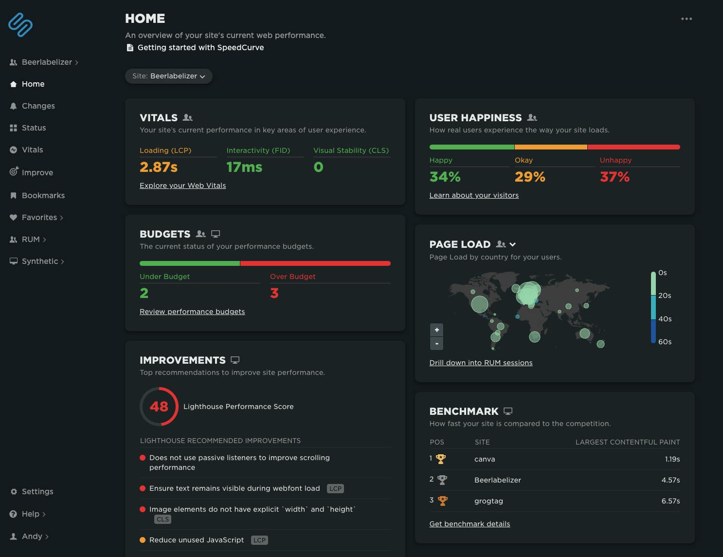
It only took nine years, but we now have a home page! ;-)
Your Home dashboard brings together your Synthetic and RUM data to provide an easy-to-digest – and easy-to-share – snapshot of how your site is performing. You can see at a glance:
- Key metrics like Core Web Vitals and your User Happiness score
- The current status of your performance budgets
- Performance in different geolocations around the world
- Your current competitive benchmarks status
- Top Lighthouse recommendations for performance improvements
(Hint: If you're considering installing a big-screen performance monitor at your organization, this dashboard is a good candidate for that.)
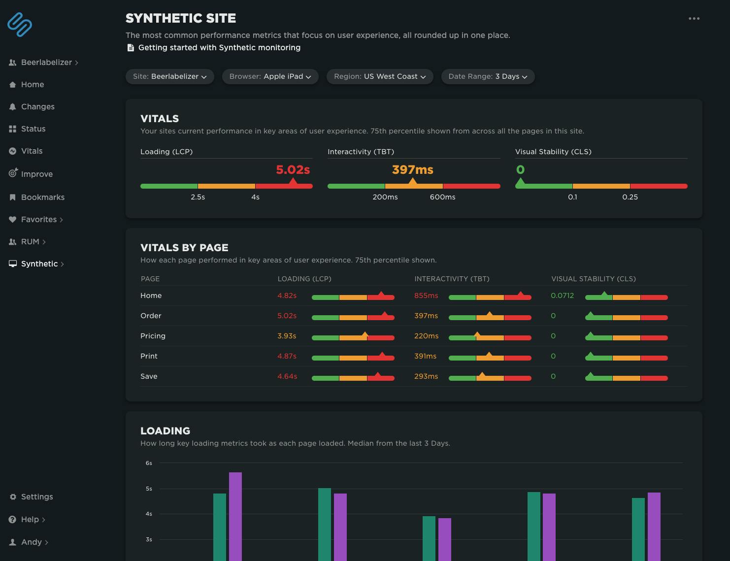
Synthetic Site dashboard
You may have noticed that your Site dashboard has been given a complete overhaul. It now focuses on helping you spot differences between the performance of your pages, making it easier to identify which pages in your site have performance issues.
When you identify a page that needs further investigation, you can quickly navigate through to your new Synthetic Page dashboard...
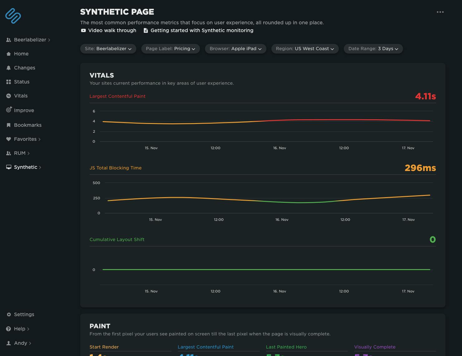
Synthetic Page dashboard
You'll find your new Page dashboard to be similar to your old Synthetic Site dashboard. Here you can still find time series charts that show how performance is trending over time across a number of key metrics, including Core Web Vitals.
Contextual Web Vitals recommendations
As you may already know, we run full Lighthouse audits on every page you test in synthetic. The results – including detailed performance optimization recommendations – are available in your test details.
In addition to that, we now badge all performance recommendations with the Core Web Vitals metric (LCP, CLS, FID, and TBT) they affect. Fix those performance issues and you should see an improvement in your Core Web Vitals and Lighthouse scores.
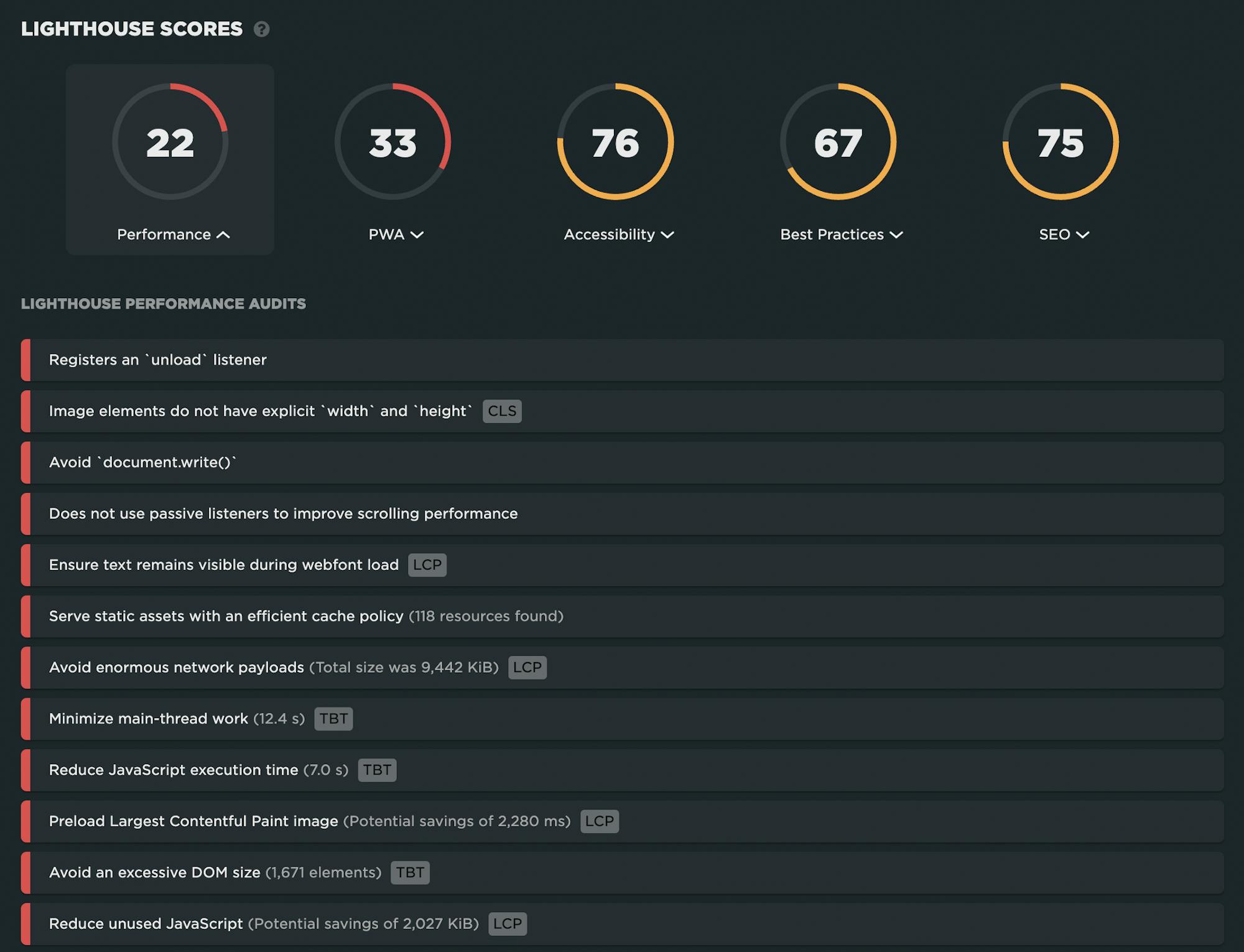
Here are the dashboards where you can find your Vitals-badged performance recommendations:
- Home
- Vitals
- Improve
- Synthetic Site
- Synthetic Page
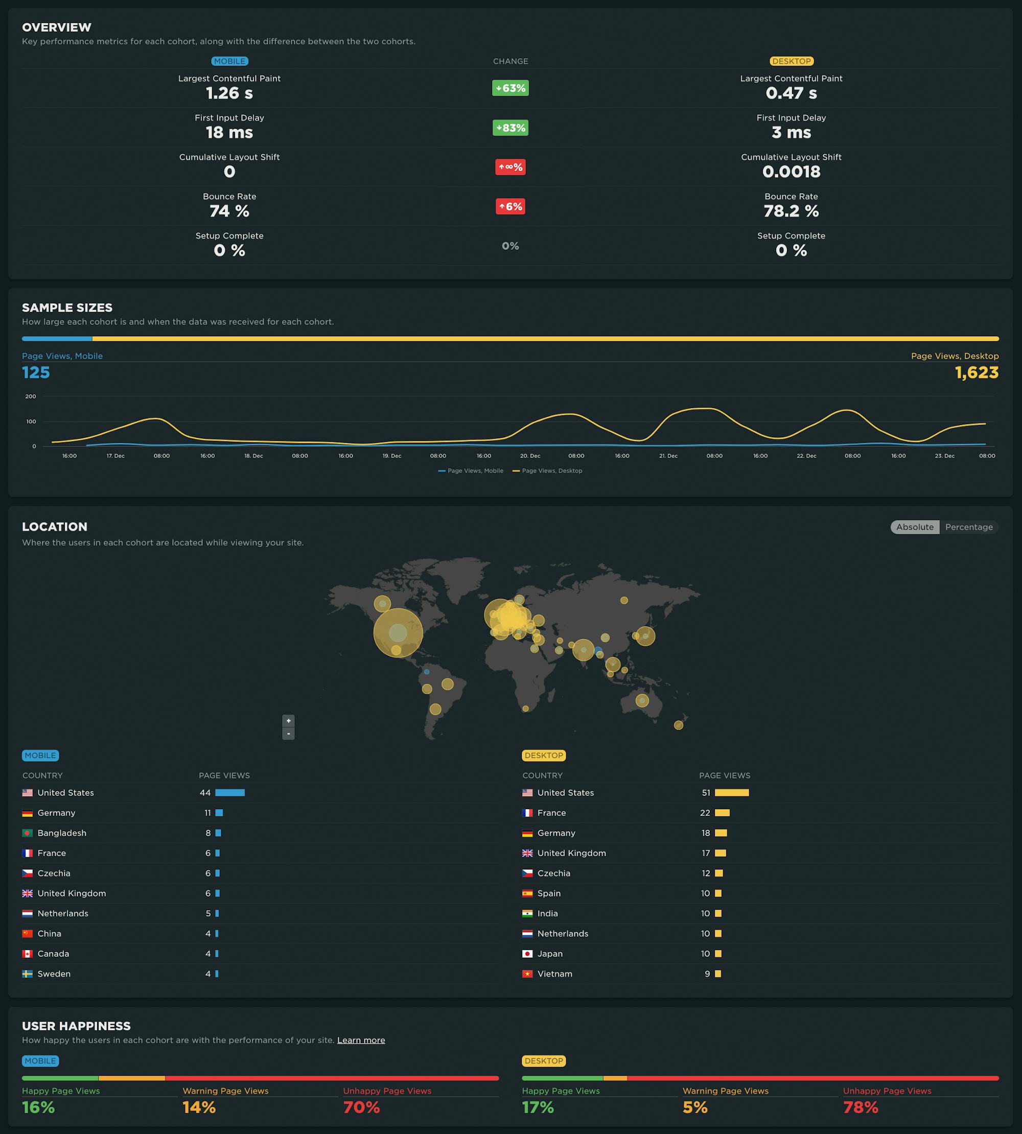
RUM Compare dashboard
With your RUM Compare dashboard, you can easily generate side-by-side comparisons for any two cohorts of real user data.
Some of the many reasons you might want to compare RUM cohorts:
- Improve Core Web Vitals by identifying the tradeoffs between pages that have different layout and construction
- Triage a performance regression related to the latest change or deployment to your site by looking at a before/after comparison
- Explore and compare different out-of-the-box cohorts, such as device types, geographies, page labels, and more
- Analyze A/B tests or experiments to understand which had the most impact on user behaviour, as well as performance
- Optimize your funnel by understanding differences between users that convert or bounce from your site and users who don't
- Evaluate CDN performance by exploring the impact of time-of-day traffic patterns
RUM update: Page labels
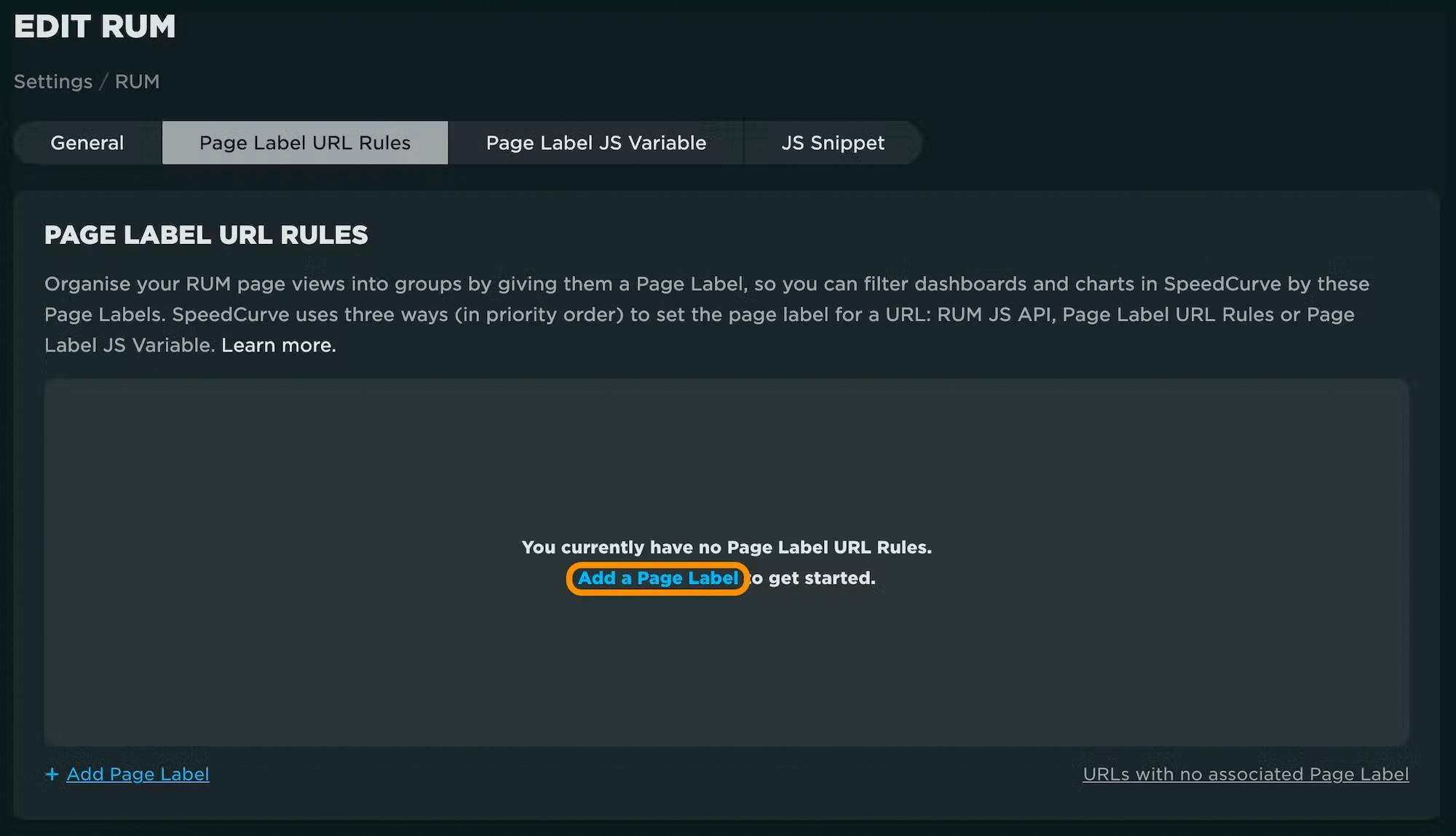
Page labels are an integral part of getting the most out of dashboards like your RUM Compare dashboard (above). We've added new capabilities for defining page labels with an easy, no-code, server-side (SpeedCurve) option using URL patterns. (This means you now have four options for labeling pages in RUM, depending on your use case.)
RUM update: Performance heat maps
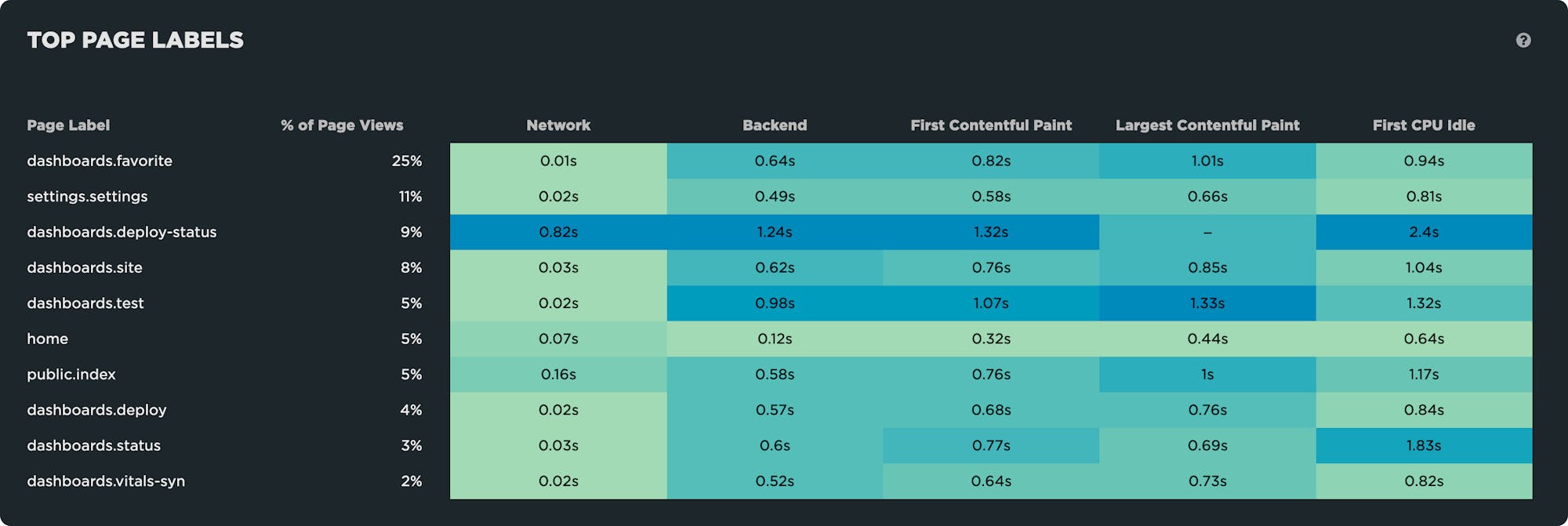
We've added heat maps to your RUM Performance dashboard. These let you quickly spot which page labels or paths are outliers. You can then prioritize and focus on these areas to improve important metrics, such as Largest Contentful Paint. Fixing high-traffic but poor-performing areas of your site will help lift your overall metrics.
Synthetic update: Compare third parties
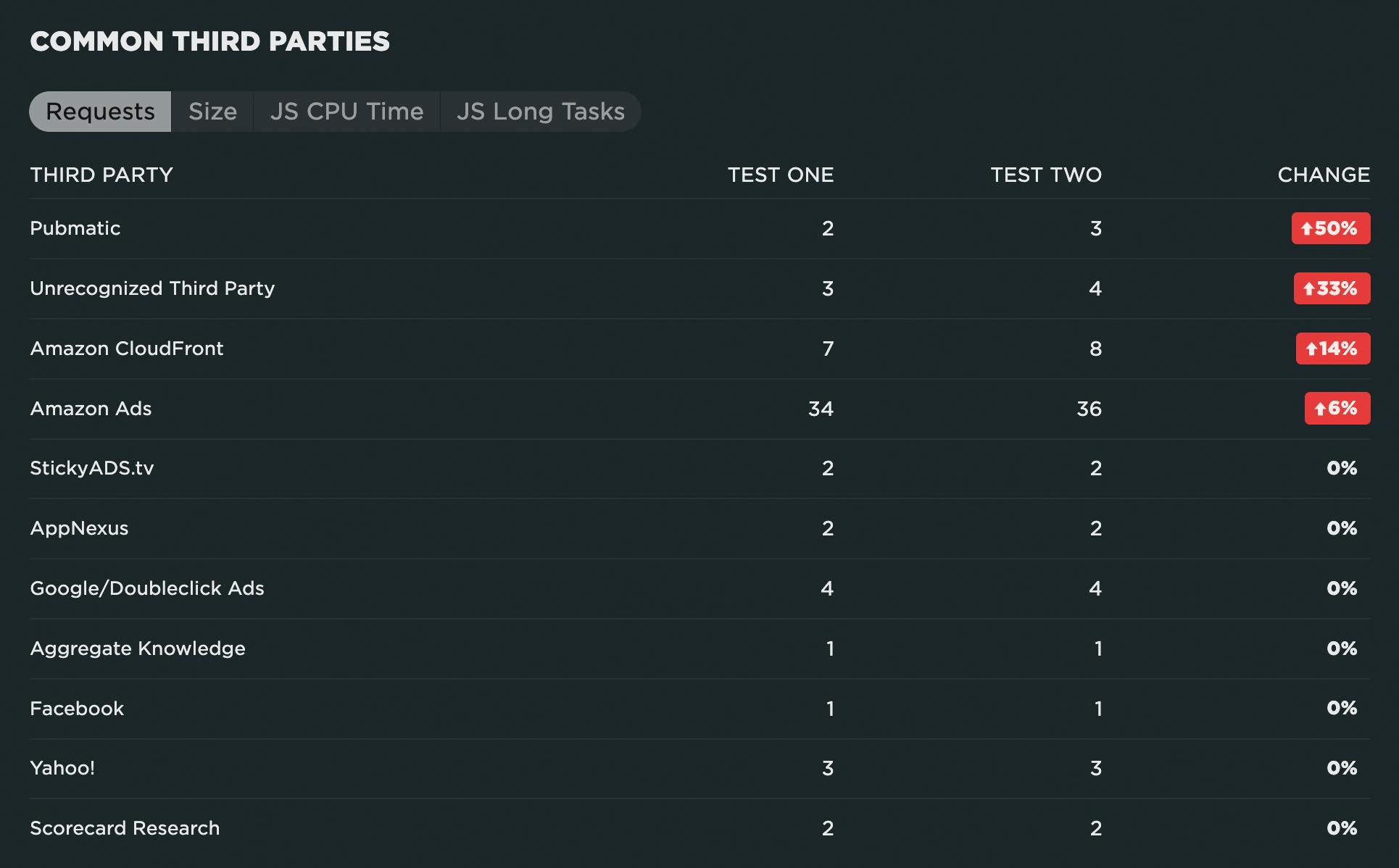
When comparing any two synthetic tests, we now show you a comparison of common third parties and identify which third parties are unique to each test. This lets you quickly spot changes in common third parties, as well as new third parties that might have introduced performance issues.
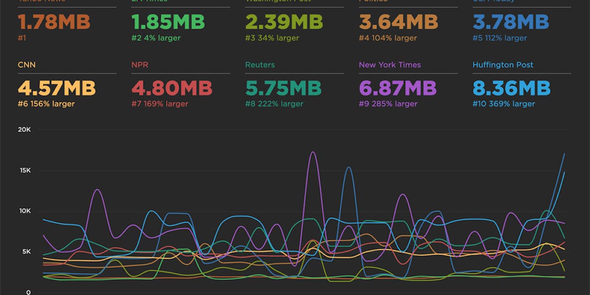
Expanded Industry Speed Benchmarks
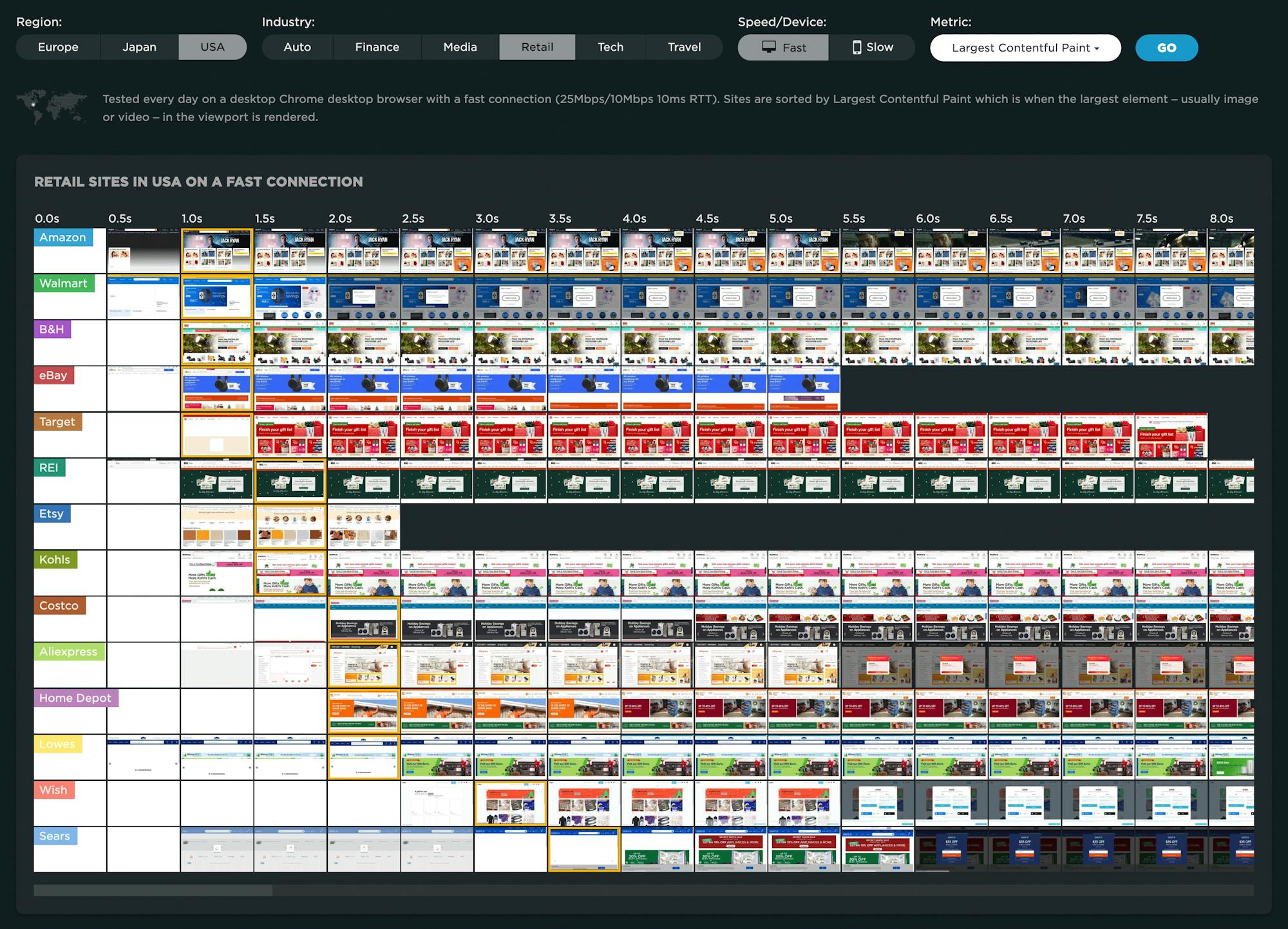
Page Speed Benchmarks is an interactive dashboard that lets you explore and compare web performance data for leading websites across several industries – from retail to media – over the past year. The dashboard allows you to easily filter by region, industry, mobile/desktop, fast/slow, and key web performance metrics, including Core Web Vitals.
The Industry Benchmarks dashboard is publicly available (meaning you don't need a SpeedCurve account to explore it) and is a treasure trove of meaningful data that you can use for your own research.
Lots of new videos!
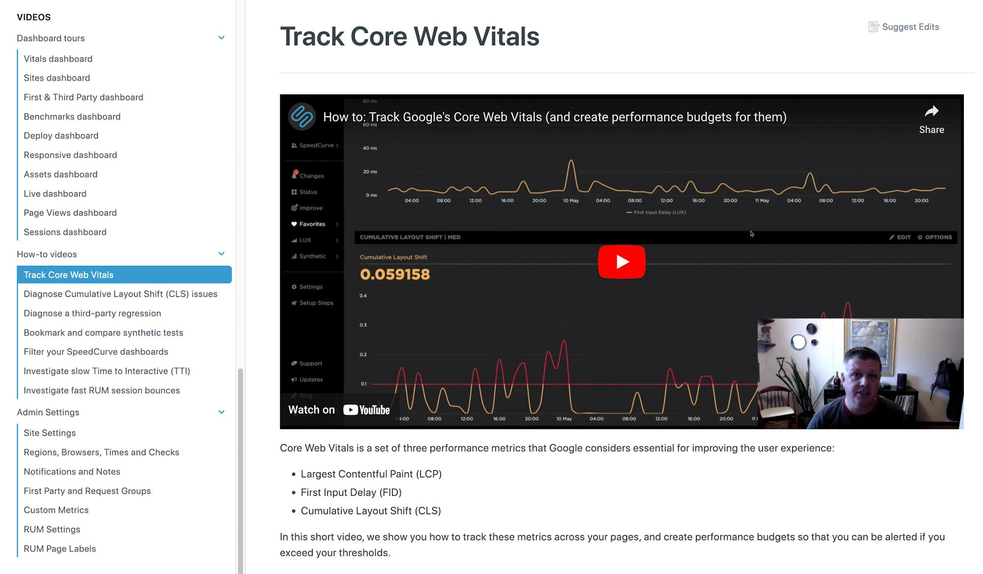
We've added a plethora of new videos to give you everything from dashboard tours to best practices for fighting third-party regressions and tracking Core Web Vitals. You can find them in our Support Hub.
Here's to the year that was and the year ahead. :-)
As we enter our tenth year of bringing you the very best performance monitoring tools we can muster – and helping you deliver fast, joyous experiences to your users – we welcome your feedback and suggestions. Let us know your thoughts by leaving a comment or sending us a note at support@speedcurve.com.

