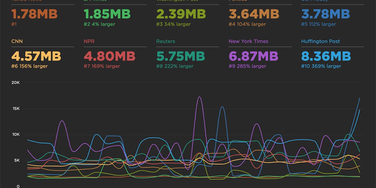
Build your own charts

We put a lot of thought into curating a thematic set of dashboards that help you understand the performance of your front-end, but sometimes you just want to play with the data yourself and slice 'n' dice the data in all sorts of different ways. We've added a new "Favorites" dashboard that lets you do just that. You can explore the data and build your own charts, then rearrange them and share them with the team to help demonstrate the performance issues you're focused on right now.
Here's a walkthrough showing you how to slice the available data in different ways:
We'd love your feedback. Let us know what else you'd like to see added to the Favorites dashboard. Here's a few of things we're considering adding:
- Select multiple metrics on the same chart
- Choose median rather than average along with support for percentiles
- Custom metrics
- Click through to an individual test for each data point
- Filmstrips
- Histograms
Read Next

See how customers are using SpeedCurve to make their sites faster.
See industry-leading sites ranked on how fast their pages load from a user's perspective.