Deeper performance analysis with histograms and correlations

This week we've made some pretty exciting new changes to your Favorites dashboards. Aside from a brand-new chart editor interface, you'll also notice that we've introduced two new chart types: histograms and correlations.
In this post, I'm going to talk through some of the features in our new chart editor. I'll also explain in detail explain why I think histograms are such an important tool in your performance toolkit, and how you can get some fascinating insights by correlating other metrics on top of a histogram.
.png)
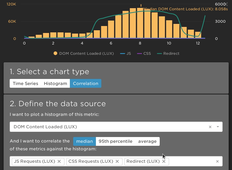
Histograms are useful for painting a more detailed picture of your performance, because they show you the distribution of a metric's value.
But what exactly is a distribution? In the chart above, the numbers along the X-axis show the start render time (in seconds), and the height of the bars shows how many page views had that start render time. This shows us that mobile users (blue) pretty consistently have a start render time of between 0.8 and 1.4 seconds.
Desktop users (yellow) on the other hand have an extremely varied experience, with start render times anywhere from 0.4 to 2.0 seconds and above.
This illustrates one of the ways histograms are so helpful: medians by themselves simply don't convey this depth of information.
To make your charts even more insightful, we also give you the option to correlate one or more metrics over top of a histogram.
In the chart below we plot the bounce rate for a website's home page against a distribution of the page load time. What it shows is that as the page load increases, so does the bounce rate. Faster pages mean fewer bounces!
.png)
Correlations are also useful for narrowing down the cause of slow page load times.
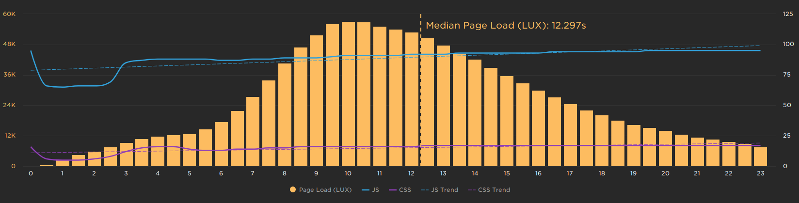
For example, in the next chart we can see that a higher page load time correlates to more JavaScript and CSS being loaded in the page. This might indicate that reducing the amount of JavaScript and CSS would have an impact on page load times.
These are just a few examples of the kinds of things you can learn from creating histograms and correlation charts. We're really looking forward to seeing what sort of insights you can gain from these new charts!
New chart editor
As well as the new chart types, we've also developed a brand-new chart editor. What we like the most about this editor is the live preview, which makes it super easy to visualize changes to your charts as you make them.
If you're a LUX customer, you'll also notice that you can now add multiple customer data filters. This allows you to dive much deeper into your real user data.
.png)
Getting started
These improvements are already available for all SpeedCurve customers. Open up one of your Favorites dashboards and create or edit a chart to see the new features in action.
Need a refresher? No problem! We have a short tutorial that walks you through the process of creating custom dashboards and charts.
If you’re not a SpeedCurve user: Sign up for your free trial and see what sort of performance insights you can gain!