The psychology of site speed and human happiness

In the fourteen years that I've been working in the web performance industry, I've done a LOT of research, writing, and speaking about the psychology of page speed – in other words, why we crave fast, seamless online experiences. In fact, the entire first chapter of my book, Time Is Money (reprinted here courtesy of the good folks at O'Reilly), is dedicated to the subject.
I recently shared some of my favourite research at Beyond Tellerrand (video here) and thought it would be fun to round it up in a post. Here we're going to cover:
- Why time is a crucial (and often neglected) usability factor
- How we perceive wait times
- Why our memory is unreliable
- How the end of an experience has a disproportionate effect on our perception
- How fast we expect pages to be (and why)
- "Flow" and what it means in terms of how we use the web
- How delays hurt our productivity
- What we can learn from measuring "web stress"
- How slowness affects our entire perception of a brand
There's a lot of fascinating material to cover, so let's get started!
Time is a crucial usability factor
If you don't consider time a crucial usability factor, you're missing a fundamental aspect of the user experience.
I'm embarrassed to admit that, in my previous career as a usability tester, I spent years testing websites in lab conditions. It never crossed my mind to take rendering time into consideration.
In fairness, that was in the early 2000s, and site speed was barely on anyone's radar. A lot has changed since then, thankfully. There's been a wealth of research into why waiting is hard – which is why site speed matters – not just from a business perspective, but from a hard-wired neurological perspective.
Let's start with a wide-angle look at how we humans handle waiting, in all its forms.
How do we perceive wait times?
Short answer: Poorly.
Queueing theory is the mathematical study of waiting lines, both real and virtual. If you jump down the research rabbit hole, you can find some fascinating stories. My favourite is one that takes place at a Houston airport.
The airport's customer relations department was fielding a huge number of complaints about how long they were forced to wait for their luggage at the baggage carousels. Airport executives tried to fix the problem by hiring more baggage handlers, which cut average wait times down to seven minutes. But the number of complaints remained the same.
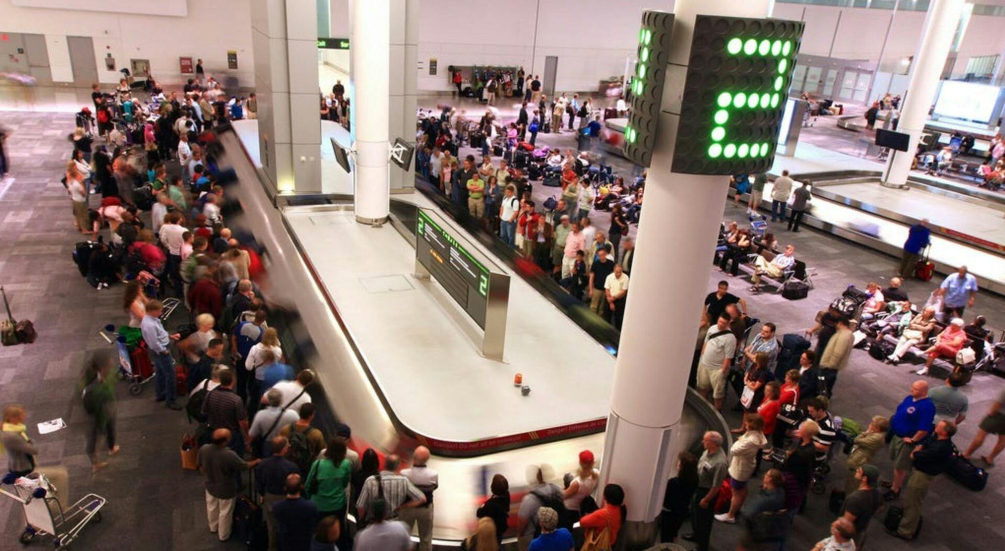
The solution? Rather than hire more baggage handlers, they simply made sure that the arrival gates for each flight were located as far as possible from the assigned baggage carousel for that flight. As a result, passengers had to walk six times longer to get to their bags, while the average wait time at the carousel dropped to a minute.
Passenger complaints dropped to almost zero.
The takeaways from this experiment:
- Waiting is hard
- Passive waiting is even harder
- Perceived speed is more important than reality
These principles apply to waiting in almost any context, including waiting for pages to load.
Our memory is unreliable
Our perception of time varies according to many factors, including (but certainly not limited to) our age, our location, our emotions, and assorted external stimuli. Not surprisingly, this inconsistency applies to our online experiences as well:
The average web user perceives load times as being 15% slower than they actually are. Later, when recalling the experience, they remember load times as being 35% slower.
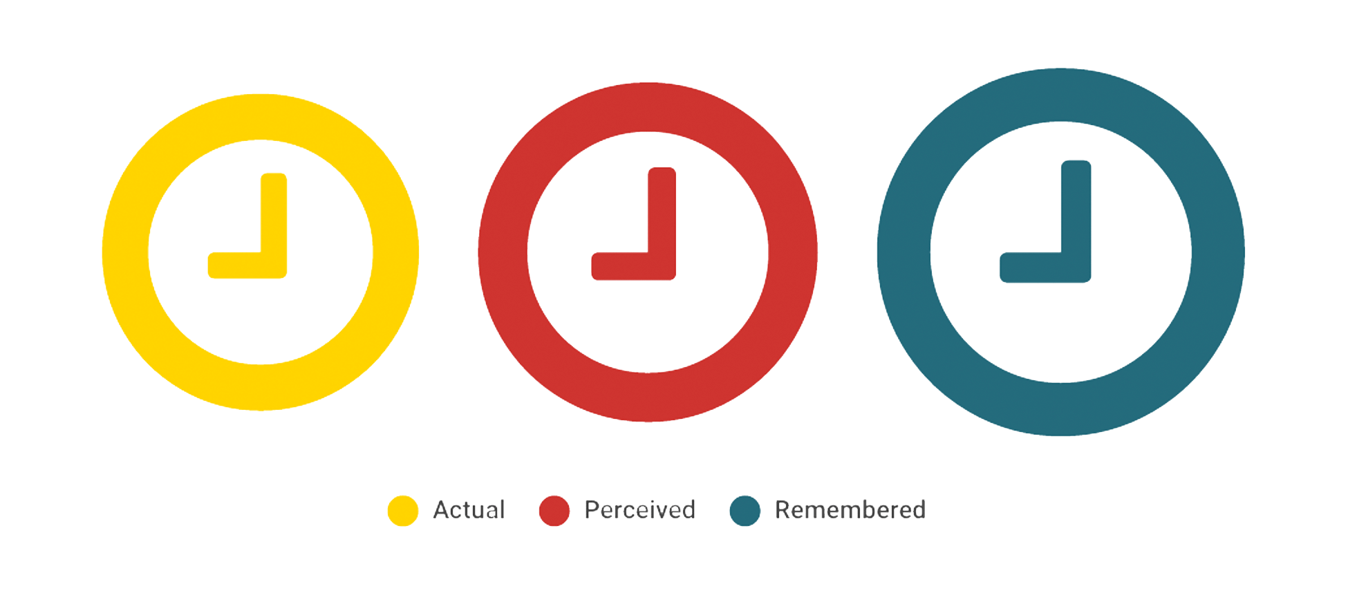
The average person believes they spend 9 minutes per day waiting for slow websites. This translates to two full days every year. (This statistic is an interesting gauge of how people feel about the web, even if it is not entirely accurate.)
Adding indicators like spinners and progress bars can trick us into believing that pages are up to 10% faster than they actually are. Not only do we feel wait times to be slower than they actually are, we later remember them as being even slower.
The end of an experience has a disproportionate effect on perception
The "colonoscopy effect" was identified in a study in which two patients tracked their perceived levels of pain throughout a colonoscopy procedure.
In the chart below, you can see the data for Patient A and Patient B. Even though Patient A's experience was shorter and had similar-sized pain peaks, they believed their experience was longer and more painful. The conclusion was that, because patient A's experience ended at a painful peak, that pain coloured their overall perception.
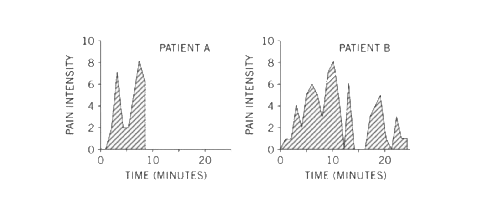 What does this finding mean in web performance terms? If your site delivers a relatively fast experience throughout most of a user's journey, but then is slow and janky during the last stage – for example, checkout – then your users may take away a disproportionate sense of your site's overall slowness.
Is that fair? Perhaps not, but it's how our brains work.
How fast do we expect web pages to be?
While what we say we expect from online experiences is inaccurate and highly variable, how we actually respond to different page speeds is much more consistent – and has been so for several decades.
In 1968, Robert Miller published a study called Response Time in Man-Computer Conversational Transactions. In the study, Miller shared that a wait of longer than 2 seconds breaks concentration and hurts productivity.
In 1993 and again in 2010, usability expert Jakob Nielsen found that:
- 0.1 seconds gives us the illusion of instantaneous response
- 1 second keeps our flow of thought seamless
- 10 seconds is enough to keep our attention – barely.
- After 10 seconds, our minds wander, making it harder to get back on task once a page finally loads.
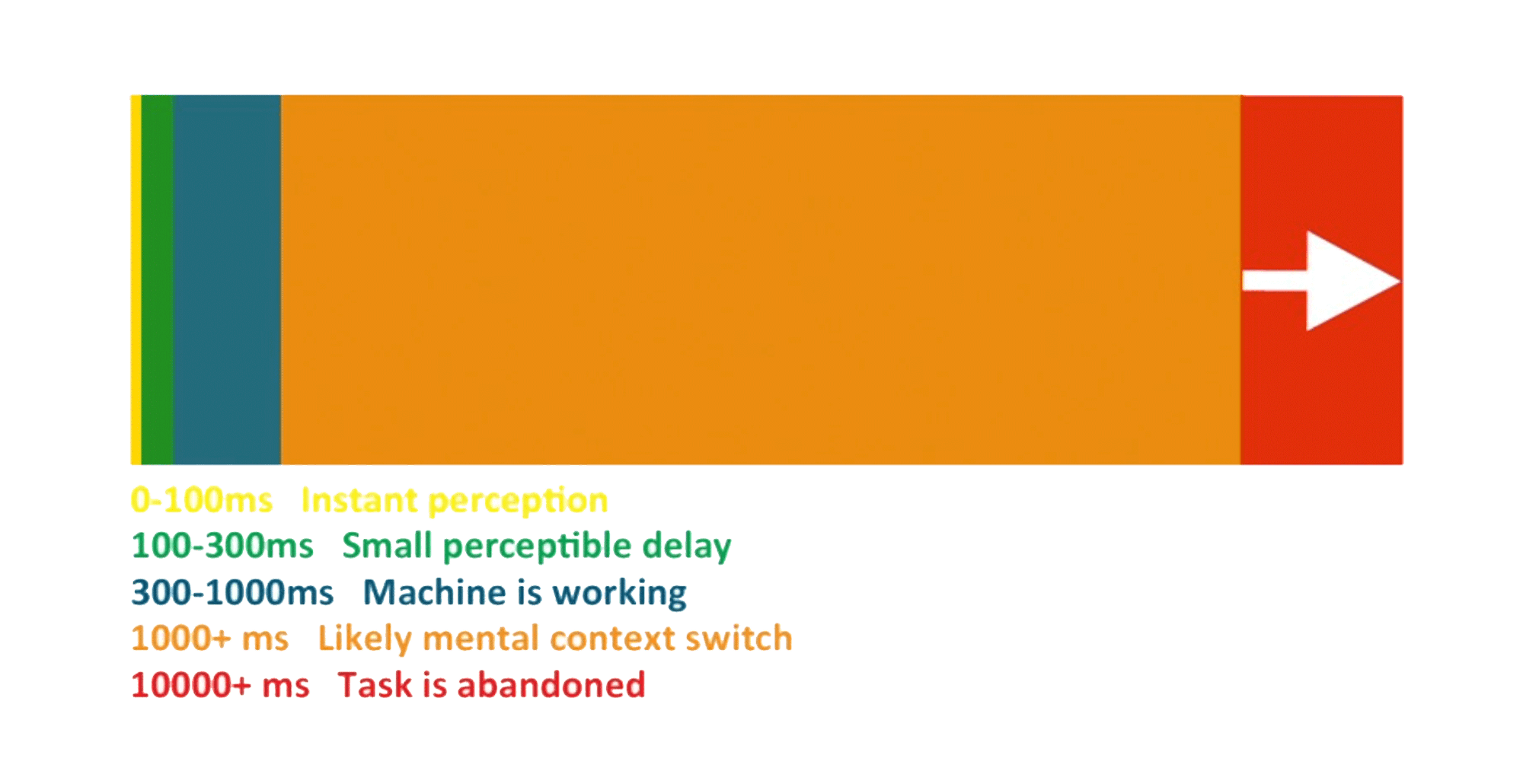
The internet may change, and web pages may grow and evolve, but user expectations are constant. The numbers about human perception and response times have been consistent for more than 45 years. These numbers are hard-wired. We have zero control over them. They are consistent regardless of the type of device, application, or connection we are using at any given moment.
But why? This is where things get really interesting.
Nielsen has stated that human responses to poor load times are based on two aspects of how our brains function:
- Our poor short-term memory – Information stored in short-term memory decays quickly.
- Our need to feel in control – Being forced to wait makes us feel powerless and frustrated.
Impatience: It's in our heads
Our impatience is an indelible part of our incredible human circuitry. At any given moment, there are three types of memory processing at work in your brain:
- Sensory memory
- Short-term memory
- Working memory
(There's also long-term memory, but it doesn't really come into play here.)
Sensory memory
Every time you see something, this visual information is taken in by photoreceptor cells in your eyes and sent to the occipital lobe in your brain. This is your iconic memory. It's just one of your three types of sensory memories. (The other two govern sound and touch.)
People have been studying how iconic memory works for almost 300 years. In one of the earliest studies, back in the early 1800s, a glowing coal was attached to the wheel of a cart. The wheel was spun faster and faster until observers perceived an unbroken circle of light. The study concluded that the glowing coal had to perform a complete cycle in 100 milliseconds or less in order to create the illusion of a fiery circle.

That early study identified the phenomenon we now call "persistence of vision", which is predicated on the fact that our iconic memory holds on to visual information for about 100 milliseconds. After that, the "memory store" runs out and the iconic memory needs to be refreshed with new visual information. This number has remained consistent throughout the centuries.
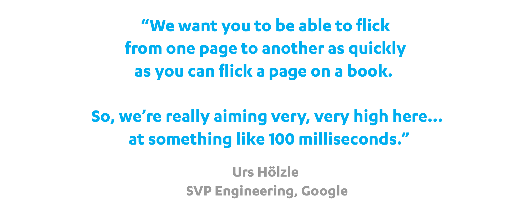
Interestingly, and perhaps not coincidentally, 100 milliseconds is Google's stated goal when it comes to page load times.
 Iconic memory, along with the other two types of sensory memory, is primitive. We can't consciously choose what information is stored in it, and we can't will it to last longer. (If we could, we'd probably go insane or accidentally walk in front of a bus.)
Some sensory memory does stick, of course... provided it's used quickly and eventually consolidated into your long-term memory.
Short-term memory and working memory
If our sensory memory's role is to provide comprehensive information on our entire sensory experience, it's our short-term memory's job to extract the relevant bits and throw them into the hopper of our working memory. Your short-term memory can store information for 10-15 seconds – at most – just enough time for your working memory to process, manipulate, and control it.
 So the goal in getting perceived page speed rendering down to 100 milliseconds is to:
- Keep information from falling through the cracks in our iconic memory, while we
- Give our short-term and working memory ample time to do all the parsing they need to do before they start losing information.
What is "flow" and what does it mean in terms of how we use the web?
For hundreds of thousands of years, human beings have evolved to perform actions in beautiful, sequential flows. Our day-to-day tasks – building a fire, hunting antelope, baking bread, milking a cow – have been comprised of a series of minute actions that flow more or less seamlessly into the next.
In his book Finding Flow: The Psychology of Engagement with Everyday Life, noted psychology researcher Mihaly Csikszentmihalyi observes that people who perform seamless, sequence-based activities on a regular basis are happier than people who do not. He coined the term "flow" to describe this state of being.

It's only in the past 40 years, with the advent of computers in our homes and workplaces – and even our pockets! – that we have imposed a new set of demands on our brains. As most of us are painfully aware, instead of offering a series of smoothly sequential actions, computer use is characterized by lag, downtime, and restarts.
Simply put, our flow-oriented brains are not wired to deal with the fits and starts of human-computer interaction.
There are some people who are skeptical about the impact of lag, downtime, and restarts on productivity and other performance indicators. A common argument is that most people do, in fact, adjust to poor performance. As it turns out, those people may be somewhat correct in their assumption, but they may also be focusing on the wrong part of the picture.
Do delays really hurt productivity?
In a 1999 study of workplace interruptions, groups of workers were subjected to various disruptions in the course of their day-to-day responsibilities. They were then measured in terms of:
- their productivity, and
- their self-reported state of mind.
While that study focused on general workplace interruptions, with only some attention given to human-computer interaction, there were some fascinating findings that are quite arguably relevant to web performance:
Finding 1: Participants developed strategies that let them deal effectively with interruptions and maintain their productivity
The research suggested that, at least for some workers in some environments, not only did they learn how to cope with interruptions, they may even have striven to overcompensate for their potential performance decline.
Finding 2: However, this coping mechanism is achieved at the expense of higher psychological costs
Cumulatively, interruptions had a negative impact on emotions and well-being. In addition, participants ultimately needed to increase the amount of effort required to perform the same tasks.
Finding 3: Over time, interruptions affected participants' ability and willingness to resume work and take on new tasks
Interruptions seemed to have a cumulative effect. When the number of interruptions grew, the resumption time (i.e., the time needed to restart the task) became disproportionately longer. The participants seemed to lose motivation and develop mental fatigue.
What do these findings mean in web performance terms?
When dealing with application delays, it is possible that people can develop coping strategies that allow them to maintain productivity in the short term. But the missing ingredient here is flow. And without flow, eventually our sense of motivation and well-being suffers.

It's important to remind ourselves that application performance is just one part of the greater world. Our everyday lives are filled with events – from sitting in traffic to standing in line at the grocery store – that challenge our need for flow.
Slow websites are just one problem, but for those of us who spend much of our work and personal time online, slow sites creates extra friction in an already friction-filled world. The effects are cumulative, as most of us are not capable of compartmentalizing our stress.
"Web stress" is measurable
When websites perform poorly, we react badly. (There is even some research that suggests using slow websites increases our blood pressure!) This is not surprising given what we now know about our deep craving for flow.
In 2011, CA Technologies commissioned Foviance, a customer experience consultancy, to conduct a series of lab experiments at Glasgow Caledonian University. The participants wore an EEG (electroencephalography) cap to monitor their brainwave activity while they performed routine online transactions. Participants completed tasks using either a 5 MB web connection or a connection that had been artificially slowed down to 2 MB.
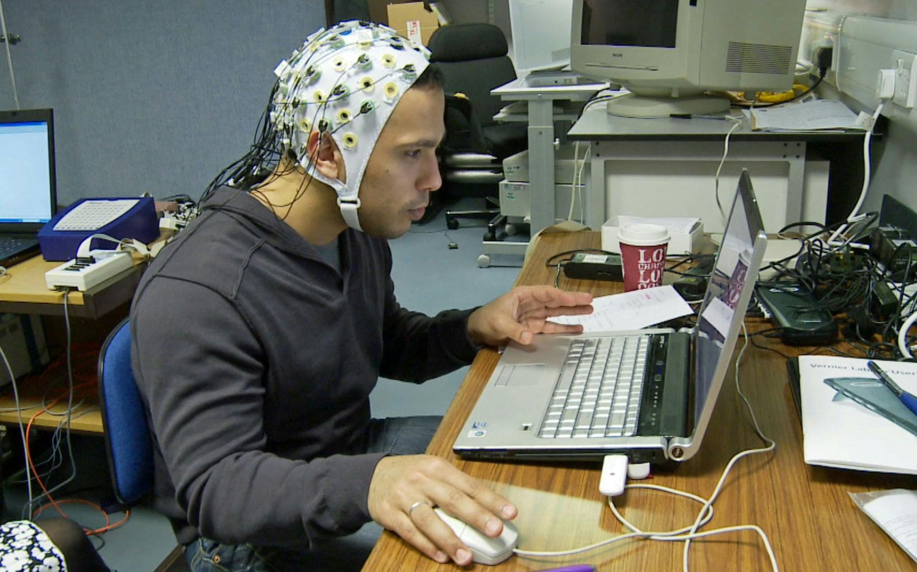
Brainwave analysis from the experiment revealed that participants had to concentrate up to 50% more when using websites via the slower connection. When asked what they liked most and least about the websites they used during the study, participants frequently cited speed as a top concern:
"The website was very slow, so it took a really long time to load the book preview."
"What I liked least about the site is its speed."
The study also found that people were most likely to experience the greatest levels of stress during these points in the transaction process:
- Search
- Finding and selecting products
- Checkout
- Entering personal information and concluding the sale
Intuitively, this makes sense. Online shopping already comes with an inherent amount of stress, as most of us are concerned with finding the right item at the best possible price. And the checkout process – when we hand over our personal and credit card information – is fraught with a certain amount of stress as well. Add page slowdowns to the mix and it is easy to understand why the online shopping experience can become unpleasant.
Mobile users feel "web stress" too
Based on the desktop neuroscientific research conducted by CA Technologies, Radware conducted a similar study in 2013, this time focusing on users of mobile devices.
(Disclosure: I worked at Radware at the time and directed the study. In order to ensure that there were no biases, the research and analysis was outsourced to a third-party neuroscientific research company called Neurostrata.)
The mobile stress study involved using a groundbreaking combination of eyetracking and electroencephalography (EEG) technologies to monitor neural activity in a group of mobile users who were asked to perform a series of online transactions via mobile devices. (Below is a photo of one of the study participants.)

In the study, participants were asked to complete standardized shopping tasks on four ecommerce sites while using a smartphone. Some participants were served pages at normal speeds over WiFi, while others were served pages at a consistently slowed-down speed (using software that created an artificial 500-millisecond network delay).
The participants did not know that speed was a factor in the tests; rather, they believed they were participating in a generic usability/brand perception study.

Some highlights of the study's findings:
- Users experienced frustration peaks of up to 26% at critical points.
- Like the CA Technologies study, frustration peaks were most common during the browsing and checkout phases.
- Faster pages correlated with increased user engagement. (That's a good thing!)
- All users experienced some level of "web stress" even under ideal mobile browsing conditions.
Slowness affects our entire perception of a brand
Yes, that includes non-performance aspects of the site, such as content, design, and navigation.
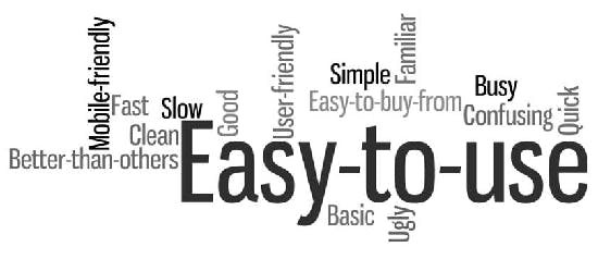
After the mobile stress study above, we conducted exit interviews with participants, in which we asked them about their impressions of the site and the company. We then poured all the adjectives from the interviews into a word cloud generator and generated clouds for each version (normal and slow) of each site.
Reminder: The only differentiator was site speed. And because this was a blind study, the testers were not consciously aware of the speed difference. The results indicate that slower page speed affects the brand on a global level.
What we found: Slow pages undermine overall brand health.
This is the word cloud that was generated by test participants after using the site at normal speed:
And this is the word cloud that was generated by participants after experiencing the same site with a 500ms network delay:
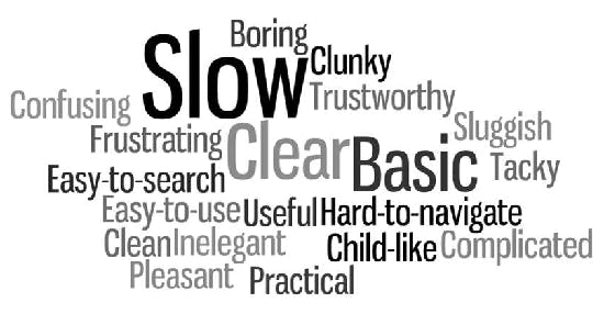
While it’s true that both word clouds contain positive and negative descriptors, it is important to note that the word cloud for the slower site contains almost three times more negative adjectives than the faster site. The adjectives shift from mainly easy-to-use (in the first word cloud) to a range of negative associations (in the second word cloud) — solely because of the page delays.
While some participants clearly picked up on the slight deterioration in performance (“slow” and “sluggish”), participants also developed negative perceptions of areas that are unrelated to speed. They reported that the site seemed "boring", "inelegant", "clunky", "tacky", and “hard to navigate".
In other words, slower page loads affected people’s perception of three important aspects of the site that are completely unrelated to load time:
- Content (“boring”)
- Visual design (“tacky” and “confusing”)
- Ease of navigation (“frustrating” and “hard-to-navigate”)
Takeaway
There is a fascinating disconnect between what we say we want and what – deep down – we really need from our online experiences.
Over the past dozen or so years, user surveys have revealed that what we claim to want changes over time – from 8-second load times back in 1999 to 4 seconds in 2006 to around 2 seconds today. If we were to believe these surveys, then we would conclude that we are an increasingly hasty, impatient species. We might be tempted to judge (or pity) ourselves as victims of our frantic modern lives.
But neuroscientific research – which studies how we actually take in and respond to visual information – tells a very different story. Over the decades, researchers have reproduced the same results: that, by and large, we function at our happiest best when our websites and apps (and technology in general) respond in fractions of a second. We may learn how to adapt to slower response times, but this adaptation will always – or at least for the foreseeable future – be awkward and uneasy.
Yes, there's a business case for making your site faster. But caring about web performance is about more than business.
As technologists – and as empathetic human beings – we need to do more than just deliver adequate online experiences. Our goal should be to deliver online experiences that are frictionless and delightful, so our visitors leave our sites and apps happier than when they arrived.


