Responsive Design Dashboard

The dramatic growth of mobile traffic has created an urgency for websites to adapt to different screen sizes. Responsive design is the preferred technique for making web content adapt to the device on which it's viewed. This approach ensures that the appropriate content is rendered in an appropriate way on phones, tables, laptops, and any other screen being used.
A corollary to responsive design is the need for performance. Delivering content that's customized for a particular device isn't enough if its delivery is slow and frustrating. Indeed, last week Google announced that websites need to deliver their design appropriately and quickly on mobile devices or they will be demoted in Google's search results.
How can you know if your website matches these standards for adaptive content and speed? SpeedCurve's Responsive Design Dashboard answers both questions in one view.
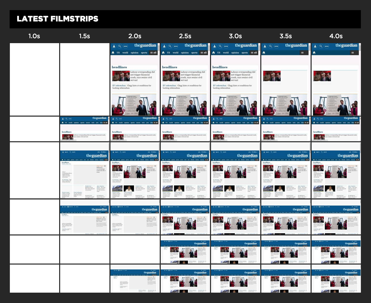
The Responsive Design Dashbard shows the URL's filmstrip across different viewport sizes: 320x568, 568x320, 768x1024, 1024x768, 1280x768, and 1366x768. Viewing these thumbnails over time reveals how quickly the content is rendered. Similarly, you can see how the site's design adapts to different screen sizes.
The Responsive Design Dashboard is created using Chrome's mobile browser emulation feature. In addition to specifying the viewport size, the User-Agent string is also adapted to correspond to the emulated device's default characteristics. (Soon we'll adapt the network settings, as well.)
Asset Breakpoints
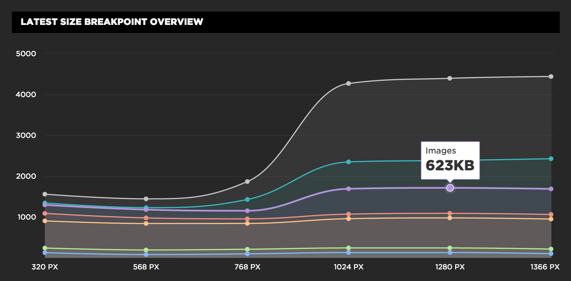
The filmstrips show how the website adapts to different visual breakpoints. It's also important to think about asset breakpoints - how the size and number of requests adapts based on the screen size. For example, we know we don't want to send huge desktop images to smaller screens.
The Responsive Design Dashboard shows asset breakpoints by revealing information about HTTP requests at each viewport size. The screenshot below, for example, paints a picture that we like to see where smaller screens receive fewer bytes, while larger screens get a heavier experience.
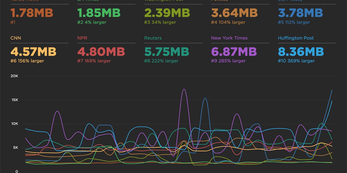
The Responsive Design Dashboard perfectly captures what SpeedCurve is about: the intersection of design and performance. Understanding how a design adapts across viewports to tracking kilobytes by Content-Type. We're having fun bringing you the information you need to create great user experiences.