Velocity: Responsive in the wild

I was lucky enough to give a Lighting Demo at Velocity Conference in Santa Clara. The focus was on research I conducted into 250 responsive websites and how well optimized for performance they were.
Methodology
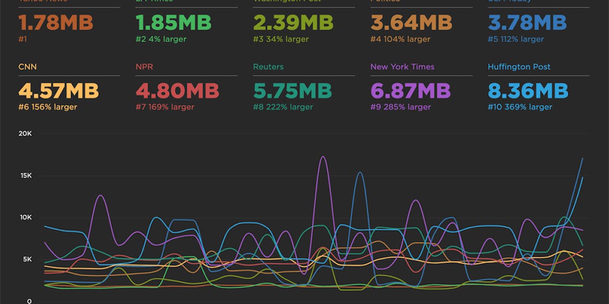
250 responsive websites were loaded at 17 different viewport widths between 320px and 1920px using WebPagetest. The number of requests and size of assets were captured for each width and used to build a visulization that revealed the cross-section of a site's performance breakpoints rather than it's visual breakpoints.
Results
Averages can hide the patterns in data so after visually sorting and grouping the cross sections of the sites we see that there are distinct patterns and approaches used by sites to tune their assets for performance at different widths.

Read Next

See how customers are using SpeedCurve to make their sites faster.
See industry-leading sites ranked on how fast their pages load from a user's perspective.