SpeedCurve is now part of the Embrace family! There are no changes to how you use our products. Our founder Mark shares what this means...
Business Success
Core Web Vitals
- Getting Started With CWV
- Largest Contentful Paint (LCP)
- Interaction to Next Paint (INP)
- Cumulative Layout Shift (CLS)
Optimization Techniques
- Web Performance Budgets
- Diagnose Time to First Byte
- Optimizing Images
- Optimizing JavaScript
- Third-Party Web Performance
- Critical CSS for Faster Rendering
- Optimizing Single Page Apps
- Caching for Faster Load Times
Metrics & Charts
Averages, medians & percentiles
There are many ways to view aggregate web performance data, including 50th percentile, 75th percentile, 95th percentile, and average. What do they each mean, and which should you use?

Image by storyset on Freepik
What is data aggregation?
Data aggregation is when multiple values are grouped together to give a single summary value. This is especially useful when you want to extract simple but meaningful values from RUM (Real User Monitoring) data that consists of thousands or millions of measurements.
Individual measurements can be represented by a frequency distribution on a histogram chart. That's a fancy way of describing a bar chart where the X (horizontal) axis shows the value of a measurement and the Y (vertical) axis shows the number of measurements that had that value. Take this chart for example:
.png?auto=format,compress&fit=max&w=2000)
The chart above shows clusters of page load times on the X axis. The height of the bars represents how many measurements had page load times that fell within each cluster. We can see that the majority of page load times were between 1 and 2 seconds, with a smaller number of page load times on either side.
Notice how there are many clusters to the right of the chart, but they all have a small number of measurements? This is called the "long tail" and represents the users who are having the slowest experience.
So how can we aggregate this data?
50th percentile (median)
The 50th percentile or median is the value in the very middle of a set of measurements. In other words, 50% of measurements are under the median and 50% are over the median.
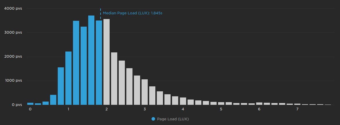
The chart above shows the page load measurements from earlier, with all of the measurements below the median coloured in blue.
When to use the median
We like to think of medians as the "best case" when it comes to performance data, since it only represents what half of your users will experience. The median is typically a stable measurement, so it's good for seeing long-term trends. However the median will typically not show short-term trends or anomalies.
In synthetic testing, viewing the median results in your charts lets you click on 'View Test' and drill down into your detailed test results. If you've filtered the data in your charts by average, 75th, or 95th percentile – which are based on calculations made to your aggregated test results – you won't be able to view or compare tests.

75th percentile
The 75th percentile is the value where 75% of all measurements are under it, and 25% of measurements are over it. It is the percentile that Google recommends using when monitoring Web Vitals.
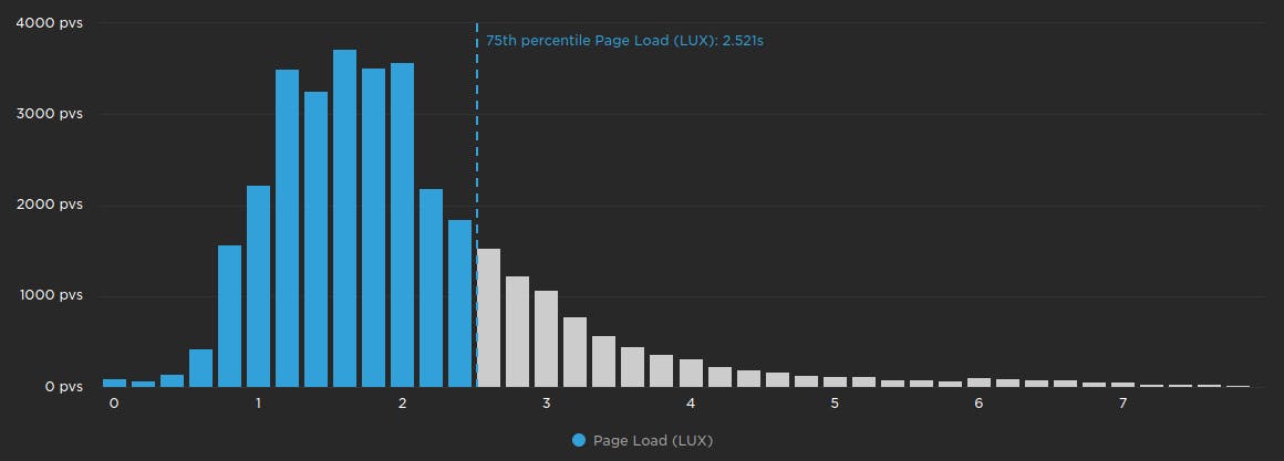
The chart above shows the page load histogram with all of the measurements below the 75th percentile coloured in blue.
When to use the 75th percentile
The 75th percentile is a good balance of representing the vast majority of measurements, and not being impacted by outliers. While not as stable as the median, the 75th percentile is a good choice for seeing medium- to long-term trends. We also think the 75th percentile is the best value to use when setting performance budgets.
95th percentile
The 95th percentile is the value where 95% of all measurements are under it, and 5% of measurements are over it.
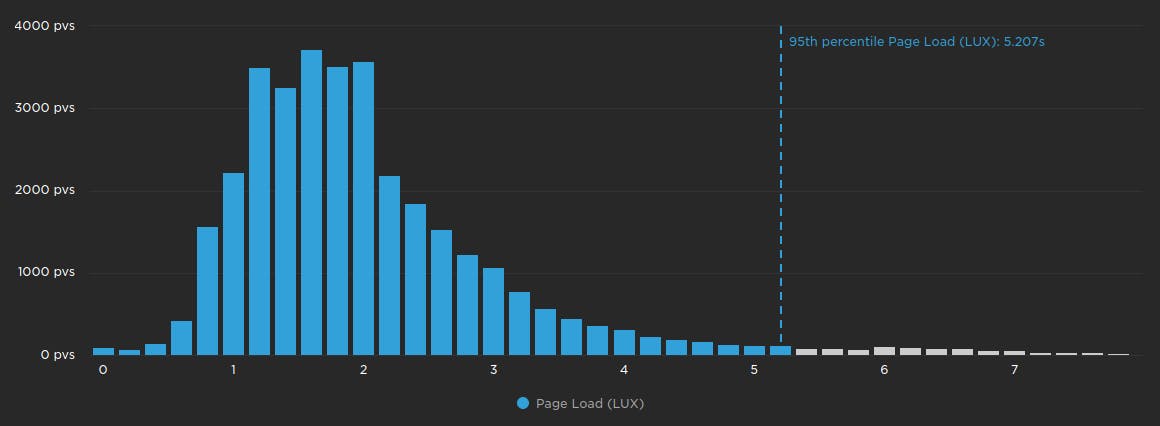
The chart above shows the page load histogram with all of the measurements below the 95th percentile coloured in blue.
When to use the 95th percentile
The 95th percentile encompasses the experience of almost all of your users, with only the most severe outliers excluded. This makes it perfect for spotting short-term trends and anomalies. However the 95th percentile can be volatile, and may not be suitable for plotting long-term trends.
Average (arithmetic mean)
The average is calculated by adding every measurement together, and then dividing it by the number of measurements. One important and slightly confusing thing about the average measurement is: it doesn't exist!
What does that mean? Consider the following measurements: 2, 3, 5, 7. The average of these measurements is (2 + 3 + 5 + 7) / 4 = 4.25. But none of the measurements have a value of 4.25! This is why you might hear people say things like "the average person doesn't exist".
Due to the caveat mentioned above, we recommend that you use averages sparingly.
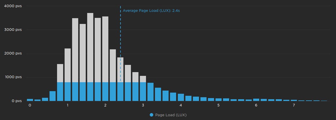
The chart above doesn't truly represent the average, however it should help to illustrate that all of the measurements are used when calculating the average.
When to use the average
Averages are best used to aggregate measurements that have a relatively even distribution, which means that all the bars in the histogram are roughly the same height.
When not to use the average
Averages are not suitable for aggregating most performance data, since it typically does not have an even distribution. With such varying distributions, averages will produce inconsistent values across different metrics. For example on the page load histogram above, the average is roughly the same as the 75th percentile. However on the chart below, the average is closer to the 95th percentile. The average of these two metrics represents two completely different sets of users.

Does SpeedCurve support any other percentiles?
SpeedCurve does not support any percentiles other than 50th (median), 75th, or 95th. We believe that data aggregation should tell a story:
- What experiences are are my fastest users having?
- What about my slowest users?
- Where are the anomalies happening?
By limiting the available aggregations, SpeedCurve can keep these stories consistent across websites, devices, connections, and countries. Adding more percentiles allows the data to be moulded to fit a predefined story, rather than letting the data tell the story.

Read Next

Glossary of common web performance metrics you can track with synthetic (SYN) and real user monitoring (RUM). We also show browser support for each metric, as well as whether the metric is supported within a single-page application (SPA).

Have you ever wondered why you get different numbers for the same metrics using different tools? Here are some of the most common reasons.
