Business Success
Core Web Vitals
- Getting Started With CWV
- Largest Contentful Paint (LCP)
- Interaction to Next Paint (INP)
- Cumulative Layout Shift (CLS)
Optimization Techniques
- Web Performance Budgets
- Diagnose Time to First Byte
- Optimizing Images
- Optimizing JavaScript
- Third-Party Web Performance
- Critical CSS for Faster Rendering
- Optimizing Single Page Apps
- Caching for Faster Load Times
Metrics & Charts
Using Critical CSS for Faster Rendering
Too often in web performance, people focus on the final rendered page as the end goal, but how the page renders can be more critical. Users will abandon your page if it appears empty and inactive for more than 3 seconds. If they see content rendering or the skeleton of a page loading, you'll buy more time and patience.

Image: Freepik
We can use a few different concepts and techniques to help render a page in a more managed and sequential manner, rather than dumping all the resources in the browser and hoping people hang around long enough for them to be discovered, downloaded, parsed, and displayed.
Using the techniques in this article, you can take control of the browser's rendering process and craft a loading experience that will keep people happier and more engaged. They will browse more pages, explore more content, and maybe buy more of whatever it is you're offering!
Understanding the critical rendering path
Before diving into understanding critical CSS, it's worth understanding what stops the browser from rendering content instantly in the first place.
The browser must go through a number of steps before rendering any pixels to the screen. This is called the critical rendering path.
- Download the HTML document.
- Parse the HTML, look for any external blocking resources, and build the DOM.
- Download and parse any blocking CSS and JS found in the HTML.
- Use the DOM and CSS styles to create a render tree that lays out and "paints" the pixels of each element on the screen.
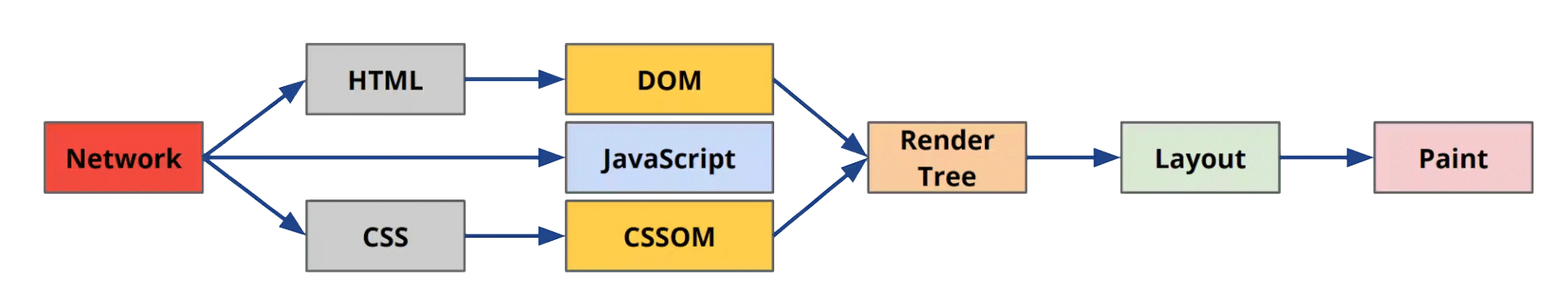
The critical rendering path from Ilya Grigorik's Building Faster Websites
From the steps above, you can see how critical CSS is. Without any styles, the browser doesn't know where to put the elements onscreen, so CSS is considered blocking, and the browser waits for it to be downloaded before rendering anything.
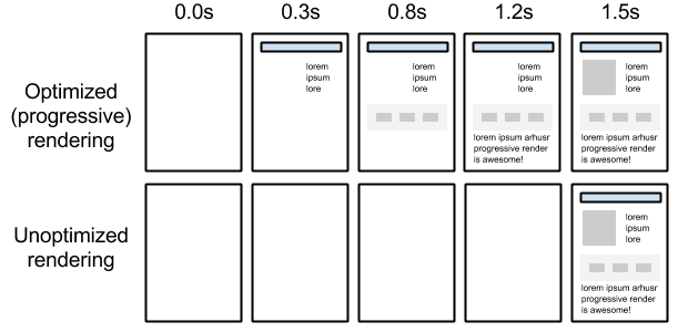
Optimized rendering from web.dev
By speeding up and managing the delivery of CSS, we optimize and speed up the page's rendering and signal to users that the page is working, and they are in the right place.
Critical CSS
Too often, all the CSS styles for a page or even the whole site are dumped into the same file, making it slower to download and parse. By splitting out the critical parts of the CSS required to render some of the page and lazy loading the rest, we can manage how CSS is rendered.
What's critical to your users?
There are various approaches to deciding what are the critical styles that should be split out. Some folks like to take all the content visible in the viewport and the related styles as critical, while others focus on setting up skeleton screens as quickly as possible. It really depends on your content and the type of site you are building.
It's worth imagining your page loading as a set of frames in a filmstrip, just like the filmstrips you see in web performance tools like SpeedCurve. What do you want each of those frames to look like? Can you get the logo, background colour and structure of the page to show first and then the rest of the content over the top? Getting your design and development team involved in crafting each frame of the loading sequence can help prioritise which elements should be rendered first.
Because you are teasing apart the structure of a page and trying to sequence how elements are rendered, applying this technique to an existing website can be difficult and frustrating. It's not impossible, but it's much easier to work on the rendering steps and spliting them into different CSS files when designing and building a new site from scratch.
Harry Roberts did a great exploration of the pros and cons of Critical CSS and shared the following guidelines:
- Generally, don’t bother retrofitting critical CSS.
- If you want to, make sure it’s the right thing to focus on.
- If you manage it, you really need to maintain it.
- Make sensible choices about your CSS for new projects.
- A good CSS-in-JS solution should handle most of it.
- Don’t turn your non-critical CSS back into a synchronous resource.
- Be very, very certain that your non-Critical CSS doesn’t (re)style anything above the fold.
Everything in the first request
The basic idea behind critical CSS is to isolate the smallest set of styles needed to start rendering useful content and inline that CSS into the first HTML request. That way, everything the page needs to start rendering is in the first request, making your site as fast as possible. This is especially important if you are focused on the mobile web, where high latency and slow bandwidth are common.
These techniques make it possible to render a page under one second, even under bad network conditions. Ilya Grigorik explored what's needed to do this in his brilliant presentation, Breaking the 1000 ms mobile barrier. Don't be put off by this talk being over 10 years old. It's absolute gold!
Keep it under 14KB
When inlining your CSS into the HTML, aim for your total size to be under 14KB. This guideline is based on fitting everything in the first network TCP roundtrip.
Recommended: Critical CSS tools
If you're trying to automatically detect what CSS is required to render the initial viewport of content, a few tools can help you automate that process.
- Critical extracts & inlines critical-path (above-the-fold) CSS from HTML.
- Penthouse is the original critical path CSS generator, helping you to speed up page rendering for your websites.
Skeleton screens
Ideally, when you start your new site, you work with your design and development team to visualize each step of the rendering process. One of those steps could be a skeleton screen that outlines the content that is on its way.

Polar app skeleton screens that outline elements that are then filled with content. Luke W.
When well designed and constructed, a skeleton screen can signal to users that the site is working and that content is on it's way. They do need to be used thoughtfully though. Tim Kadlec shared some great things to keep in mind when designing them in Effective Skeleton Screens:
- Are they necessary? Can you avoid the delay altogether with a different approach?
- Skeleton screens only distract for so long before they become frustrating. If you have a long delay at a critical stage in your site or application, shortening that delay should still be a primary focus.
- When you use skeleton screens, make sure people see incremental progress and that they’re given as much context as possible at each stage in the progression.
- Make the expectations match reality. Skeleton screens that falsely represent what’s coming or how it will be positioned, will be disorienting and cause confusion.
Filmstrips
Use a visual tool, like SpeedCurve, that captures video of exactly how the page loads. You get a frame for each 100ms step in the loading process, which lets you see exactly how the page is rendering. You can then compare the filmstrip and the waterfall chart of resources and see exactly what's blocking your page from rendering.
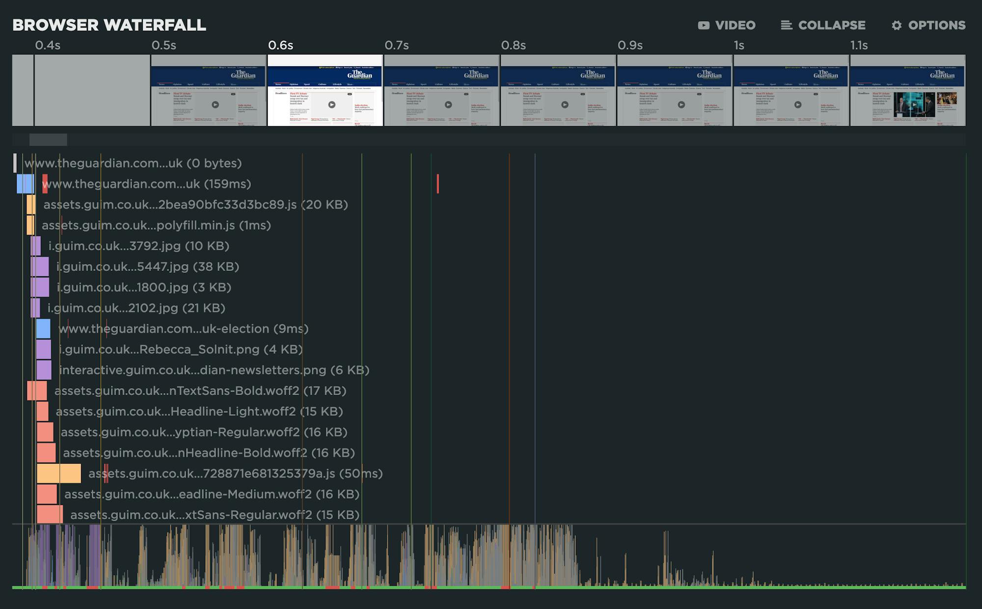
Filmstrip and waterfall chart from SpeedCurve, showing the relationship between downloading resources and rendering pixels.
Takeaway
By being mindful of the critical rendering path and working with your team to design the rendering steps, you can use the technique of critical CSS to inline the most important styles and get your pages rendered as fast as possible.

Read Next

Images are an important part of providing a rich, user-friendly experience online. It’s critical to optimize how they’re loaded and how much they weigh, making sure your beautiful images aren't hurting your page speed.

This guide walks you through essential techniques for reducing the negative impact of JavaScript on your pages by focusing on reducing the impact on the initial load, as well as reducing the impact of the actual JS interaction itself.