- Getting Started With CWV
- Largest Contentful Paint (LCP)
- Interaction to Next Paint (INP)
- Cumulative Layout Shift (CLS)
- Web Performance Budgets
- Diagnose Time to First Byte
- Optimizing Images
- Optimizing JavaScript
- Third-Party Web Performance
- Critical CSS for Faster Rendering
- Optimizing Single Page Apps
- Caching for Faster Load Times
How to Read a RUM Histogram
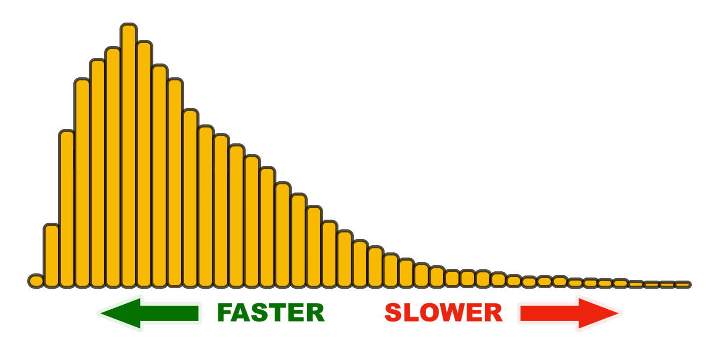
Performance is a distribution, not a single number. A histogram represents the distribution of your users who had a range of experiences when visiting your site. Looking at your RUM data in the form of a histogram allows you to think of the shape of performance and how you want to influence it. Faster shifts left, slower shifts right.
Understanding percentiles
This is key when you want to communicate a single number that represents a population. Percentiles represent segments of your population from 0-100. You don’t need to be a statistician to do this. Just think in terms like this:
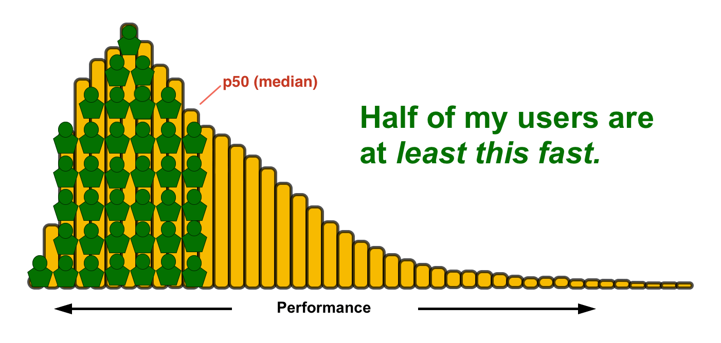
50th percentile (median)
The 50th percentile, aka the median, is arguably the easiest to understand and communicate. You can even refer to it as an average if you want.
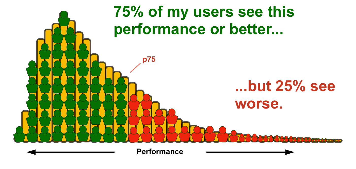
75th percentile
For some popular metrics, such as Core Web Vitals, the 75th percentile is being used for reporting.
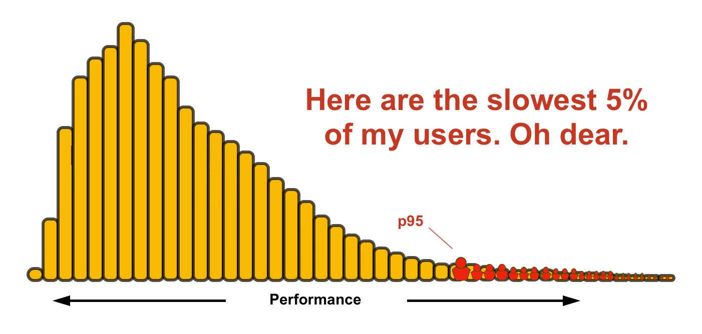
95th percentile
If your site is already pretty fast for most users, you can focus on making it fast for your long tail. Five percent of your users may not sound like much, but if you site gets 10M visitors a month, that means 500,000 of those people are having a really poor experience.
Exploring real-world data
Now that you understand what a histogram represents, here are a few common things to look for when trying to understand a population of users.
"There's no way our site is this fast/slow"
It's very common for someone looking at RUM data for the first time to feel a little bit apprehensive. This is especially true if you are coming from a synthetic monitoring background where you are controlling all of the variables that may impact a user's experience.
Faster pages
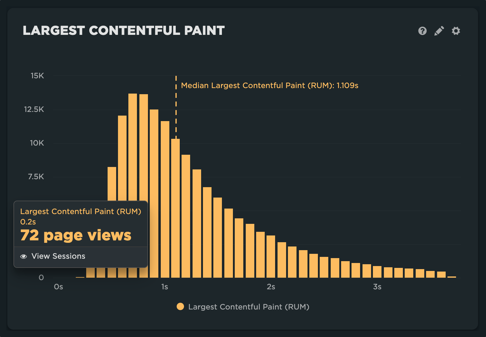
Drivers
- Cached navigation (full browser cache or back/forward navigation)
- Refresh of the page
- Text only version of page using reader mode or service
- Other unknown/unfiltered bot traffic
- Top of the line hardware
Slower pages
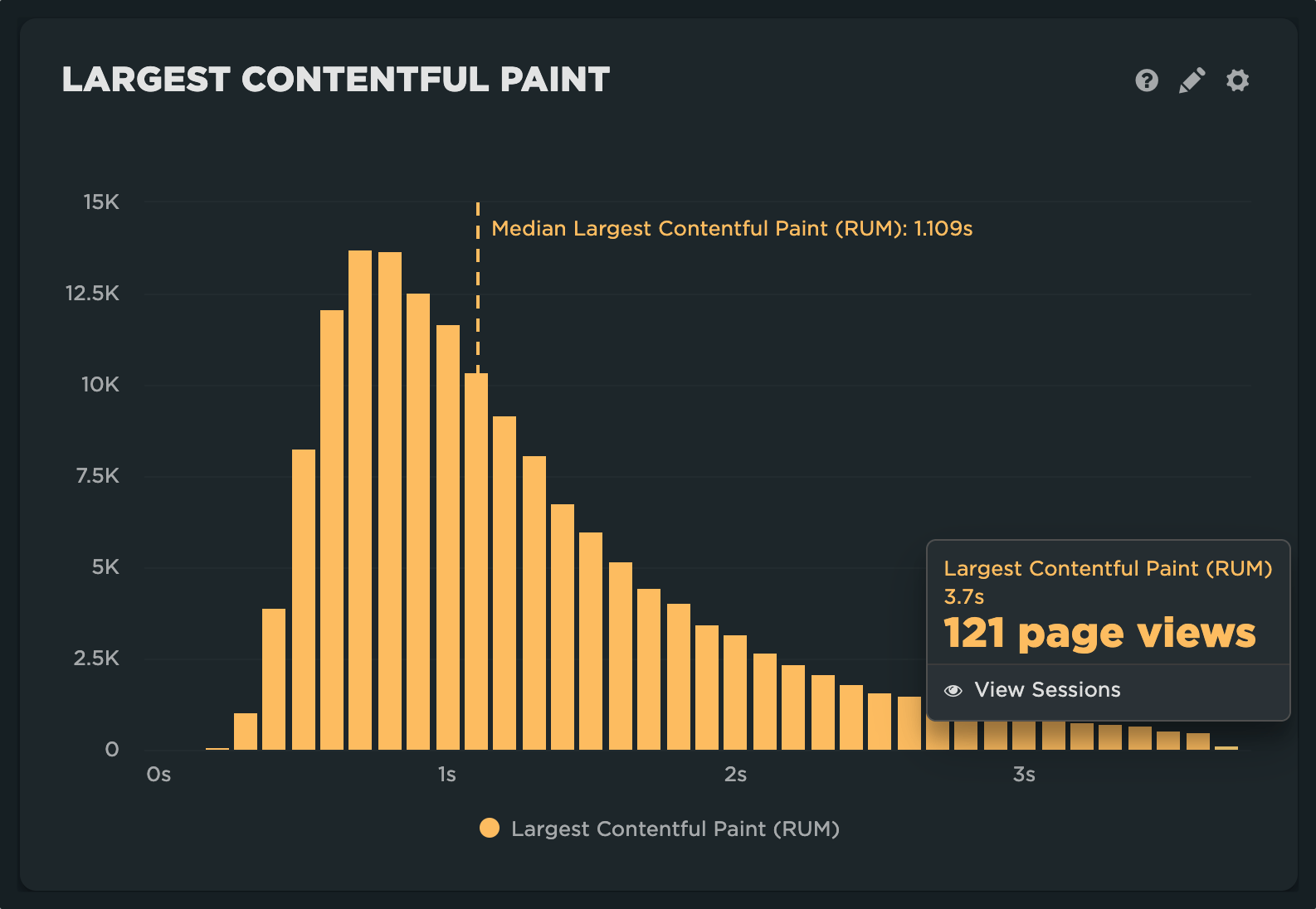
Drivers
- First time visits (empty browser cache)
- Remote location or under-serviced country or region
- Network saturation in over populated areas
- Other poor network conditions ("The Internet")
- Airplane wifi
- Lower-end, underpowered hardware
A lumpy curve to the shape of your histogram
When looking at RUM data, it's not uncommon to run into a distribution that may look something like this:
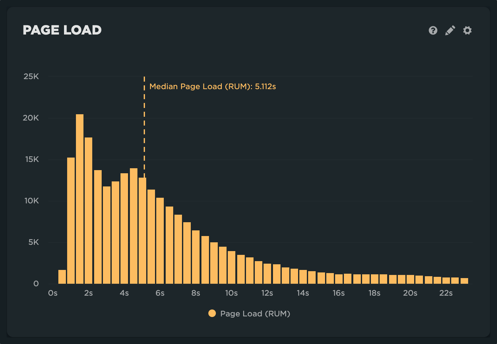
This is known as a multi-modal distribution. More simply put, there are more than one groups or populations that have different performance characteristics represented in the histogram.
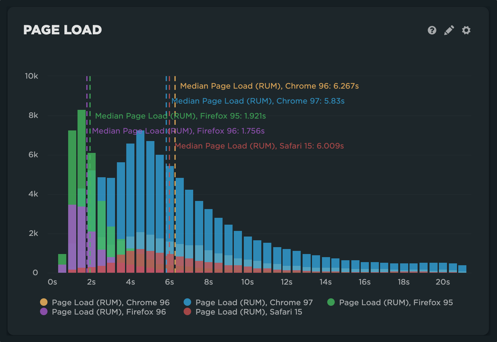
When we apply a browser level filter, we can see that the modality is driven by a high number of Firefox users, who appear to be having a much faster experience. Other common cohorts to explore:
- Mobile vs. desktop
- Page labels
- Domains
- Custom data
Sparse data or data with little variation
Sometimes histograms can look a bit sparse or incomplete.
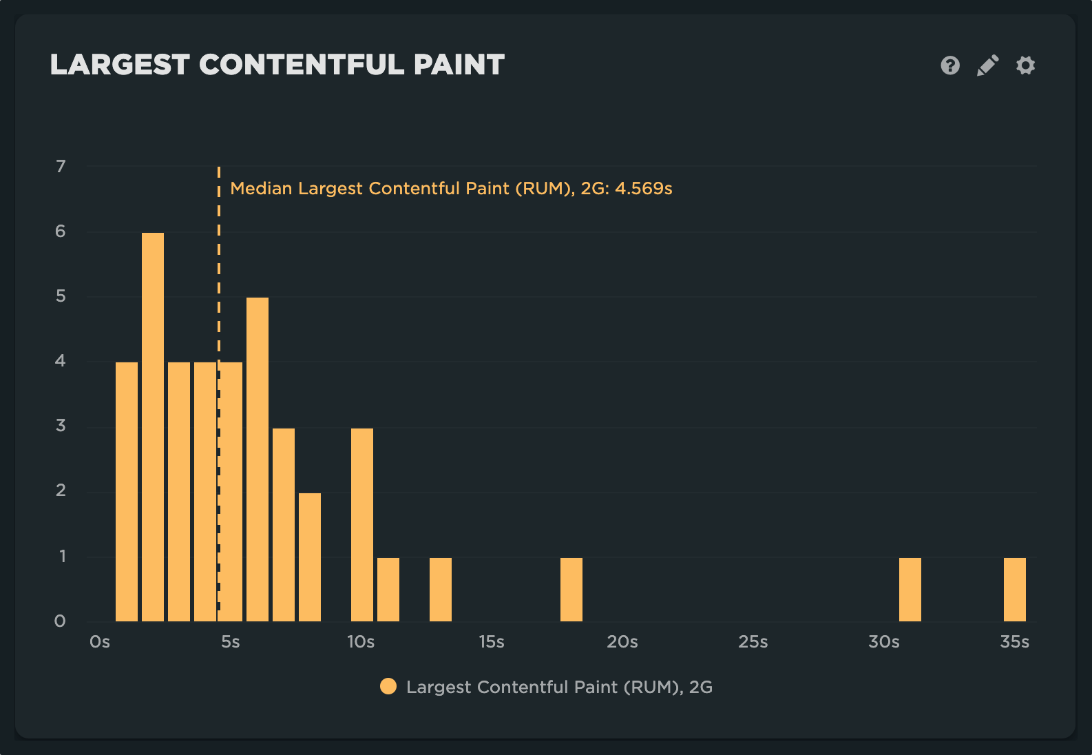
This may mean the following:
- You need to look at a larger time window
- The filter you applied is too restrictive/not representative of your population
- You aren't sampling enough
- The data just isn't interesting or relevant
Other times, the data may look less variable than you expected.
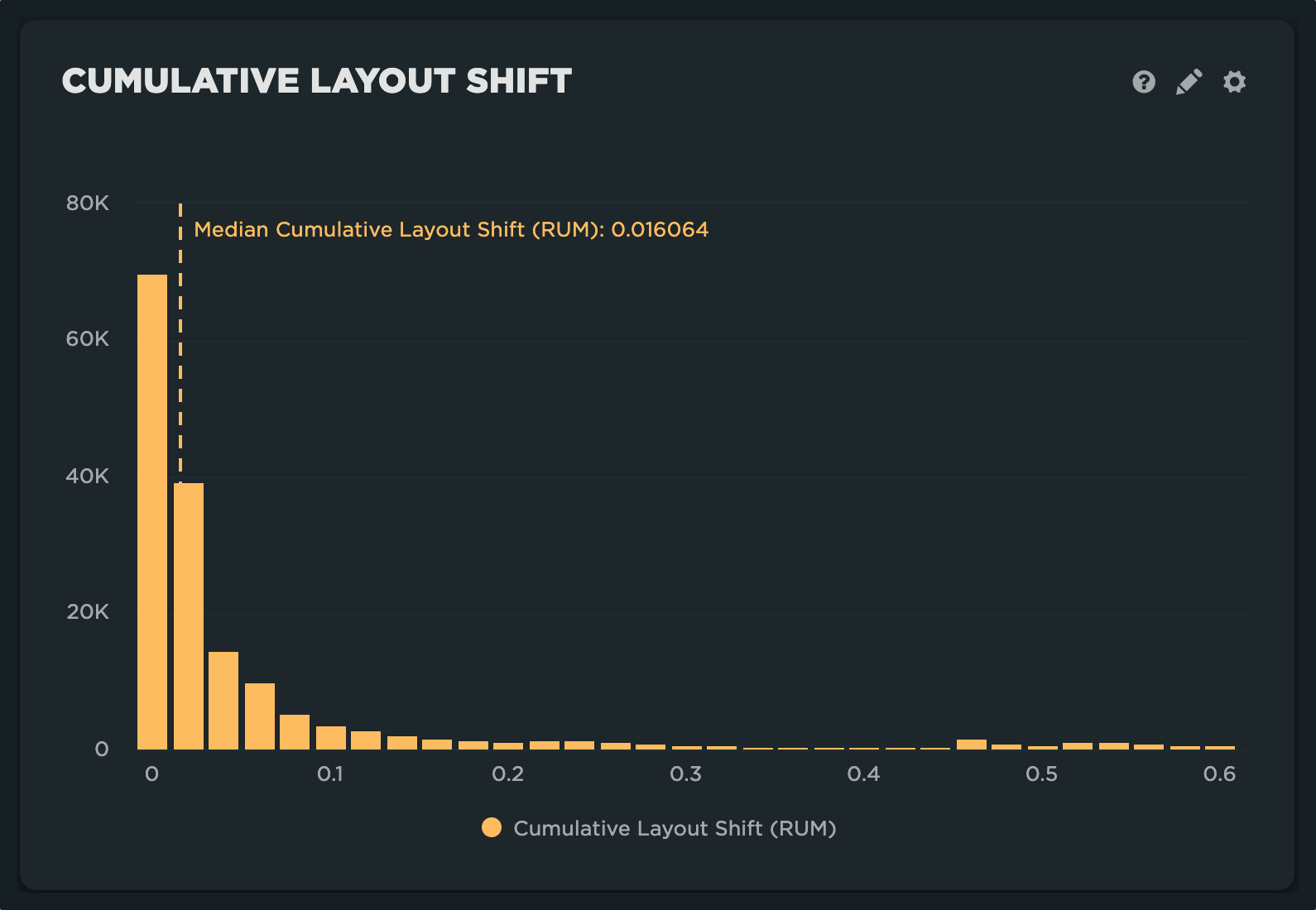
In most cases, this just means the data isn't influenced by as many factors. This can be true of metrics like CLS, DNS Lookup, and other page construction metrics like sizes and request counts.
Exploring your own data
John Rauser delivered one of our all-time favorite talks at Velocity Conference in 2011 called 'Look at your data'.. This remains one of the best explainers on the subject of distributed populations applied to web performance/operations monitoring.
Histogram correlations
Another place you'll see histograms popping up is in correlation charts. One of the unique things we focus on with RUM is the impact of performance on business outcomes. This can be modeled by looking at the distribution for a specific metric and correlating it with a behavior-based metric such as bounce rate, conversion rate, etc.
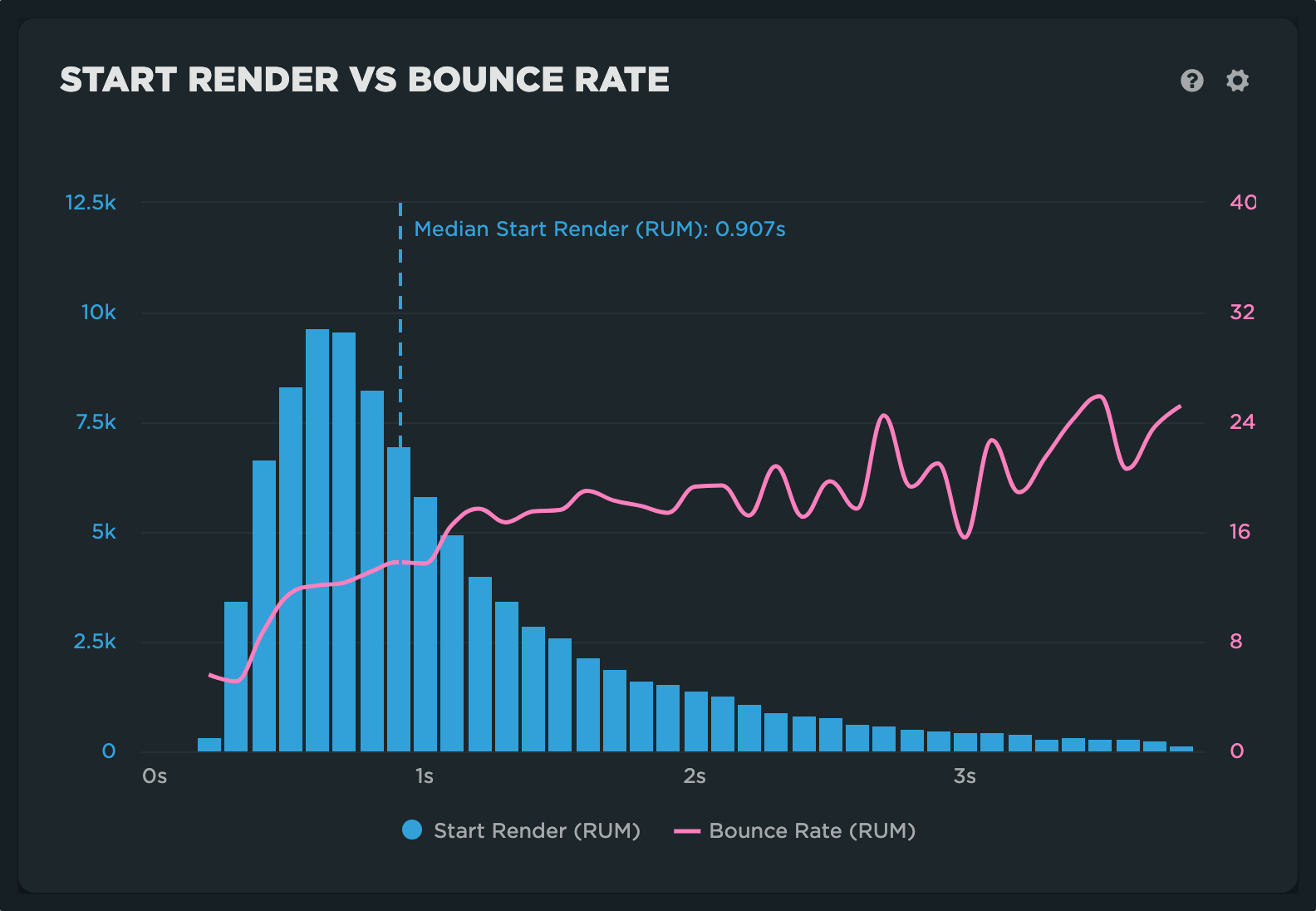
Correlation charts allow you to look at the impact of a specific variable on a metric by holding the other variables constant. What we take from this, and other examples you may create in your custom dashboards, is that there is a strong correlation between performance (start render) and user behavior (bounce rate).
