SpeedCurve is now part of the Embrace family! There are no changes to how you use our products. Our founder Mark shares what this means...
An Opinionated Guide to Performance Budgets

Performance budgets are one of those ideas that everyone gets behind conceptually, but then are challenged to put into practice – and for very good reason. Web pages are unbelievably complex, and there are hundreds of different metrics available to track. If you're just getting started with performance budgets – or if you've been using them for a while and want to validate your work – this post is for you.
What is a performance budget?
A performance budget is a threshold that you apply to the metrics you care about the most. You can then configure your monitoring tools to send you alerts – or even break the build, if you're testing in your staging environment – when your budgets are violated.
Understanding the basic premise of performance budgets is pretty easy. The tricky part comes when you try to put them into practice. This is when you run into three important questions:
- Which metrics should you focus on?
- What should your budget thresholds be?
- How do you stay on top of your budgets?
Depending on whom you ask, you could get very different answers to these questions. Here are mine.
New! Vitals Dashboard

Getting up to speed on Core Web Vitals seems to be at the top of everyone's to-do list these days. Just in time for the holidays, we are happy to bring you our new Vitals dashboard to help you get a huge jumpstart.
We love to visualize performance data (in case you haven't heard). We love it even more when we can be true to one of our biggest motivations at SpeedCurve: leveraging both RUM and Synthetic data to help you take action on what matters most.
First Input Delay: How vital is it?
We’ve been pretty vocal about Core Web Vitals since Google announced this initiative last spring. We love the idea of having a lean, shared set of metrics that we can all rally around – not to mention having a broader conversation about web performance that includes teams throughout an organization.
For many site owners, the increased focus on Core Web Vitals is driven by the fact that Google will be including them as a factor in search ranking in May 2021. Other folks are more interested in distilling the extremely large barrel of performance metrics into an easily digested trinity of guidelines to follow in order to provide a delightful user experience.
We’ve had some time to evaluate and explore these metrics, and we're committed to transparently discussing their pros and cons.
The purpose of this post is to explore First Input Delay (FID). This metric is unique among the three Web Vitals in that it is can only be measured using real user monitoring (RUM), while the other two (Largest Contentful Paint and Cumulative Layout Shift) can be measured using both RUM and synthetic monitoring.
In this post we'll cover:
- What is FID?
- What does FID look like across the web?
- The importance of measuring user interactions
- How JavaScript affects user behavior
- Suggestions for how you can look at FID in relation to your other key metrics
Let's dig in!
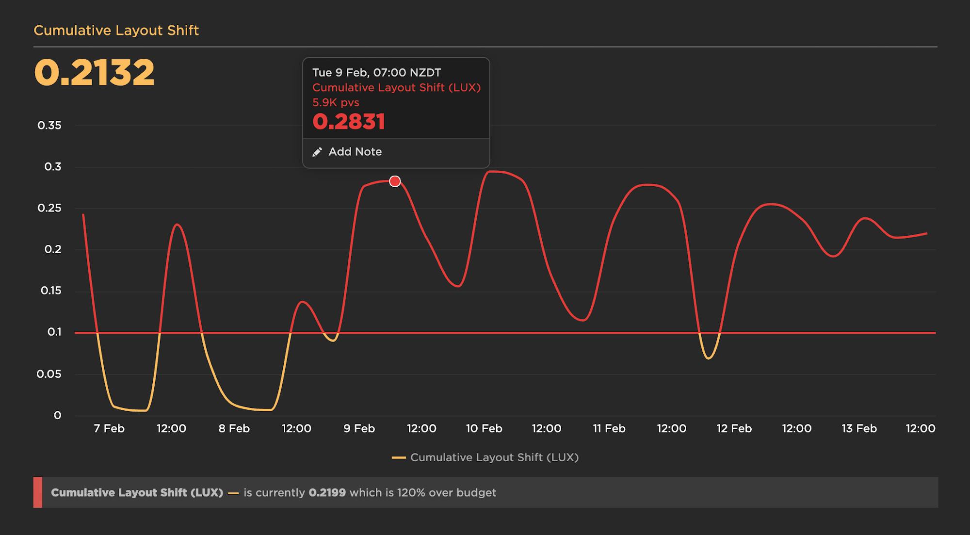
Cumulative Layout Shift: What it measures, when it works (and doesn't), and how to use it
Back in May, we shared that SpeedCurve supports Google's Core Web Vitals in both our synthetic monitoring and real user monitoring tools. Two of the Web Vitals – Largest Contentful Paint (LCP) and First Input Delay (FID) – were actually available in SpeedCurve for quite a while prior to the announcement. The newcomer to the scene was Cumulative Layout Shift (CLS), and, not surprisingly, it's the metric that's gotten the most questions.
A few of the questions I've been asked (or asked myself) about Cumulative Layout Shift:
- What does CLS measure?
- How is it calculated?
- What does it mean in terms of actual user experience?
- Does it correlate to user behaviour or business metrics in any measurable way?
- What are the (inevitable) gotchas?
- Ultimately, how much should we care about CLS?
Six months in, I've had a chance to gather and look at a lot of data, talk with customers, and learn from our friends in the performance community. Here's what I've learned so far.
Visualizing Layout Shifts

One of the big challenges with Google's new Cumulative Layout Shift (CLS) metric is understanding which elements actually moved on the page, when they moved, and by how much. To help with debugging your CLS scores, we've added a new visualization to SpeedCurve that shows each layout shift and how each individual shift adds up to the final cumulative metric.
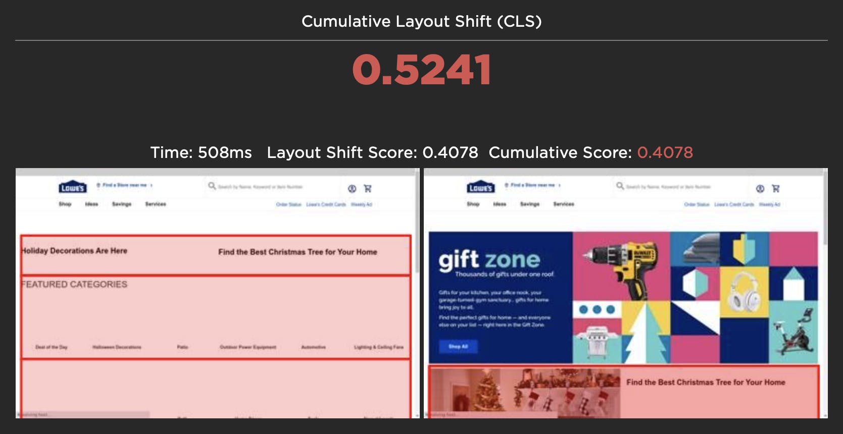
For each layout shift, we show you the filmstrip frame right before and right after the shift. We then draw a red box around the elements that moved, highlighting exactly which elements caused the shift. The Layout Shift Score for each shift also helps you understand the impact of that shift and how it adds to the cumulative score.
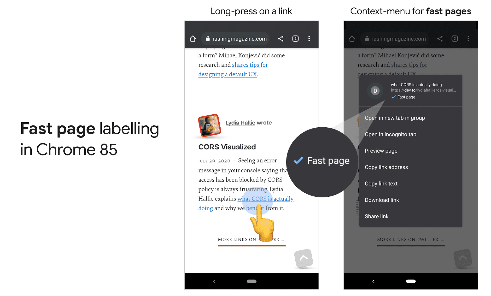
Fast badging for better UX
Is your site fast? Adding to a string of recent announcements including Lighthouse v6 and Core Web Vitals, Google has introduced Fast page labelling in Chrome 85 for Android. If you are curious about what this means for your site and how you can get in front of it, read on!
The SpeedCurve family grows

I’m really excited to have become the latest member of the SpeedCurve family. I’ve known Mark for 20 years, since he started lecturing in design here in New Zealand. I was one of his first students and we’ve always kept in touch. Our careers have overlapped at various points, it’s the nature of a small country with an even smaller web design industry. I remember attending the Webstock conference where Mark first presented SpeedCurve in the Start-Up Alley competition. He won, netting the prize money and a trip to the USA to present his new startup. We all know how relevant and useful his startup has become and I’m thrilled to have this opportunity to get involved in its development.
NEW: Lighthouse v6 support!

Lighthouse v6 has arrived! The much-anticipated update to Lighthouse is now available to SpeedCurvers as part of our latest test agent updates. Keep reading to find out what this means and how it may affect your performance metrics.
Are your JavaScript long tasks frustrating users?
When it comes to long JavaScript tasks, how long is too long?
The general consensus within the web performance community is that any JS scripting task that takes more than 50ms to execute can affect a user's experience. When the browser's main thread hits max CPU for more than 50ms, a user starts to notice that their clicks are delayed and that scrolling the page has become janky and unresponsive. Batteries drain faster. People rage click or go elsewhere.
No one plans to make a page or web app that sucks the life out of their users' devices, so it's super important to monitor the effect your JS is having. (Yes... I'm looking at you, front-end JS libraries and third-party ads!)
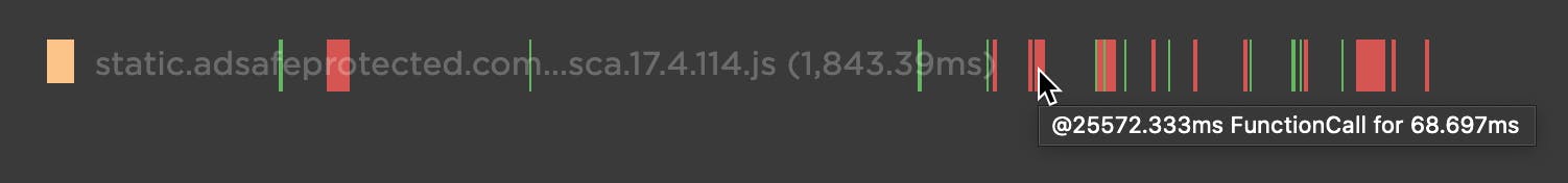
Our waterfall chart shows every long task over 50ms as a red block.
New JavaScript CPU metrics
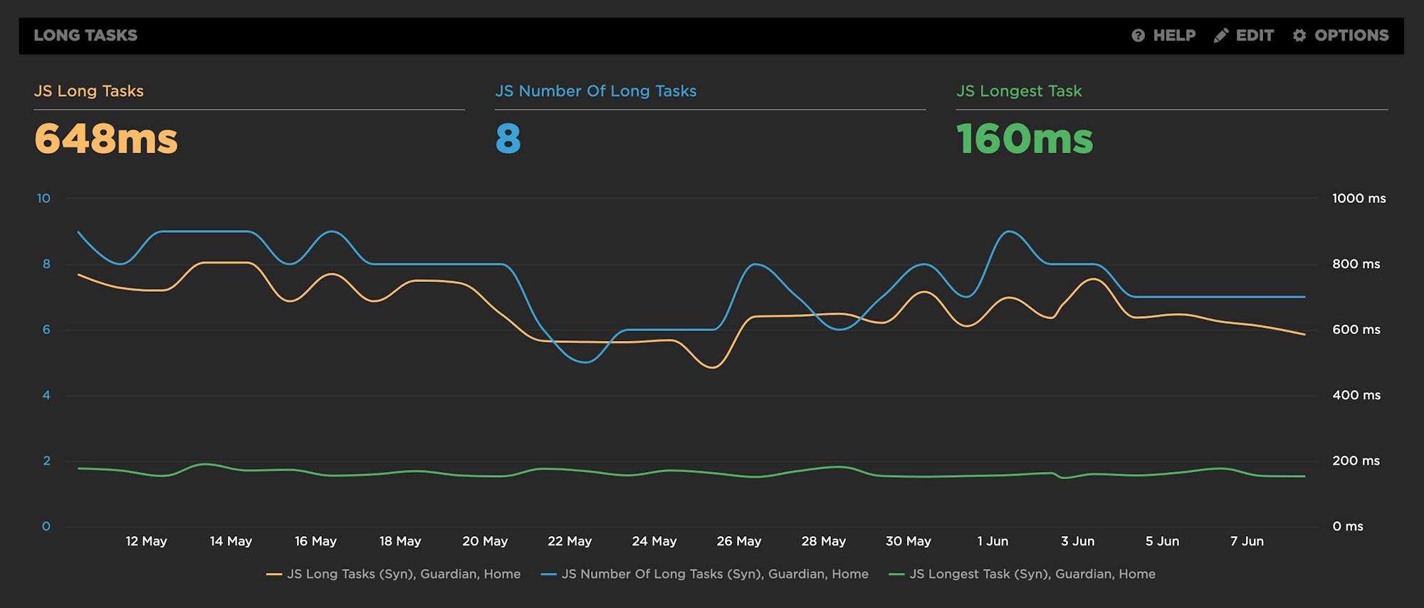
We've recently added a bunch of new JavaScript CPU metrics that help you understand if your scripts are blocking the main thread and getting in the way of a super smooth experience for your users:
- Long Tasks – The total time of all your JS tasks over 50ms added together – from navigation start till the page is fully loaded.
- Number of Long Tasks – The total number of individual JS long tasks.
- Longest Task – There's a lot that can hide in the details of long task time. One really long task that frustrates your user is an order of magnitude worse than a bunch of long tasks that are just over the 50ms threshold each. For that reason, we track not only the number of long tasks in a page but also the duration of the longest task in the page. (We've seen individual JS long tasks taking over 1,000ms! That's a whole second where the browser just locked up, sat on its hands, and refused to do anything while a poor user mashed on the keyboard and wiggled the mouse wondering what happened.)
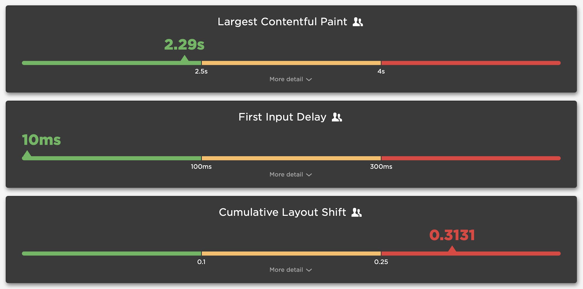
Tracking Web Vitals for a better user experience
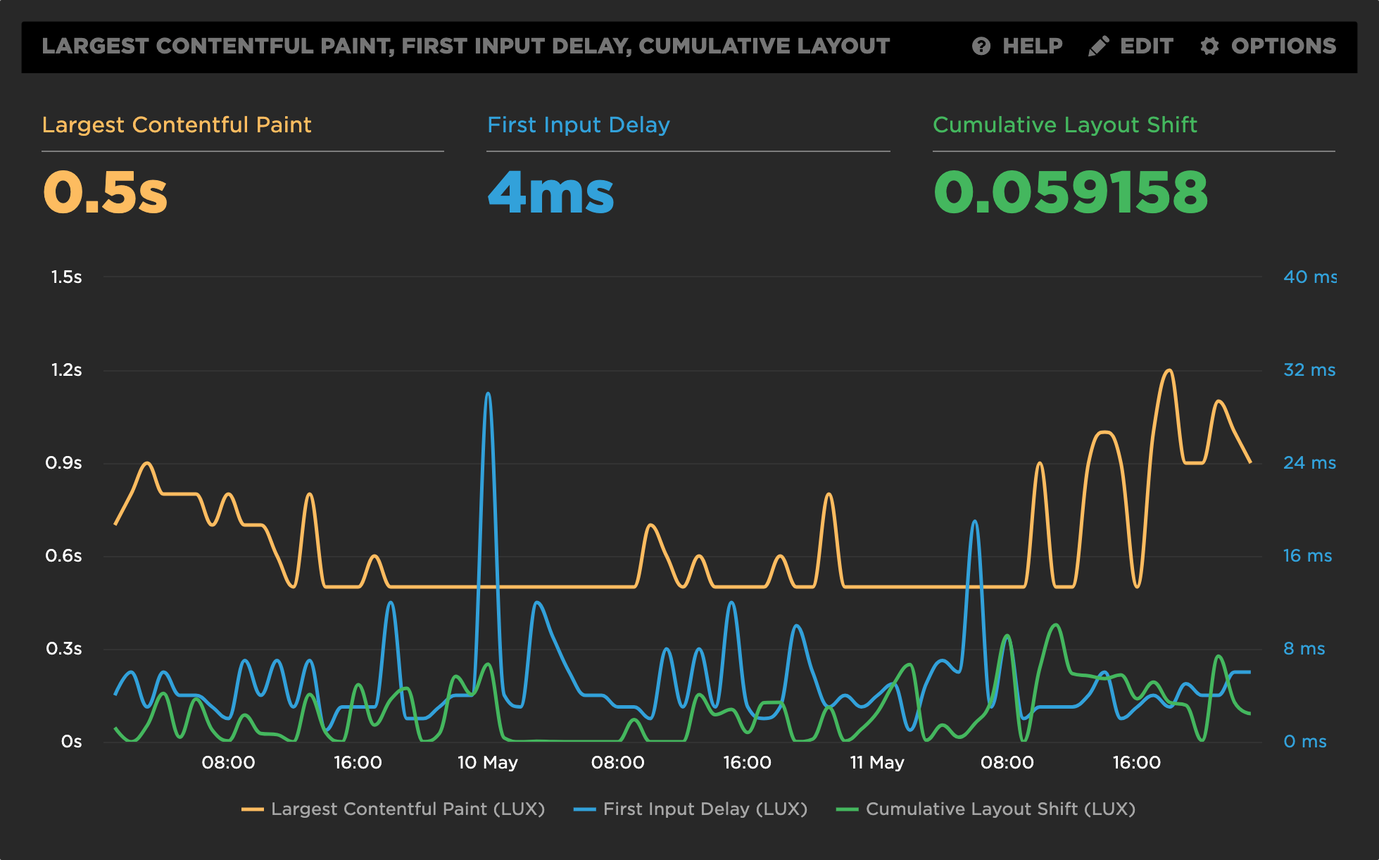
Google recently announced an initiative called 'Web Vitals', which focuses on three performance metrics they consider essential for improving the user experience:
- Largest Contentful Paint (LCP)
- First Input Delay (FID)
- Cumulative Layout Shift (CLS)
With the exception of FID, all of these metrics are available in both RUM and Synthetic. FID requires a real user for calculation and therefore is only available in RUM. In place of FID for Synthetic, we recommend tracking JS Long Tasks or Total Blocking Time as an alternative CPU metric.
