SpeedCurve is now part of the Embrace family! There are no changes to how you use our products. Our founder Mark shares what this means...
2025 was a big year! Here are some highlights...

I say this every year, and every year I mean it: this has been a big year, for both SpeedCurve and the web performance community!

Some highlights:
- Broad browser support for important metrics like Largest Contentful Paint and Interaction to Next Paint
- Exciting new metrics and visualizations for measuring user happiness — as well as identifying the root causes of issues that lead to user UNhappiness
- Nuanced metrics for deeper diagnostics (especially digging into JavaScript issues that were previously elusive)
- Better performance budgets
- Easier for Shopify and Magento stores — as well as SPAs — to enjoy all the benefits of real user monitoring
Let's go!
NEW! A better way to quantify user happiness on your site

The goal of making websites faster is to make users happier. Since user happiness can't be measured directly, we launched the User Happiness metric more than six years ago. We've just released a fresh User Happiness update to reflect changes in web browsers and the overall web performance space!
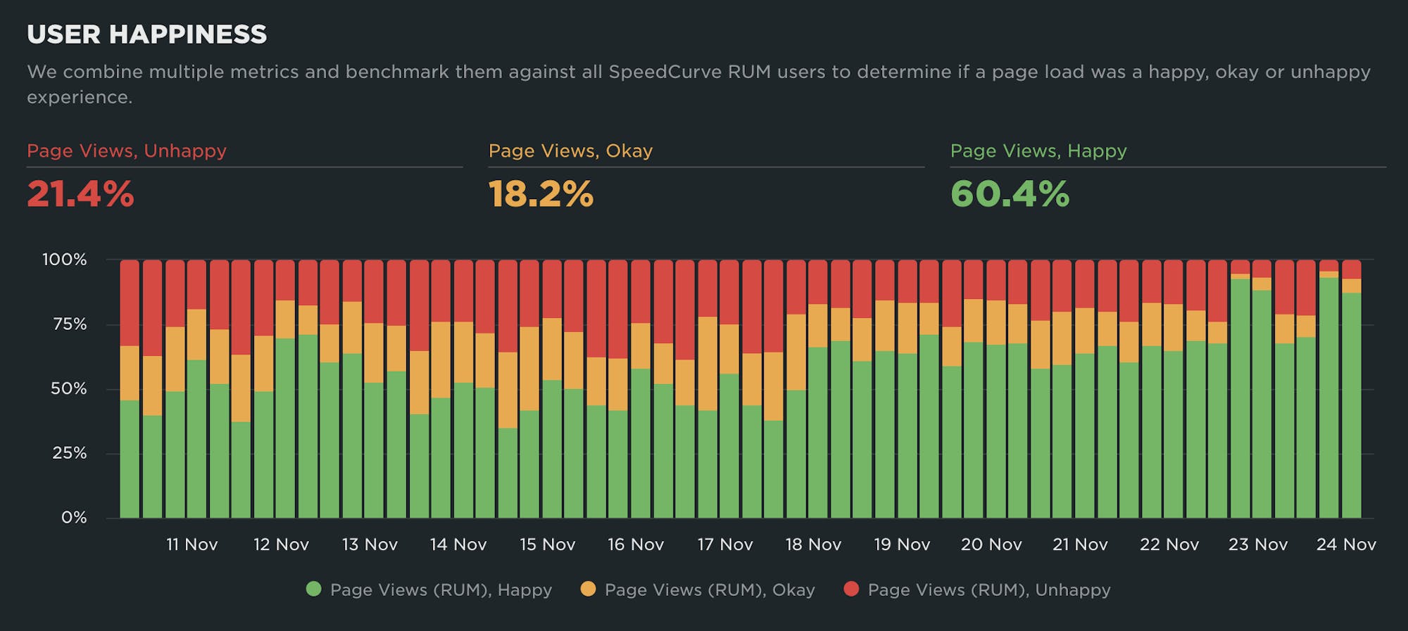
Back in October 2019, we released our User Happiness metric with the goal of quantifying how a user might have felt while loading a page.
User Happiness is an aggregated metric that combines important user experience signals, gathered with real user monitoring (RUM). To create the User Happiness algorithm, we picked metrics and thresholds that we felt reflected the overall user experience: pages that loaded slowly or lagged during interaction were more likely to make someone feel unhappy, whereas fast and snappy pages would keep users happy.
More than six years later, we've updated User Happiness to reflect changes in web browsers and the overall web performance space. Keep reading to learn more.
2025 Holiday Readiness Checklist (Page Speed Edition!)

Delivering a great user experience through the holiday season is a marathon, not a sprint. Here are 25 things you can do to make sure your site is fast and available every day, not just Black Friday.

Your design and development teams are working hard to attract users and turn browsers into buyers, with strategies like:
- High-resolution images and videos
- Geo-targeted campaigns and content
- Third-party tags for audience analytics and retargeting
However, all those strategies can take a toll on the speed and user experience of your pages – and each introduces the risk of introducing single points of failure (SPoFs).
Below we've curated 25 things you can do to keep your users happy throughout the holidays (and beyond). If you're scrambling to optimize your site before Black Friday, you still have time to implement some or all of these best practices. And if you're already close to being ready for your holiday code freeze, you can use this as a checklist to validate that you've ticked all the boxes on your performance to-do list.
When to use CrUX, RUM, and Synthetic web performance monitoring

"Should I use synthetic monitoring, real user monitoring, or CrUX?" We hear this question a lot. It's important to know the strengths and limitations of each monitoring tool and what they’re best used for, so we don’t miss out on valuable insights.
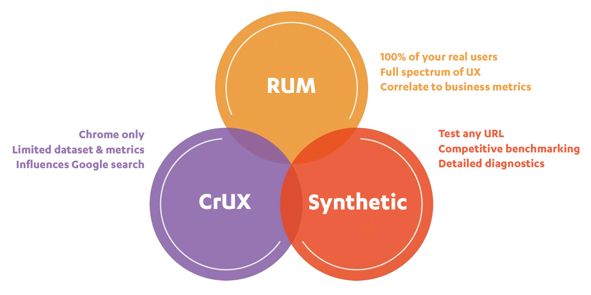
This post includes:
- How synthetic and real user monitoring (RUM) work
- What is CrUX?
- Is CrUX a substitute for RUM?
- When and why to use each tool
- An obscure cheese metaphor
- Plus a quick survey question at the end!
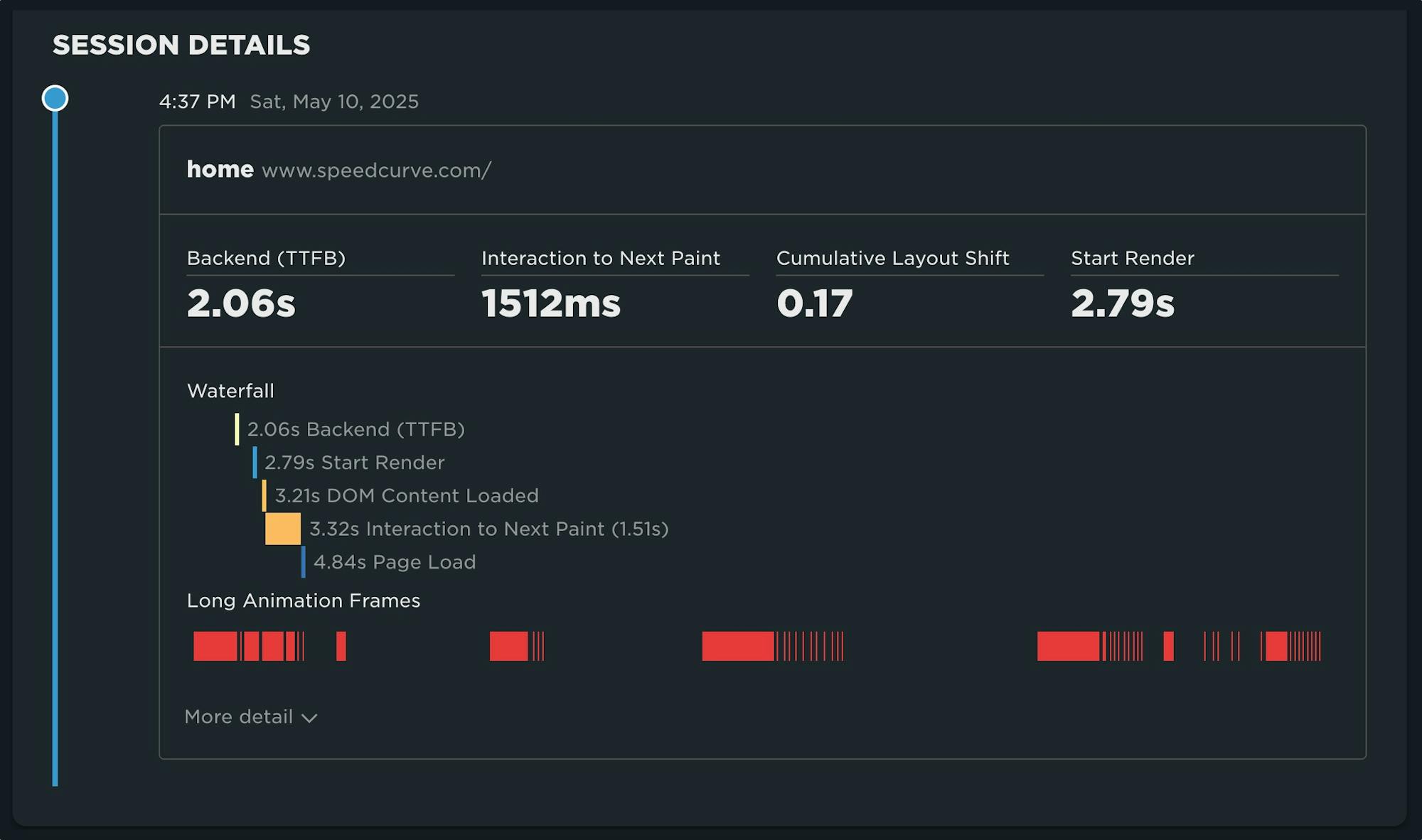
How do Long Animation Frames affect user behavior?
What's the point of a performance metric that doesn't align with user behavior – and ultimately business outcomes? Looking at four different retail sites, we compared each LoAF metric for desktop and mobile and correlated it to conversion rate. We saw some surprising trends alongside some expected patterns.
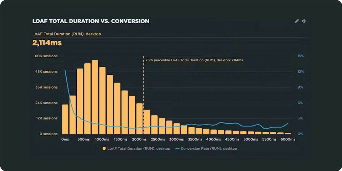
We recently shipped support for Long Animation Frames (LoAF). We're buzzing with excitement about having better diagnostic capabilities, including script attribution for INP and our new experimental metric, Total Blocking Duration (TBD).
While Andy has gone deep in the weeds on LoAF, in this post let's put the new set of metrics to the test and see how well they reflect the user experience. We'll look at real-world data from real websites and find an answer to the question: How do Long Animation Frames affect user behavior?
The Definitive Guide to Long Animation Frames (LoAF)

With Long Animation Frames (commonly referred to as LoAF, pronounced 'LO-aff') we finally have a way to understand the impact of our code on our visitors' experiences.
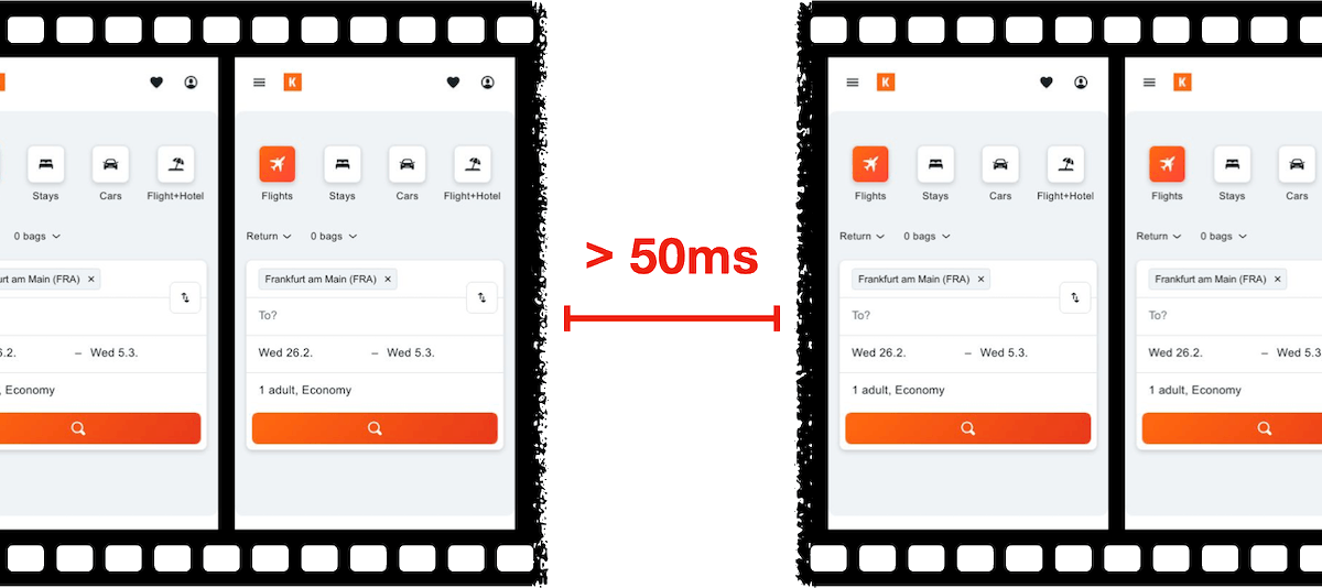
Long Animation Frame – a frame that took longer then 50ms from its start to when it started painting
LoAF allows us to understand how scripts and other tasks affect both hard and soft navigations, as well as how scripts affect interactions. Using the data LoAF provides, we can identify problem scripts and target changes that improve our visitors' experience. We can also finally start to quantify the impact of third-party scripts as they execute in our visitors' browsers.
Keep reading to learn:
- Why animation frame rate matters
- Anatomy of a Long Animation Frame
- Key LoAF milestones and what we can do with milestone data
- Script attribution (and why script details might sometimes be unavailable)
- How to match script data to Interaction to Next Paint, including sub-parts
- How to capture LoAF entries
- Getting started with LoAF
- LoAF support in SpeedCurve
NEW! Monitor Long Animation Frames and get to the bottom of your JavaScript issues
CPU consumption by the browser is one of the main causes – if not the number one cause – of a poor user experience. The primary culprit? JavaScript execution. Now you can use SpeedCurve to monitor Long Animation Frames (LoAFs) and fix the third parties and other scripts that are hurting your page speed.
Until recently, we've had little evidence from the field that definitively attributes the root cause of rendering delays. While JavaScript Long Tasks gave us a good indication that there were blocking tasks affecting metrics such as Interaction to Next Paint and Largest Contentful Paint, there was no way to attribute the work or understand how it was ultimately affecting rendering.
Fortunately, we've gotten a lot of help from Chrome in improving the attribution – and ultimately the actionability – of the data we collect in the field with RUM. The introduction of the Long Animation Frames API (LoAF) not only gives us better methods for understanding what's happening on the browser's main thread, in some cases it also gives us attribution to both first- and third-party scripts that occur during a LoAF.
This has been a highly anticipated addition to SpeedCurve, which is available for all our RUM users today. This post covers what's new in the product and points you to a few new resources to help you get up to speed on all things related to LoAF.
Correlation charts: Connect the dots between site speed and business success
If you could measure the impact of site speed on your business, how valuable would that be for you? Say hello to correlation charts – your new best friend.
Here's the truth: The business folks in your organization probably don't care about page speed metrics. But that doesn't mean they don't care about page speed. It just means you need to talk with them using metrics they already care about – such as conversion rate, revenue, and bounce rate.
That's why correlation charts are your new best friend.
Our 10 most popular web performance articles of 2024
We love writing articles and blog posts that help folks solve real web performance and UX problems. Here are the ones you loved most in 2024. (The number one item may surprise you!)

Some of these articles come from our recently published Web Performance Guide – a collection of evergreen how-to resources (written by actual humans!) that will help you master website monitoring, analytics, and diagnostics. The rest come from this blog, where we tend to publish industry news and analysis.
Regardless of the source, we hope you find these pieces useful!
A Holiday Wish: Core Web Vitals in Safari
Did you know that key performance metrics – like Core Web Vitals – aren't supported in Safari? If that's news to you, you're not alone! Here's why that is... and what we and the rest of the web performance community are doing to fix it.
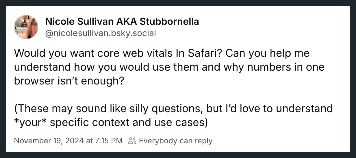
Somebody pinch me. Seeing this post and the resulting thread gives me great hope.
Nicole Sullivan (aka Stubbornella, WebKit Engineering Manager at Apple, and OG web performance evangelist) isn't making promises or dangling a carrot. Nonetheless, it's evidence of the willingness for some public discussion on a topic that's been exhaustively discussed in our community for years. Nicole's post has gotten some great responses from many leaders in our community, hopefully shaping a strong use case for future WebKit support for Core Web Vitals.
(If you're new to performance, Core Web Vitals is a set of three metrics – Largest Contentful Paint, Cumulative Layout Shift, and Interaction to Next Paint – that are intended to measure the rendering speed, interactivity, and visual stability of web pages.)
In this post, I'm going to highlight some of the discussion around the topic of Core Web Vitals and Safari, which was a major theme coming out of the recent web performance marathon in Amsterdam that included WebPerf Days, performance.sync(), and the main event, performance.now().
How to provide better attribution for your RUM metrics

Here's a detailed walkthrough showing how to make more meaningful and intuitive attributions for your RUM metrics – which makes it much easier for you to zero in on your performance issues.
Real user monitoring (RUM) has always been incredibly important for any organization focused on performance. RUM – also known as field testing – captures performance metrics as real users browse your website and helps you understand how actual users experience your site. But it’s only in the last few years that RUM data has started to become more actionable, allowing you to diagnose what is making your pages slower or less usable for your visitors.
Making newer RUM metrics – such as Core Web Vitals – more actionable has been a significant priority for standards bodies. A big part of this shift has been better attribution, so we can tell what's actually going on when RUM metrics change.
Core Web Vitals metrics – like Largest Contentful Paint (LCP), Interaction to Next Paint (INP), and Cumulative Layout Shift (CLS) – all have some level of attribution associated with them, which helps you identify what exactly is triggering the metric. The LoAF API is all about attribution, helping you zero in on which scripts are causing issues.
Having this attribution available, particularly when paired with meaningful subparts, can help us to quickly identify which specific components we should prioritize in our optimization work.
We can help make this attribution even more valuable by ensuring that key components in our page have meaningful, semantic attributes attached to them.
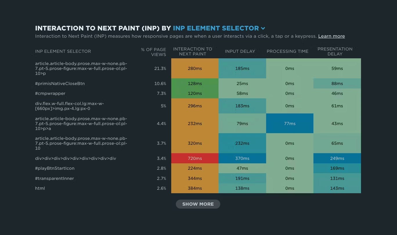
NEW: RUM attribution and subparts for Interaction to Next Paint!
Now it's even easier to find and fix Interaction to Next Paint issues and improve your Core Web Vitals.
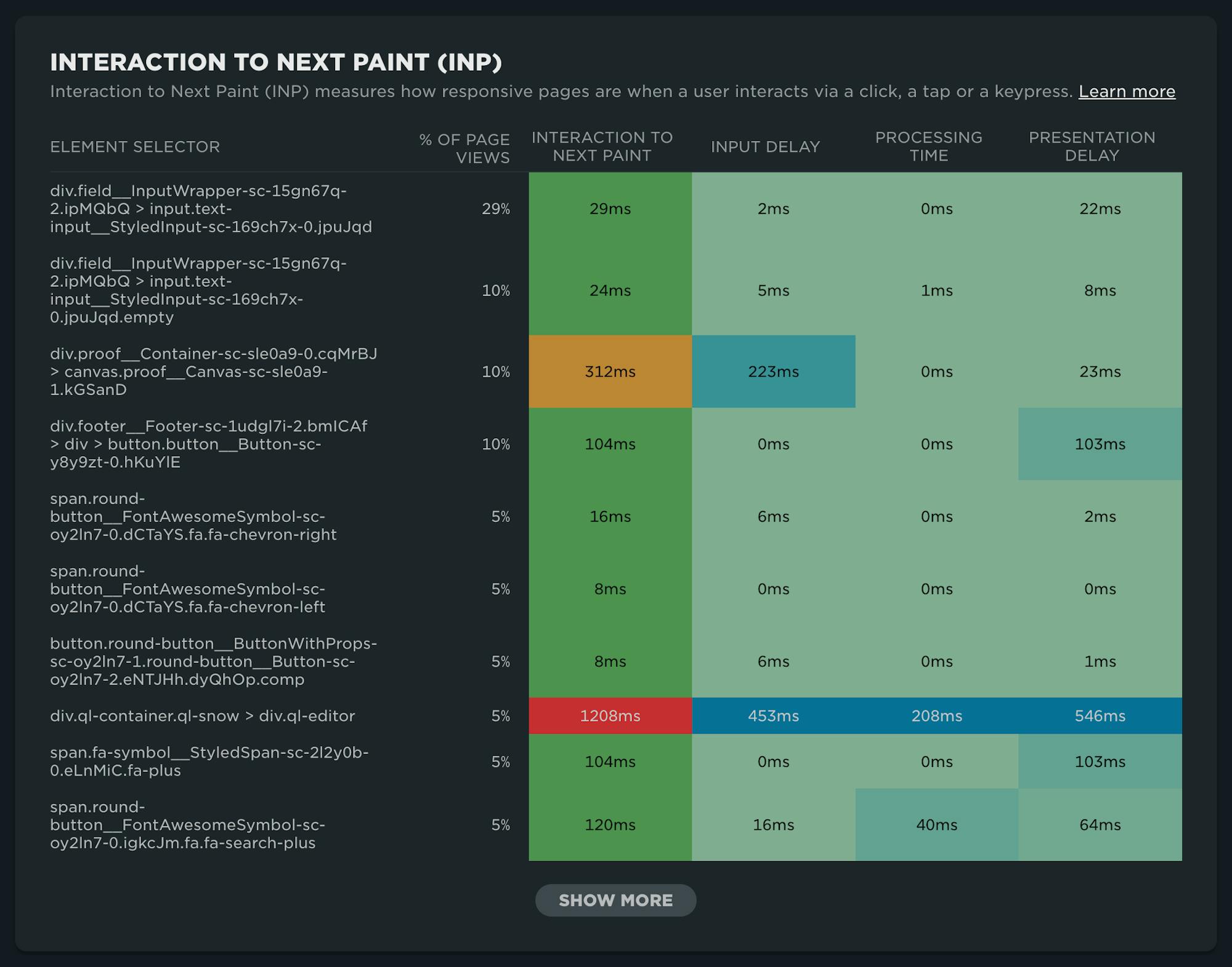
Our newest release continues our theme of making your RUM data even more actionable. In addition to advanced settings, navigation types, and page attributes, we've just released more diagnostic detail for the latest flavor in Core Web Vitals: Interaction to Next Paint (INP).
This post covers:
- Element attribution for INP
- A breakdown of where time is spent within INP, leveraging subparts
- How to use this information to find and fix INP issues
- A look ahead at RUM diagnostics at SpeedCurve
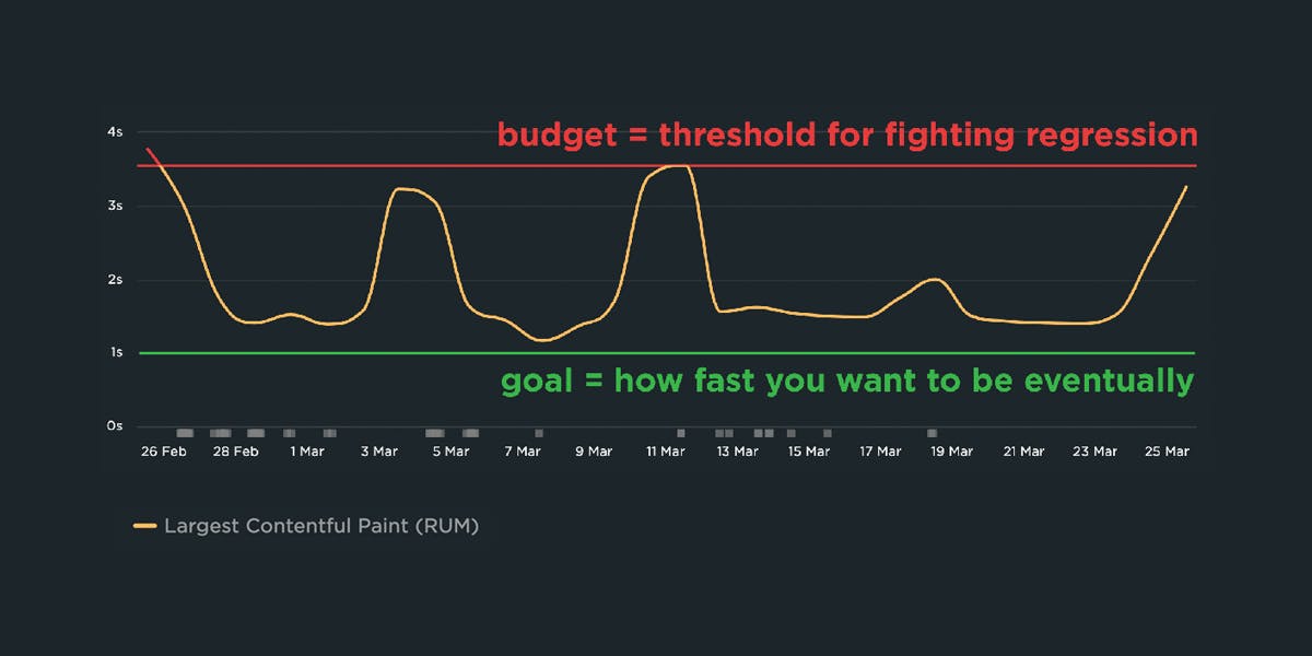
A Complete Guide to Web Performance Budgets
It's easier to make a fast website than it is to keep a website fast. If you've invested countless hours in speeding up your site, but you're not using performance budgets to prevent regressions, you could be at risk of wasting all your efforts.
In this post we'll cover how to:
- Use performance budgets to fight regressions
- Understand the difference between performance budgets and performance goals
- Identify which metrics to track
- Validate your metrics to make sure they're measuring what you think they are – and to see how they correlate with your user experience and business metrics
- Determine what your budget thresholds should be
- Focus on the pages that matter most
- Get buy-in from different stakeholders in your organization
- Integrate with your CI/CD process
- Synthesize your synthetic and real user monitoring data
- Maintain your budgets
This bottom of this post also contains a collection of case studies from companies that are using performance budgets to stay fast.
Let's get started!
Hello INP! Here's everything you need to know about the newest Core Web Vital

After years of development and testing, Google has added Interaction to Next Paint (INP) to its trifecta of Core Web Vitals – the performance metrics that are a key ingredient in its search ranking algorithm. INP replaces First Input Delay (FID) as the Vitals responsiveness metric.
Not sure what INP means or why it matters? No worries – that's what this post is for. :)
- What is INP?
- Why has it replaced First Input Delay?
- How does INP correlate with user behaviour metrics, such as conversion rate?
- What you need to know about INP on mobile devices
- How to debug and optimize INP
And at the bottom of this post, we'll wrap thing up with some inspiring case studies from companies that have found that improving INP has improved sales, pageviews, and bounce rate.
Let's dive in!
Debugging Interaction to Next Paint (INP)
Not surprisingly, most of the conversations I've had with SpeedCurve users over the last few months have focused on improving INP.
INP measures how responsive a page is to visitor interactions. It measures the elapsed time between a tap, a click, or a keypress and the browser next painting to the screen.
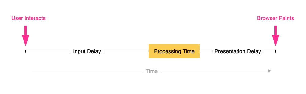
INP breaks down into three sub-parts
- Input Delay – How long the interaction handler has to wait before executing
- Processing Time – How long the interaction handler takes to execute
- Presentation Delay – How long it takes the browser to execute any work it needs to paint updates triggered by the interaction handler
Pages can have multiple interactions, so the INP time you'll see reported by RUM products and other tools, such as Google Search Console and Chrome's UX Report (CrUX), will generally be the worst/highest INP time at the 75th percentile.
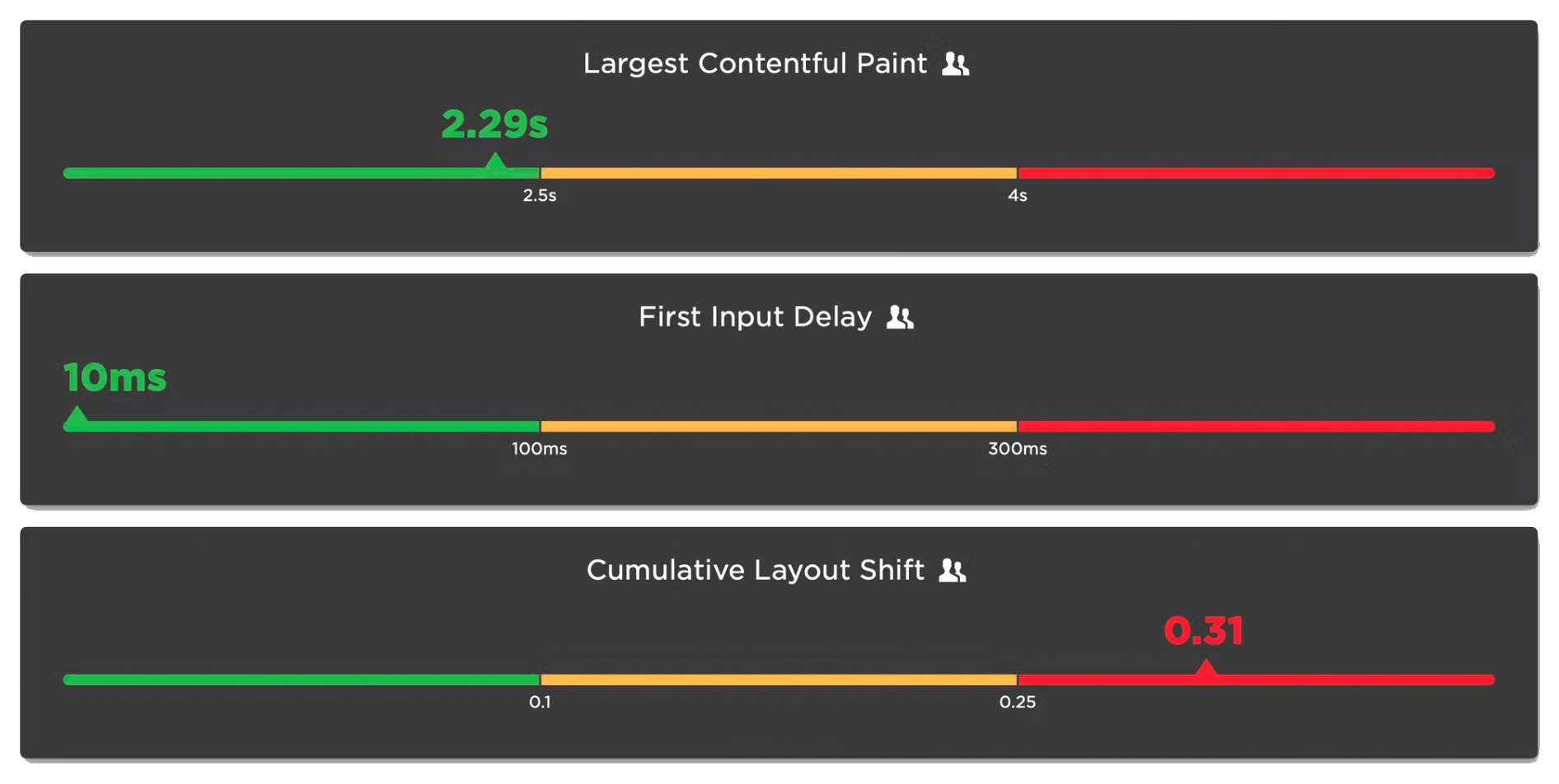
Like all Core Web Vitals, INP has a set of thresholds:
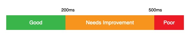
INP thresholds for Good, Needs Improvement, and Poor
Many sites tend to be in the Needs Improvement or Poor categories. My experience over the last few months is that getting to Good is achievable, but it's not always easy.
In this post I'm going to walk through:
- How I help people identify the causes of poor INP times
- Examples of some of the most common issues
- Approaches I've used to help sites improve their INP
How to use Server Timing to get backend transparency from your CDN

80% of end-user response time is spent on the front end.
That performance golden rule still holds true today. However, that pesky 20% on the back end can have a big impact on downstream metrics like First Contentful Paint (FCP), Largest Contentful Paint (LCP), and any other 'loading' metric you can think of.
Server-timing headers are a key tool in understanding what's happening within that black box of Time to First Byte (TTFB).
In this post we'll explore a few areas:
- Look at industry benchmarks to get an idea of how a slow backend influences key metrics, including Core Web Vitals
- Demonstrate how you can use server-timing headers to break down where that time is being spent
- Provide examples of how you can use server-timing headers to get more visibility into your content delivery network (CDN)
- Show how you can capture server-timing headers in SpeedCurve
How to find (and fix!) INP interactions on your pages
Andy Davies – fellow SpeedCurver and web performance consultant extraordinaire – recently shared an impressive Interaction to Next Paint (INP) success:
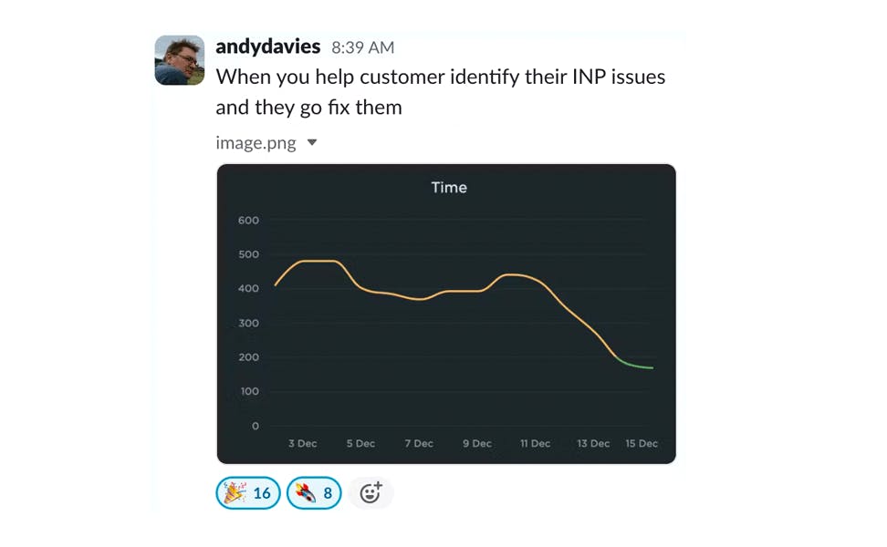
Andy has promised us a more in-depth post on debugging Interaction to Next Paint. While he's working on that, I'll try not to steal his thunder while I share a tip that may help you identify element(s) causing INP issues for your pages.
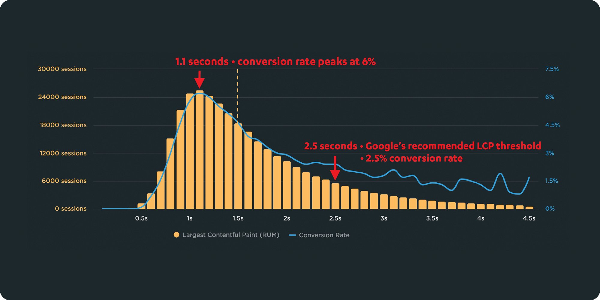
Mobile INP performance: The elephant in the room

Earlier this year, when Google announced that Interaction to Next Paint (INP) will replace First Input Delay (FID) as the responsiveness metric in Core Web Vitals in *gulp* March of 2024, we had a lot to say about it. (TLDR: FID doesn't correlate with real user behavior, so we don't endorse it as a meaningful metric.)
Our stance hasn't changed much since then. For the most part, everyone agrees the transition from FID to INP is a good thing. INP certainly seems to be capturing interaction issues that we see in the field.
However, after several months of discussing the impending change and getting a better look at INP issues in the wild, it's hard to ignore the fact that mobile stands out as the biggest INP offender by a wide margin. This doesn't get talked about as much as it should, so in this post we'll explore:
- The gap between "good" INP for desktop vs mobile
- Working theories as to why mobile INP is so much poorer than desktop INP
- Correlating INP with user behavior and business metrics (like conversion rate)
- How you can track and improve INP for your pages
10 things I love about SpeedCurve (that I think you'll love, too)

This month, SpeedCurve enters double digits with our tenth birthday. We're officially in our tweens! (Cue the mood swings?)
I joined the team in early 2017, and I'm blown away at how quickly the years have flown by. Every day, I marvel at my great luck in getting to work alongside an amazing team to build amazing tools to help amazing people like you!
In the spirit of celebration, I thought it would be fun to round up my ten favourite things to do in SpeedCurve (that I think you'll like, too). Keep scrolling to learn how to:
- Fight regressions and stay fast
- See the impact of performance on your business
- Benchmark your site against your competitors
- Track third parties to make sure they're not quietly hurting performance
- Make sure you're tracking the best metrics for your pages
- Get a prioritized list of performance recommendations
- Bookmark and compare synthetic tests and RUM sessions so you can quickly find and fix performance issues
- Run A/B tests so you see how code changes affect your performance and user engagement metrics
- Get customized weekly reports
- Motivate your team with a wall-mounted monitor showing your favourite charts
Demystifying Cumulative Layout Shift with CLS Windows
As we all know, naming things is hard.
Google's Core Web Vitals are an attempt to help folks new to web performance focus on three key metrics. Not all of these metrics are easy to understand based on their names alone:
- Largest Contentful Paint (LCP) – When the largest visual element on the page renders
- First Input Delay (FID) – How quickly a page responds to a user interaction (FID will be replaced by Interaction to Next Paint in March 2024)
- Cumulative Layout Shift (CLS) – How visually stable a page is
Any time a new metric is introduced, it puts the burden on the rest of us to first unpack all the acronyms, and then explore and digest what concepts the words might refer to. This gets even trickier if the acronym stays the same, but the logic and algorithm behind the acronym changes.
In this post, we will dive deeper into Cumulative Layout Shift (CLS) and how it has quietly evolved over the years. Because CLS has been around for a while, you may already have some idea of what it represents. Before we go any further, I have a simple question for you:
How do you think Cumulative Layout Shift is measured?
Hold your answer in your head as we explore the depths of CLS. I'm interested if your assumptions were correct, and there's a poll at the bottom of this post I'd love you to answer.
