SpeedCurve is now part of the Embrace family! There are no changes to how you use our products. Our founder Mark shares what this means...
The speed of trust: How slow pages hurt your brand

Performance isn’t just a technical metric or a revenue lever. It’s a perception engine. Every delay subtly reshapes how users evaluate your credibility, professionalism, and trustworthiness. Once perception shifts, it’s difficult to reverse.

We’ve known for years that slow pages hurt conversion rates. They increase bounce. They reduce revenue. They drag down engagement.
But there’s another cost that’s harder to measure and potentially more damaging in the long term: Slow pages change how people feel about your brand.
2025 Holiday Readiness Checklist (Page Speed Edition!)

Delivering a great user experience through the holiday season is a marathon, not a sprint. Here are 25 things you can do to make sure your site is fast and available every day, not just Black Friday.

Your design and development teams are working hard to attract users and turn browsers into buyers, with strategies like:
- High-resolution images and videos
- Geo-targeted campaigns and content
- Third-party tags for audience analytics and retargeting
However, all those strategies can take a toll on the speed and user experience of your pages – and each introduces the risk of introducing single points of failure (SPoFs).
Below we've curated 25 things you can do to keep your users happy throughout the holidays (and beyond). If you're scrambling to optimize your site before Black Friday, you still have time to implement some or all of these best practices. And if you're already close to being ready for your holiday code freeze, you can use this as a checklist to validate that you've ticked all the boxes on your performance to-do list.
Are your retail landing pages killing conversions?
You've probably started to notice retail campaigns for Halloween, Thanksgiving, and even Christmas! Online campaigns are pricey, so the landing page should be the MOST scrutinized page of your site — but too often it's an afterthought.
I tracked the rendering times of campaign landing pages for leading retailers to see how they compare — who's fast, who's slow, and what's causing their page speed bottlenecks.
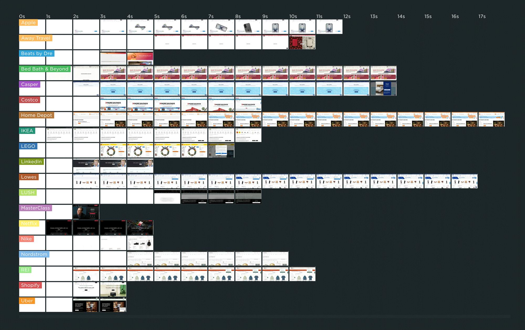
As you can see in this competitive benchmarking leaderboard, rendering speeds varied across pages ranging from Apple to Uber. The fastest campaign page — which belonged to IKEA.com — started to render in about 1 second, which is great to see.
But for many of the other pages, it was common to wait 3 or 4 seconds — or longer! — to see meaningful content.
In this post, we'll cover:
- Why the speed of your campaign landing pages matters... possibly even more than most of the other pages on your site
- Why performance issues on campaign landing pages often go unnoticed
- Common performance issues on landing pages
- A deep dive into the landing page for one of the sites I tracked
- Who should be responsible for the performance of the landing pages on your site?
- What you can do to make sure your campaign landing pages stay fast
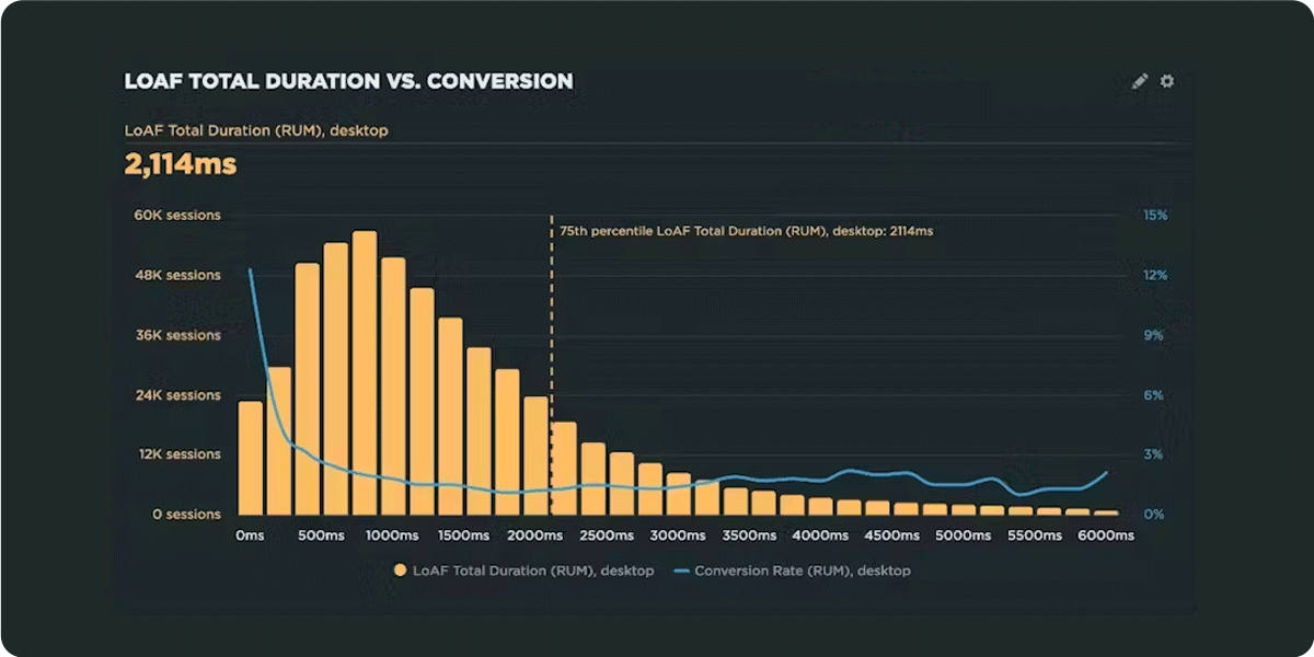
How do Long Animation Frames affect user behavior?
What's the point of a performance metric that doesn't align with user behavior – and ultimately business outcomes? Looking at four different retail sites, we compared each LoAF metric for desktop and mobile and correlated it to conversion rate. We saw some surprising trends alongside some expected patterns.
We recently shipped support for Long Animation Frames (LoAF). We're buzzing with excitement about having better diagnostic capabilities, including script attribution for INP and our new experimental metric, Total Blocking Duration (TBD).
While Andy has gone deep in the weeds on LoAF, in this post let's put the new set of metrics to the test and see how well they reflect the user experience. We'll look at real-world data from real websites and find an answer to the question: How do Long Animation Frames affect user behavior?
NEW! SpeedCurve RUM for your Magento projects
Now you can integrate robust real user monitoring into your Magento project in minutes!
As a product manager, I have to say there are few things more flattering than having our users build apps that empower other folks to use our product.
Hot on the heels of our SpeedCurve RUM for Shopify app is a new open‑source Magento module – from Jesper Ingels and the awesome team at Bluebird Day – that lets you integrate SpeedCurve real user monitoring into your Magento project in minutes – no coding required!
Keep reading to learn the benefits of gathering real user data and how to get started.
How to enable SpeedCurve in your Shopify store

SpeedCurve now has a Shopify app to make installing and using SpeedCurve in your Shopify store much easier. With this app, you can quickly set up real user monitoring – no coding required.
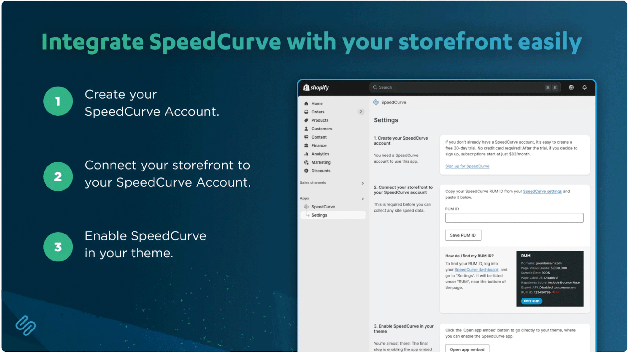
Here's how to install the SpeedCurve RUM app in your Shopify store, along with troubleshooting and next steps.
NEW! SpeedCurve RUM for your Shopify store
If you run a Shopify store, you already know how critical it is to provide a seamless shopping experience. That's why I was so excited when the folks at SpeedCurve asked me to draw on my Shopify experience to build their new RUM app for Shopify storefronts. Now I'm here to let you know how it works and why it's an important part of your UX toolset.
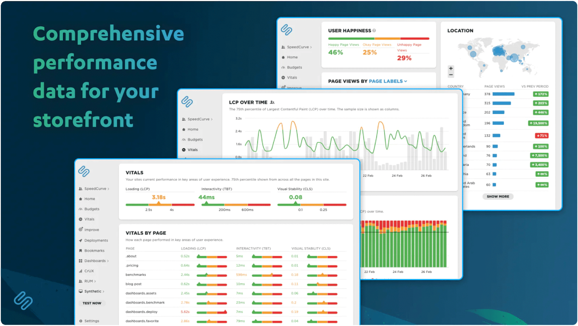
In ecommerce, speed isn’t just nice to have – it’s a competitive advantage. Slow websites lead to frustrated users, lost sales, and damaged brand trust.
With the SpeedCurve RUM app, you can track metrics like Core Web Vitals, identify performance issues, measure the impact of site speed on conversion rates, and stay ahead of page slowdowns – no coding required.
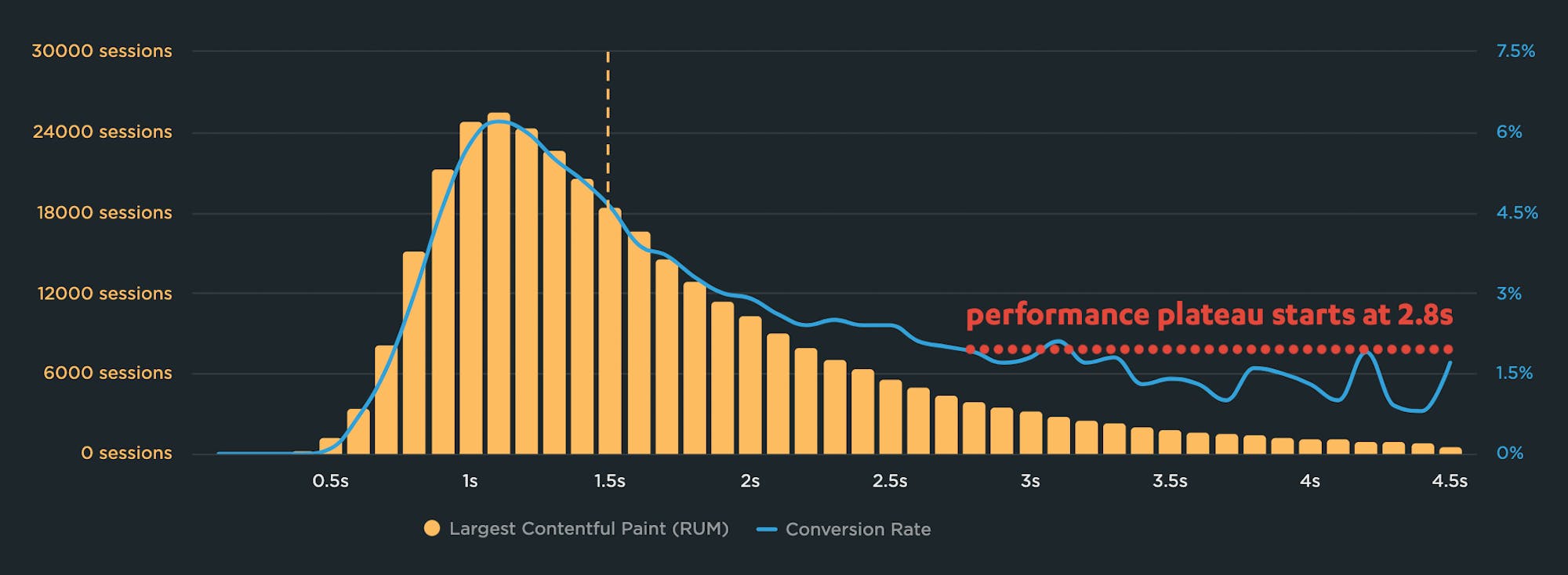
Why you need to know your site's performance plateau (and how to find it)
Have you ever wondered why your site got faster, but your business and user engagement metrics didn't improve? The answer might lie on the performance plateau.
Have you ever asked yourself these questions?
"I made my pages faster, but my business and user engagement metrics didn't change. WHY???"
"How do I know how fast my site should be?"
"How can I demonstrate the business value of page speed to people in my organization?"
The answers might lie with identifying and understanding the performance plateau for your site.
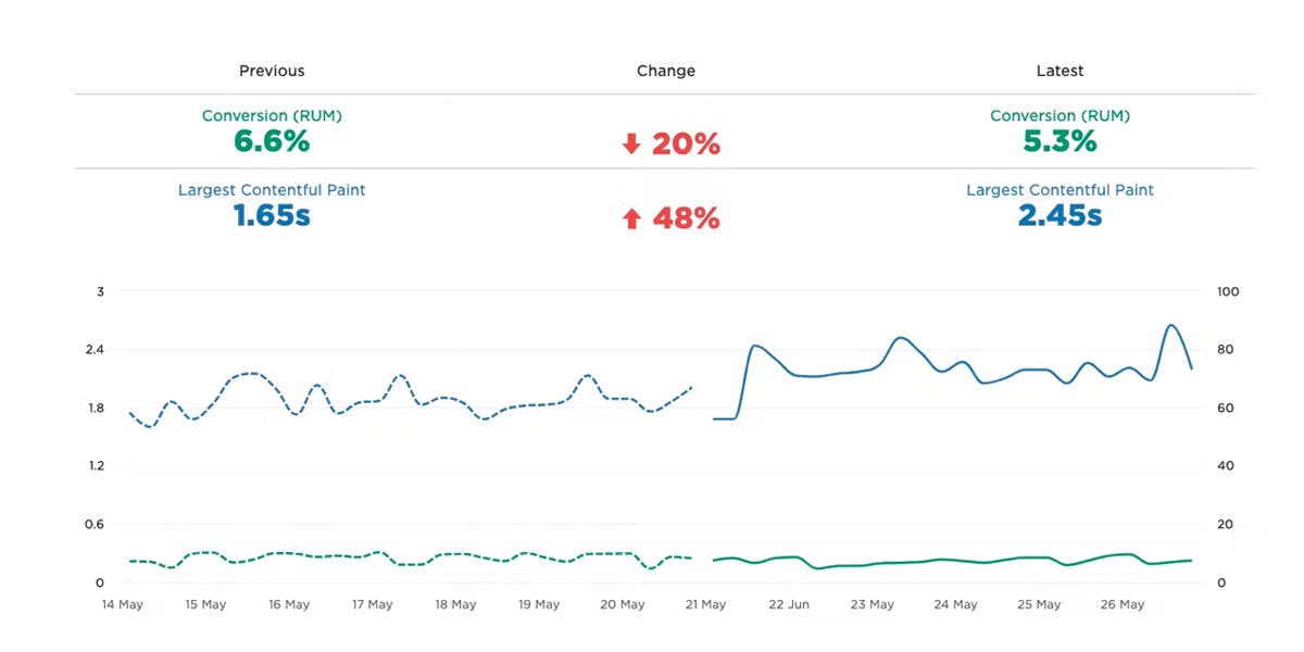
Correlation charts: Connect the dots between site speed and business success
If you could measure the impact of site speed on your business, how valuable would that be for you? Say hello to correlation charts – your new best friend.
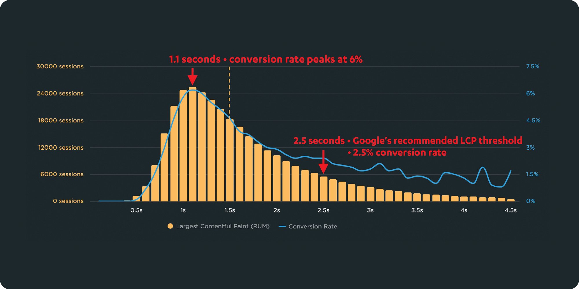
Here's the truth: The business folks in your organization probably don't care about page speed metrics. But that doesn't mean they don't care about page speed. It just means you need to talk with them using metrics they already care about – such as conversion rate, revenue, and bounce rate.
That's why correlation charts are your new best friend.
Downtime vs slowtime: Which costs you more?
Comparing site outages to page slowdowns is like comparing a tire blowout to a slow leak. One is big and dramatic. The other is quiet and insidious. Either way, you end up stranded on the side of the road.

Downtime is horrifying for any company that uses the web as a vital part of its business (which is to say, most companies). Some of you may remember the Amazon outage of 2013, when the retail behemoth went down for 40 minutes. The incident made headlines, largely because those 40 minutes were estimated to have cost the company $5 million in lost sales.
Downtime makes headlines:
- 2015 – 12-hour Apple outage cost the company $25 million
- 2016 – 5-hour outage caused an estimated loss of $150 million for Delta Airlines
- 2019 – 14-hour outage cost Facebook an estimated $90 million
It's easy to see why these stories capture our attention. These are big numbers! No company wants to think about losing millions in revenue due to an outage.
Page slowdowns can cause as much damage as downtime
While Amazon and other big players take pains to avoid outages, these companies also go to great effort to manage the day-to-day performance – in terms of page speed and user experience – of their sites. That’s because these companies know that page slowdowns can cause at least as much damage as downtime.
Mobile INP performance: The elephant in the room

Earlier this year, when Google announced that Interaction to Next Paint (INP) will replace First Input Delay (FID) as the responsiveness metric in Core Web Vitals in *gulp* March of 2024, we had a lot to say about it. (TLDR: FID doesn't correlate with real user behavior, so we don't endorse it as a meaningful metric.)
Our stance hasn't changed much since then. For the most part, everyone agrees the transition from FID to INP is a good thing. INP certainly seems to be capturing interaction issues that we see in the field.
However, after several months of discussing the impending change and getting a better look at INP issues in the wild, it's hard to ignore the fact that mobile stands out as the biggest INP offender by a wide margin. This doesn't get talked about as much as it should, so in this post we'll explore:
- The gap between "good" INP for desktop vs mobile
- Working theories as to why mobile INP is so much poorer than desktop INP
- Correlating INP with user behavior and business metrics (like conversion rate)
- How you can track and improve INP for your pages
Does Interaction to Next Paint actually correlate to user behavior?
Earlier this year, Google announced that Interaction to Next Paint (INP) is no longer an experimental metric. INP will replace First Input Delay (FID) as a Core Web Vital in March of 2024.
Now that INP has arrived to dethrone FID as the responsiveness metric in Core Web Vitals, we've turned our eye to scrutinizing its effectiveness. In this post, we'll look at real-world data and attempt to answer: What correlation – if any – does INP have with actual user behavior and business metrics?
10 things I love about SpeedCurve (that I think you'll love, too)

This month, SpeedCurve enters double digits with our tenth birthday. We're officially in our tweens! (Cue the mood swings?)
I joined the team in early 2017, and I'm blown away at how quickly the years have flown by. Every day, I marvel at my great luck in getting to work alongside an amazing team to build amazing tools to help amazing people like you!
In the spirit of celebration, I thought it would be fun to round up my ten favourite things to do in SpeedCurve (that I think you'll like, too). Keep scrolling to learn how to:
- Fight regressions and stay fast
- See the impact of performance on your business
- Benchmark your site against your competitors
- Track third parties to make sure they're not quietly hurting performance
- Make sure you're tracking the best metrics for your pages
- Get a prioritized list of performance recommendations
- Bookmark and compare synthetic tests and RUM sessions so you can quickly find and fix performance issues
- Run A/B tests so you see how code changes affect your performance and user engagement metrics
- Get customized weekly reports
- Motivate your team with a wall-mounted monitor showing your favourite charts
Exploring performance and conversion rates just got easier
Demonstrating the impact of performance on your users – and on your business – is one of the best ways to get your company to care about the speed of your site.
Tracking goal-based metrics like conversion rate alongside performance data can give you richer and more compelling insights into how the performance of your site affects your users. This concept is not new by any means. In 2010, the Performance and Reliability team I was fortunate enough to lead at Walmartlabs shared our findings around the impact of front-end times on conversion rates. (This study and a number of other case studies tracked over the years can be found at WPOstats.)
Setting up conversion tracking in SpeedCurve RUM is fairly simple and definitely worthwhile. This post covers:
- What is a conversion?
- How to track conversions in SpeedCurve
- Using conversion data with performance data for maximum benefit
- Conversion tracking and user privacy
NEW! RUM Compare dashboard
Exploring real user (RUM) data can be a hugely enlightening process. It uncovers things about your users and their behavior that you never might have suspected. That said, it's not uncommon to spend precious time peeling back the layers of the onion, only to find false positives or uncertainty in all that data.
At SpeedCurve, we believe a big part of our job is making your job easier. This was a major driver behind the Synthetic Compare dashboard we released last year, which so many of you given us great feedback on.
As you may have guessed, since then we've been hard at work coming up with the right way to explore and compare your RUM datasets using a similar design pattern. Today, we are thrilled to announce your new RUM Compare dashboard!
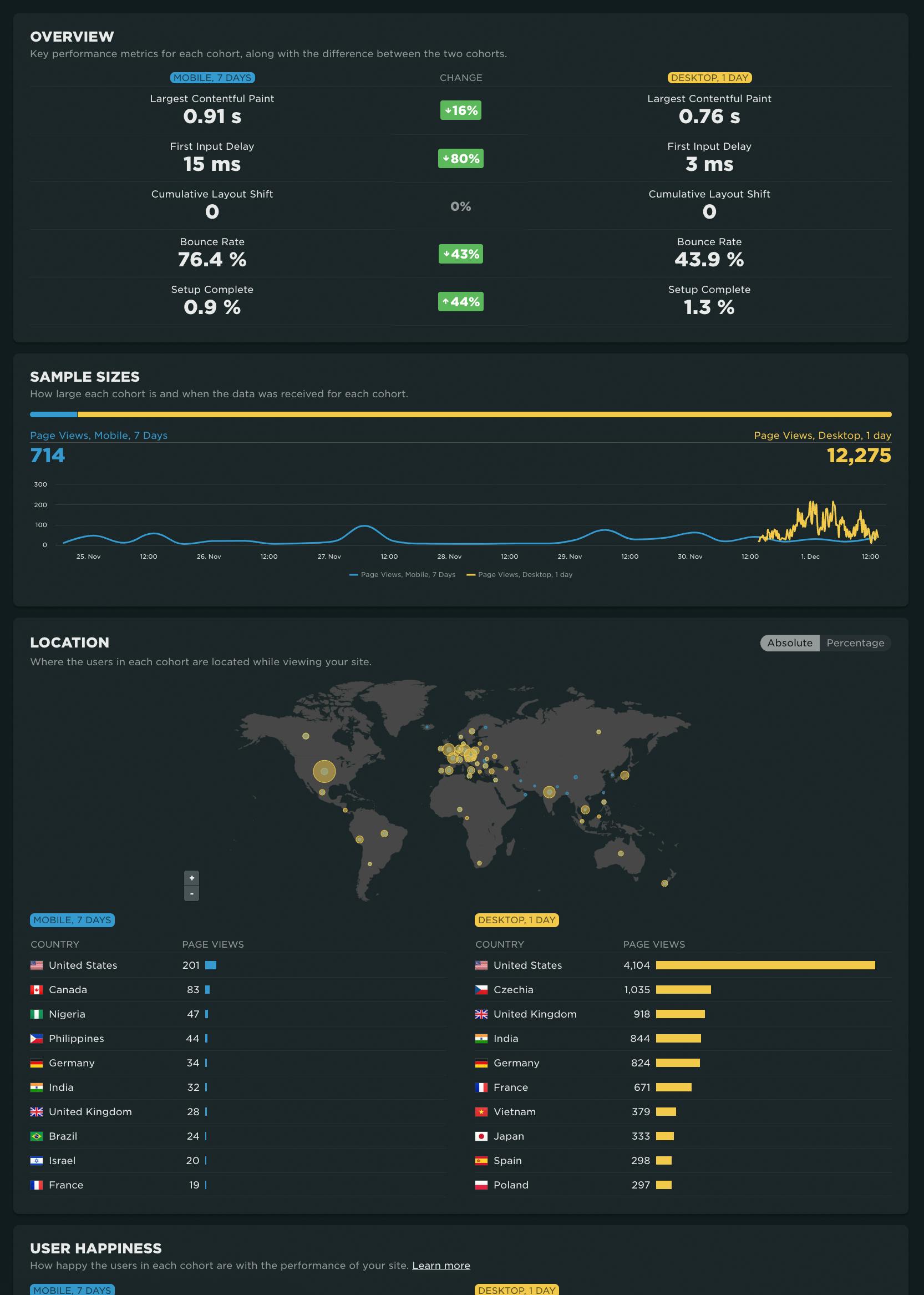
With your RUM Compare dashboard, you can easily generate side-by-side comparisons for any two cohorts of data. Some of the many reasons you might want to do this include:
- Improve Core Web Vitals by identifying the tradeoffs between pages that have different layout and construction
- Triage a performance regression related to the latest change or deployment to your site by looking at a before/after comparison
- Explore and compare different out-of-the-box cohorts, such as device types, geographies, page labels, and more
- Analyze A/B tests or experiments to understand which had the most impact on user behavior, as well as performance
- Optimize your funnel by understanding differences between users that convert or bounce from your site and users who don't
- Evaluate CDN performance by exploring the impact of time-of-day traffic patterns
Let's take a tour...
Cumulative Layout Shift: What it measures, when it works (and doesn't), and how to use it
Back in May, we shared that SpeedCurve supports Google's Core Web Vitals in both our synthetic monitoring and real user monitoring tools. Two of the Web Vitals – Largest Contentful Paint (LCP) and First Input Delay (FID) – were actually available in SpeedCurve for quite a while prior to the announcement. The newcomer to the scene was Cumulative Layout Shift (CLS), and, not surprisingly, it's the metric that's gotten the most questions.
A few of the questions I've been asked (or asked myself) about Cumulative Layout Shift:
- What does CLS measure?
- How is it calculated?
- What does it mean in terms of actual user experience?
- Does it correlate to user behaviour or business metrics in any measurable way?
- What are the (inevitable) gotchas?
- Ultimately, how much should we care about CLS?
Six months in, I've had a chance to gather and look at a lot of data, talk with customers, and learn from our friends in the performance community. Here's what I've learned so far.
