Cumulative Layout Shift: What it measures, when it works (and doesn't), and how to use it

Back in May, we shared that SpeedCurve supports Google's Core Web Vitals in both our synthetic monitoring and real user monitoring tools. Two of the Web Vitals – Largest Contentful Paint (LCP) and First Input Delay (FID) – were actually available in SpeedCurve for quite a while prior to the announcement. The newcomer to the scene was Cumulative Layout Shift (CLS), and, not surprisingly, it's the metric that's gotten the most questions.
A few of the questions I've been asked (or asked myself) about Cumulative Layout Shift:
- What does CLS measure?
- How is it calculated?
- What does it mean in terms of actual user experience?
- Does it correlate to user behaviour or business metrics in any measurable way?
- What are the (inevitable) gotchas?
- Ultimately, how much should we care about CLS?
Six months in, I've had a chance to gather and look at a lot of data, talk with customers, and learn from our friends in the performance community. Here's what I've learned so far.
What does CLS measure?
Cumulative Layout Shift measures how visually stable a page is. It's a formula-based metric that, put very (very) simply, takes into account how much visual content shifts within the viewport, combined with the distance that those visual elements shifted. You can dig deeper into the mechanics of how it's calculated, but the human-friendly definition is that CLS helps you understand how likely a page is to deliver a janky, unpleasant experience to viewers.
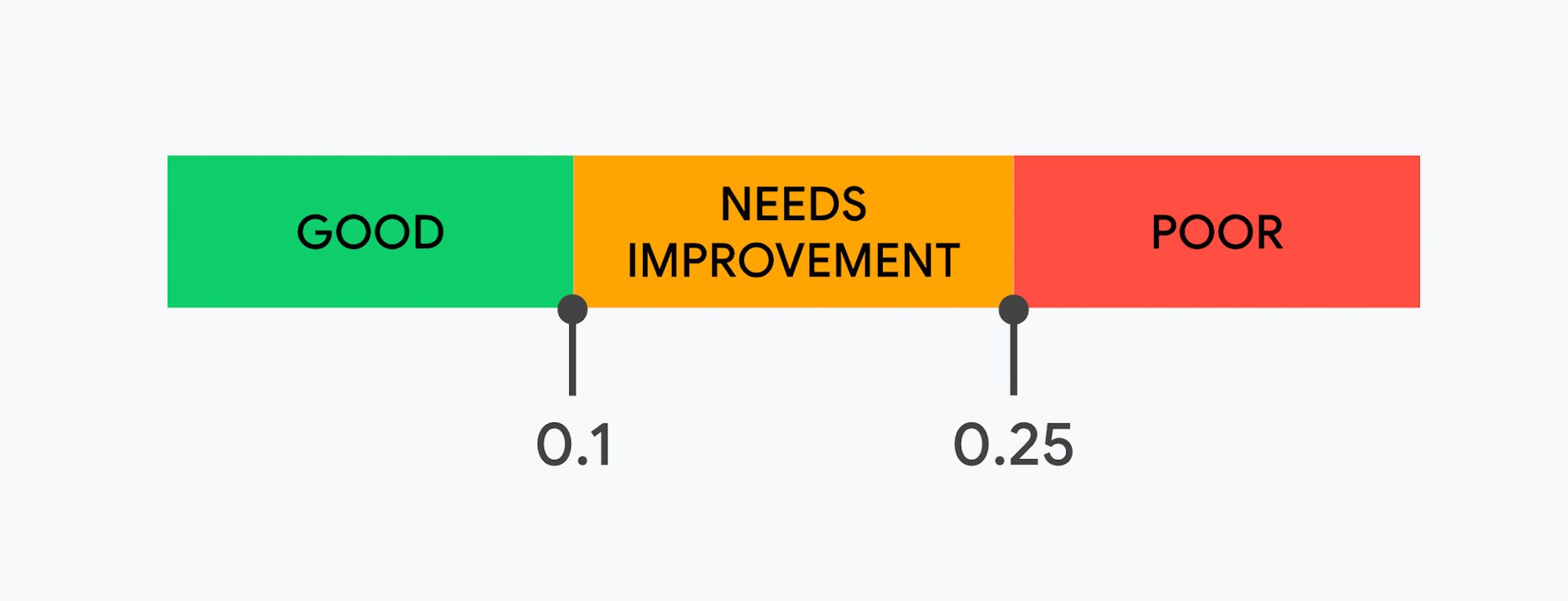
According to Google, pages should maintain a CLS score of less than 0.1 at the 75th percentile for mobile and desktop devices. A score greater than 0.25 is considered poor. (It's important to note that CLS is a boundless measure that, while abnormal, can be greater than 1.)
While I understand why score-based metrics add value, I'm a visual person. Numbers on a chart or in a spreadsheet can only take me so far. Wherever possible, I like to see visuals that show me what that score is trying to teach me, and why it actually matters in terms of user experience and business impact. Fortunately, we have the ability to do both those things in synthetic and real user monitoring (RUM).
What does a poor CLS score look like?
One of the things I like about Cumulative Layout Shift is that it can be measured in both synthetic and RUM. This lets us explore it in a bunch of complementary ways. One of the first things I want to do is look at synthetic data, which lets us generate filmstrip views of pages and see where layout shifts are actually happening.
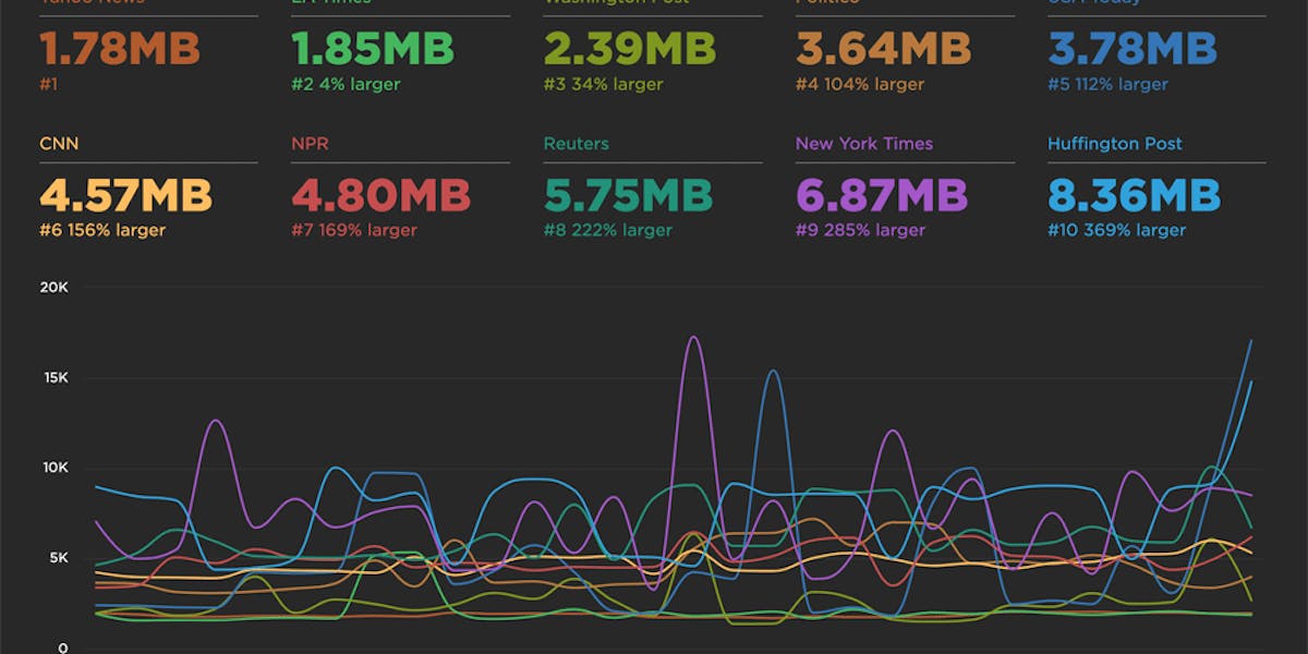
SpeedCurve's Industry Benchmarks dashboard – which tracks the performance of top sites in retail, media, travel, and other industries – is a good place to start. Here are the current US media benchmarks on a fast desktop connection, ranked by CLS score.
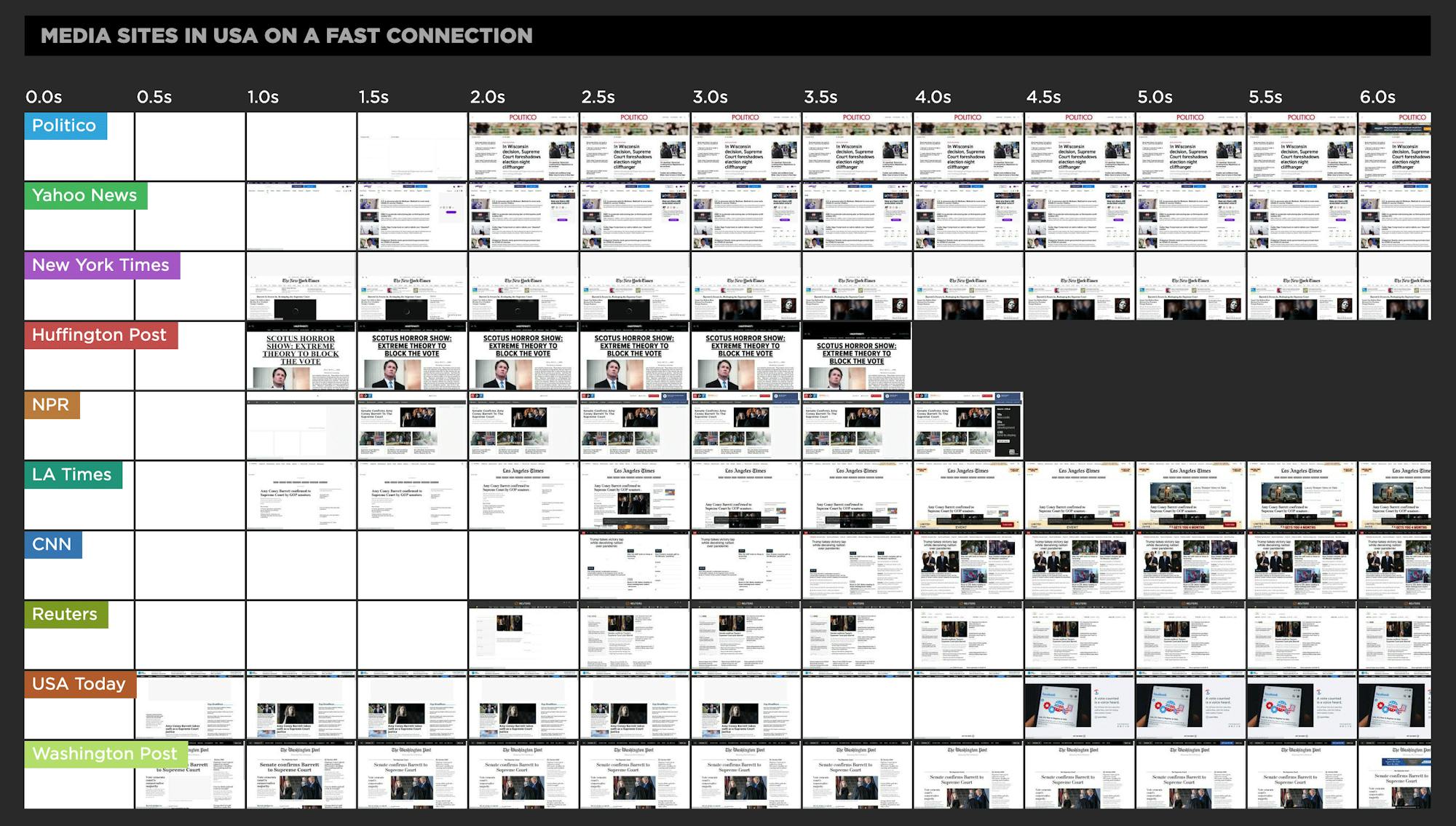
As you can see right away in these filmstrips, a better or worse Cumulative Layout Shift doesn't correlate to faster initial rendering. That's fine, as we don't expect it to. The Washington Post (the bottom filmstrip) has the poorest CLS score, but it's also the first to start rendering. So is this a good user experience, or a poor one? This seems like an invitation to go in for a closer look, so let's do that.
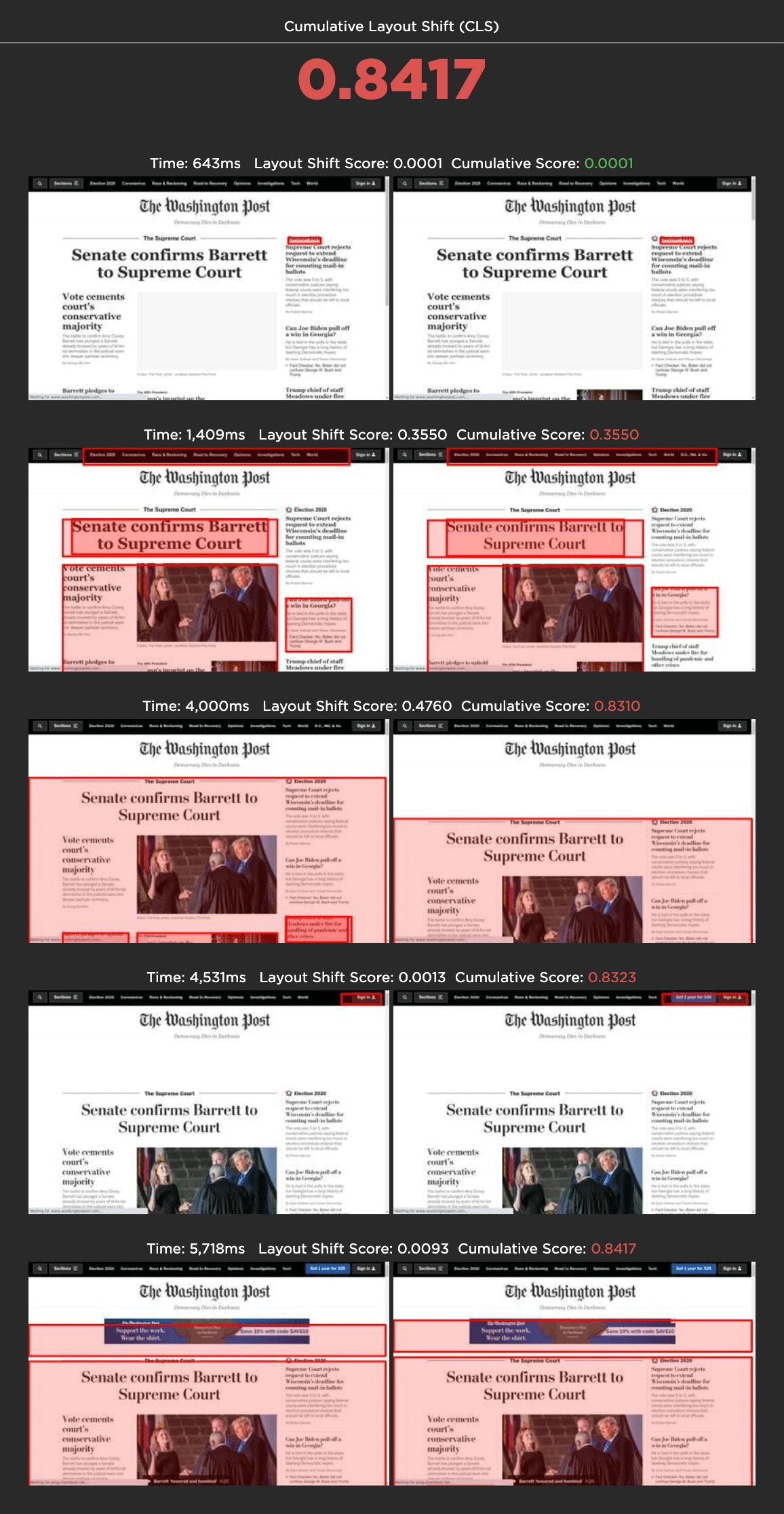
Drilling down into a detailed test page for The Washington Post, the CLS score is 0.8417 – much worse than the 0.1 recommended by Google. As the layout shift visuals below demonstrate, the two biggest culprits appear to be:
- Web fonts – specifically, the fact that there's a significant discrepancy between the sizes of the default and custom fonts.
- Ads that cause the entire editorial body of the page to shift. The size of the shifting element really matters when it comes to calculating CLS. (This issue is explored further in this post, which goes into more detail about page issues that can affect your CLS score and how to troubleshoot them. It's definitely worth a read.)
Looking at these frames, it's easy to see the issues that generated this page's high CLS score. It's a bit trickier to figure out how much these layout shifts actually hurt user-perceived performance – and ultimately the business.
How does CLS correlate to user engagement and business metrics?
This is where it's helpful to look at real user data. If you're already capturing metrics like bounce rate or conversion rate, you can correlate Cumulative Layout Shift scores against them and see if you can spot any trends. (Learn more about correlation charts here.)
In this next set of charts, I looked at a month's worth of anonymized real user monitoring (RUM) data for four different retail sites. The results were interesting.
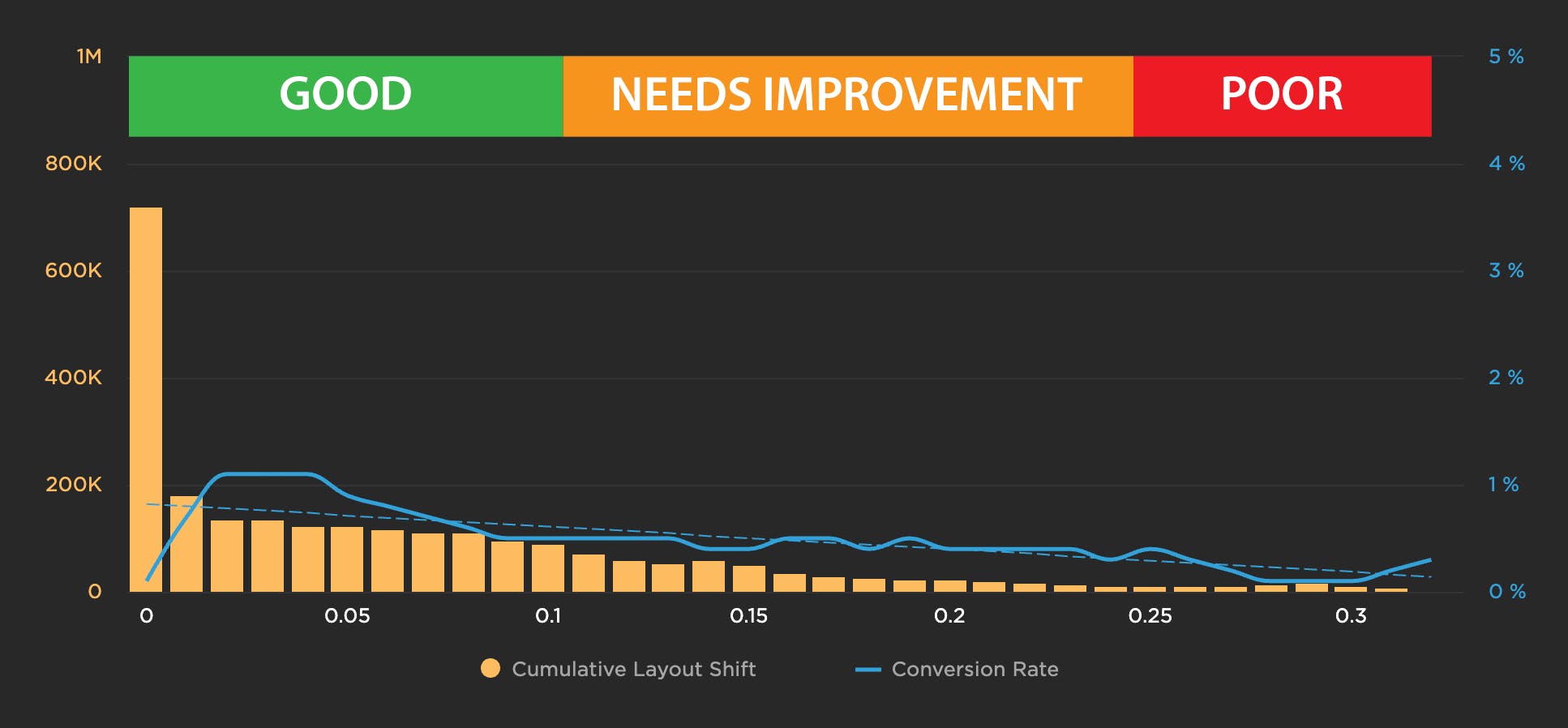
Site 1: Conversion rate drops as CLS score degrades
For this site, conversion behaviour followed Google's CLS guidelines very closely. You can see that the conversion rate is highest in the "good" zone, and it drops off significantly right before hitting 0.1. It plateaus in the "needs improvement" zone, and then takes another sharp dip in the "poor" zone after 0.25. For this site, CLS arguably correlates to buyer behaviour. This site owner might want to look into page issues that could be causing jank and driving away customers.
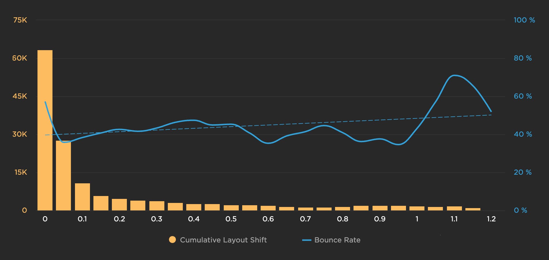
Site 2: Bounce rate gets worse as CLS score degrades
Similar to the chart above, the chart below indicates that user behaviour correlates predictably with poorer CLS scores. For this site, as CLS worsens, so does bounce rate:
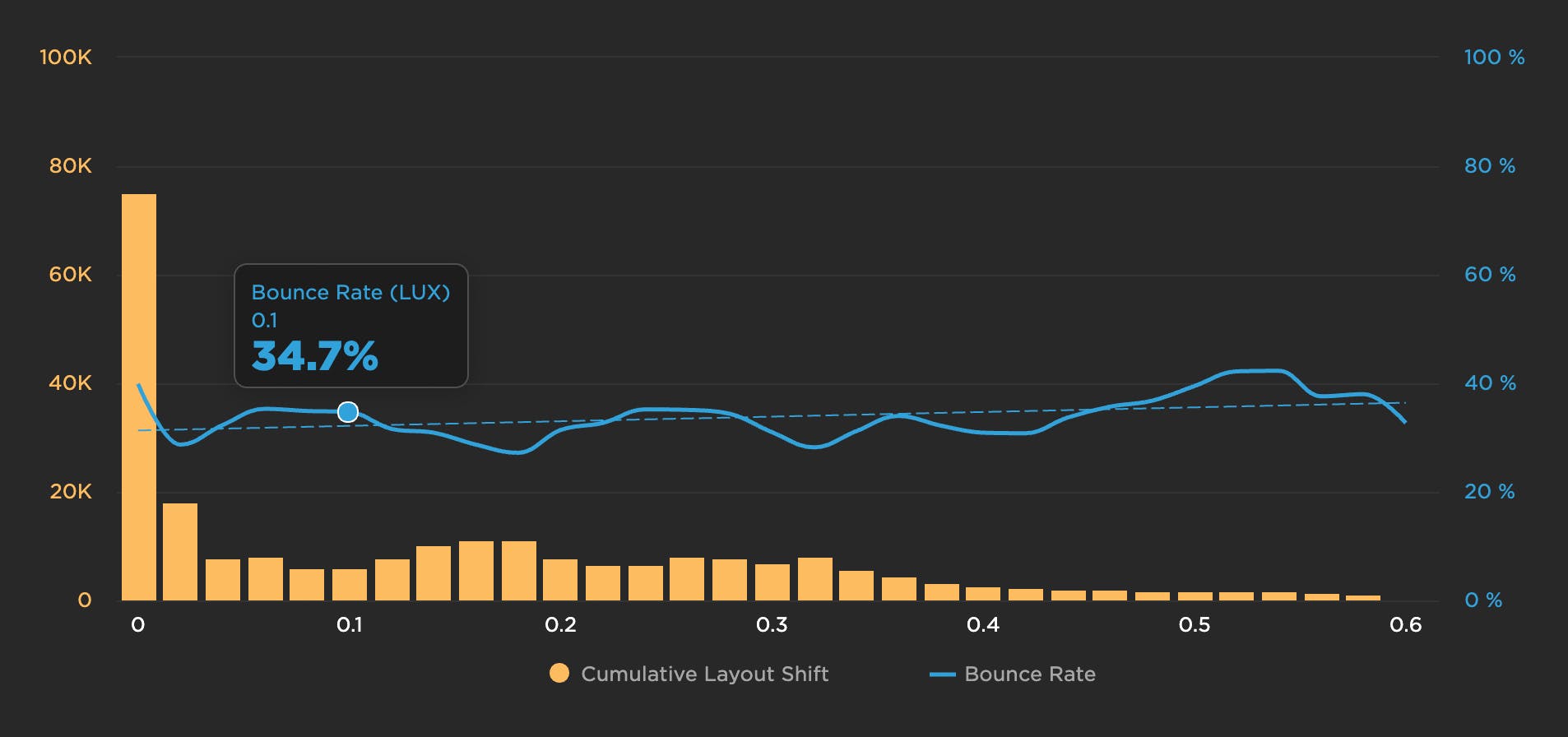
Site 3: Bounce rate doesn't change much as CLS score degrades
If you stopped after looking at the first two correlation charts, you might be convinced that CLS absolutely is a predictor of user experience and behaviour. The chart below, however, shows only a mild worsening of bounce rate as the CLS score degrades:
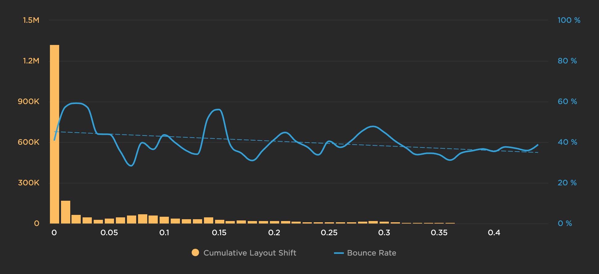
Site 4: Bounce rate *improves* as CLS score degrades
And finally, this chart shows that, as the CLS score gets worse, bounce rate actually gets better:
The reason for sharing these charts is not to cast doubt on the validity and usefulness of CLS as a metric. The point is to illustrate that – like all your other metrics – your CLS scores need to be validated within the context of your own site.
Speaking of validation, this is a good opportunity to talk about validating how you measure CLS via different tools. (Hat tip to my awesome colleague Cliff for sharing his insights with me in this next section!)
Why CLS numbers might be different across tools
While the method for calculating CLS is consistent across tools, there are a couple of gotchas to be aware of when comparing mixed data sets.
1. CLS is an accumulation of layout shifts that occur during a page's life cycle. However, measurement of the life cycle may differ across technologies.
- When measuring with RUM, most tools measure the accumulation of layout shifts that happen before the load event, but stop there.
- The CrUX data set (an invaluable resource provided by Google) measures CLS for Chrome users*, but extends the life cycle until the viewability state of the browser window has changed.
- With synthetic monitoring tools, by default you'll continue to capture layout shifts until the page is considered 'fully loaded'. Most likely, 'fully loaded' happens well after the load event is fired, but as there is no visibility state change due to the absence of a user interaction, the life cycle duration will likely be different.
The differences in the duration of the page life cycle can account for some of the larger discrepancies we've seen in CLS.
*CrUX captures data from Chrome for users who have opted-in, not set up a Sync passphrase, and have usage statistic reporting enabled.
2. Synthetic monitoring is well known for creating a 'lab' environment, where there are few, if any, changes between measurements. Browser version, device, viewport size, network throttling, and CPU throttling all remain constant. This allows you to more accurately baseline the target application.
In the real world, however, you have a complex distribution of various devices and environmental conditions. This can lead to a bit of variability when accumulating layout shifts. If a viewport is much smaller, some shifts may occur below the fold. As network conditions vary, you may see differences in CLS due to slow/fast loading of fonts, and so on.
The point is, measurements in the wild will vary when comparing to a baseline synthetic measurement (or perhaps a Lighthouse test run).
Takeaways
While your CLS score might not always reflect how likely users are to bounce from your site, it's still a useful metric for investigating performance issues. One of the greatest benefits of Cumulative Layout Shift is that it makes us think outside of the usual time-based metrics, and instead it gets us thinking about the other subtle ways that unoptimized page elements can degrade the user experience.
As you start to track CLS on your own site, keep in mind that your results may vary depending on how your pages are built, which measurement tools you use, and whether you're looking at RUM or synthetic data. If you use both synthetic and RUM monitoring:
- Use your RUM data for your source of truth. Set your performance budgets and provide reporting with this data. Expect RUM and CrUX data to become more aligned over time.
- Use synthetic data to visually identify where shifts are happening and improve from there. Focus on the largest layouts first. Some shifts are so small that you may not want to bother chasing them.
I'd love to hear people's thoughts on measuring and analyzing CLS in the real world!