SpeedCurve is now part of the Embrace family! There are no changes to how you use our products. Our founder Mark shares what this means...
New! Web Performance Guide

Our customers often tell us how much they appreciate the user-friendliness of the articles we create for them, so we recently decided to make them available to everyone (not just SpeedCurve users). Introducing the Web Performance Guide!

The Web Performance Guide is – as its name suggests – a collection of articles we've been writing over the years to answer the most common questions we field about performance topics like site speed, why it matters, how it's measured, website monitoring tools, metrics, analytics, and optimization techniques.
You'll find the articles grouped into these topics...
Performance Hero: Estela Franco

Continuing our series of Performance Heroes, this month we celebrate Estela Franco! Estela is a passionate web performance and technical SEO specialist with more than ten years of contributing to our community. She loves to talk and share about web performance optimization, technical SEO, JavaScript, and Jamstack whenever she can.

NEW: RUM attribution and subparts for Interaction to Next Paint!
Now it's even easier to find and fix Interaction to Next Paint issues and improve your Core Web Vitals.
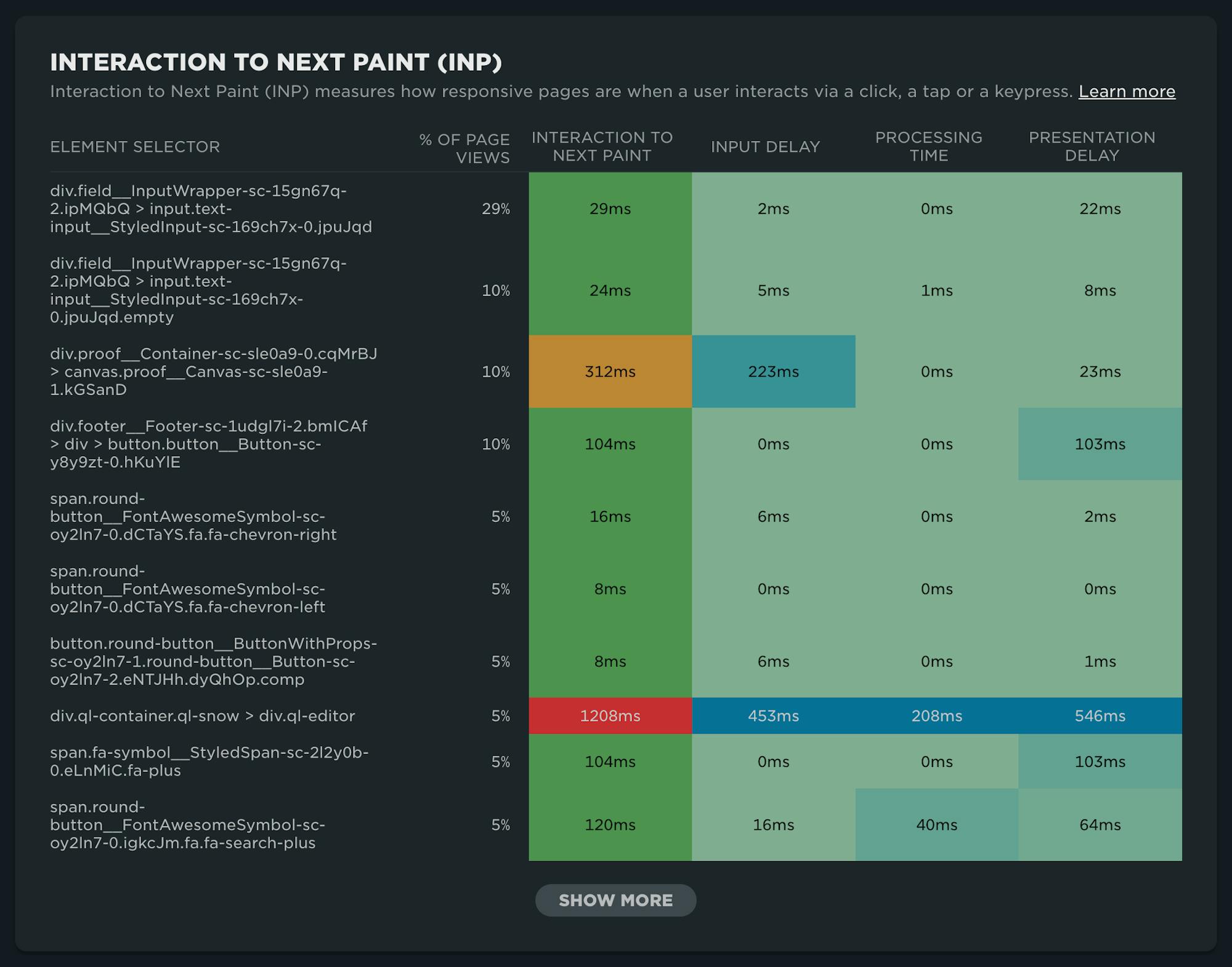
Our newest release continues our theme of making your RUM data even more actionable. In addition to advanced settings, navigation types, and page attributes, we've just released more diagnostic detail for the latest flavor in Core Web Vitals: Interaction to Next Paint (INP).
This post covers:
- Element attribution for INP
- A breakdown of where time is spent within INP, leveraging subparts
- How to use this information to find and fix INP issues
- A look ahead at RUM diagnostics at SpeedCurve
Performance Hero: Paul Calvano
Celebrating performance wins is critical to a healthy, well-supported, high-performing team. This isn't a new idea. In fact, it's something that started in the early days of web performance when Lara Hogan, who was an engineering manager at Etsy at the time, discussed the practice of empowering people across the organization by celebrating 'performance heroes'.

In that spirit, we're reigniting the tradition of spotlighting Performance Heroes from our awesome community. It seems appropriate that we'd start with someone who is currently focused on keeping Etsy's site as fast as possible: Paul Calvano
Not only has Paul had a long career dedicated to making the web faster for some of the largest and most popular sites in the world, he is humble, incredibly talented, and one of the kindest people you'll ever meet.
Five ways cookie consent managers hurt web performance (and how to fix them)
Cookie consent popups and banners are everywhere, and they're silently hurting the speed of your pages. Learn the most common problems – and their workarounds – with measuring performance with content manager platforms in place.

I've been spending a lot of time looking at the performance of European sites lately, and have found that the consent management platforms (CMPs) consistently create a false reality for folks when trying to understand performance using synthetic monitoring. Admittedly, this is not a new topic, but I feel it's important enough that it warrants another PSA.
In this post, I will cover some of the issues related to measuring performance with CMPs in place and provide some resources for scripting around consent popups in SpeedCurve.
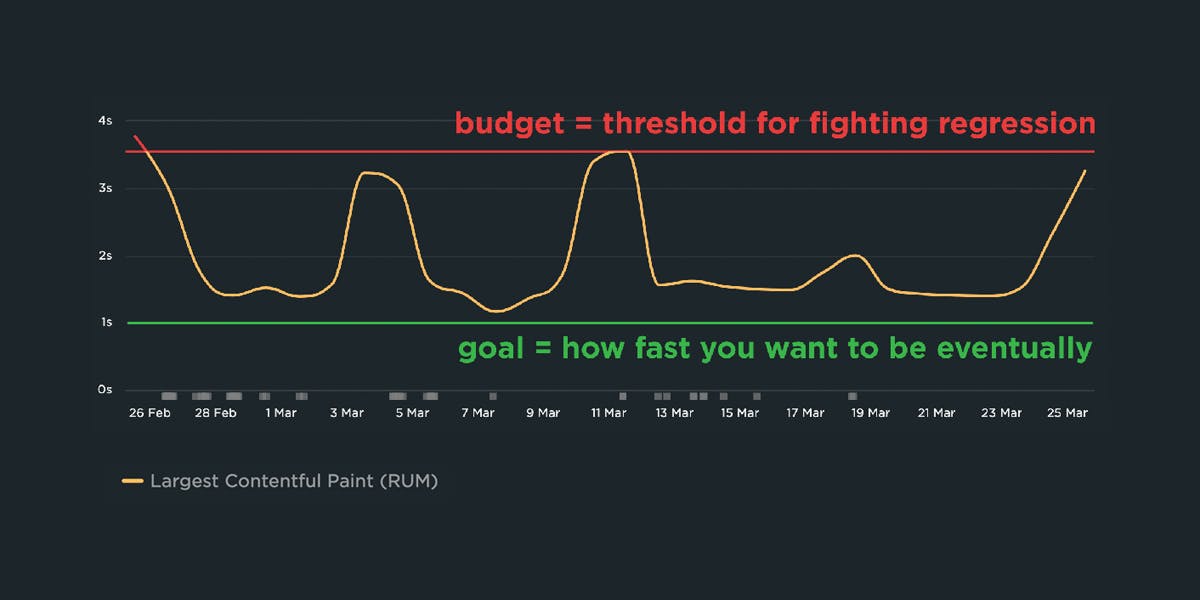
A Complete Guide to Web Performance Budgets
It's easier to make a fast website than it is to keep a website fast. If you've invested countless hours in speeding up your site, but you're not using performance budgets to prevent regressions, you could be at risk of wasting all your efforts.
In this post we'll cover how to:
- Use performance budgets to fight regressions
- Understand the difference between performance budgets and performance goals
- Identify which metrics to track
- Validate your metrics to make sure they're measuring what you think they are – and to see how they correlate with your user experience and business metrics
- Determine what your budget thresholds should be
- Focus on the pages that matter most
- Get buy-in from different stakeholders in your organization
- Integrate with your CI/CD process
- Synthesize your synthetic and real user monitoring data
- Maintain your budgets
This bottom of this post also contains a collection of case studies from companies that are using performance budgets to stay fast.
Let's get started!
Navigate your way to better performance with prerendering and the bfcache
I was inspired by Tim Vereecke's excellent talk on noise-cancelling RUM at PerfNow this past November. In this talk, he highlighted a lot of the 'noise' that comes along with capturing RUM data. Tim's approach was to filter out the noise introduced by really fast response times that can be caused by leveraging the browser cache, prerendering, and other performance optimization techniques.
I thought Tim's focus on 'human viewable navigations' was a great approach to use when looking at how to improve user experience. But there also may be times when you want to understand and embrace the noise. Sometimes there are opportunities in the signals that we often forget are there.
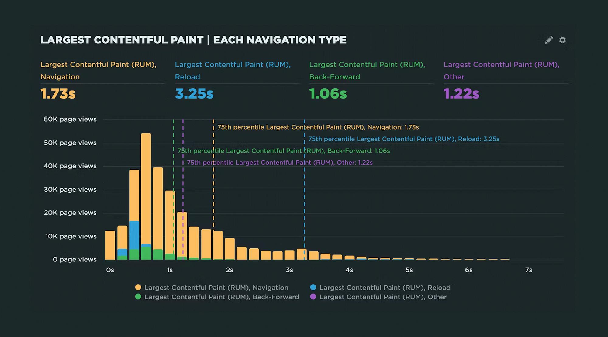
In this post, I'll demonstrate how you can use SpeedCurve RUM to identify all types of navigations, their performance impact, and potential opportunities for delivering lightning-fast page speed to your users.
We'll cover things like:
- Understanding SPA navigations and performance
- Whether or not to track hidden pages (such as pages opened in background tabs)
- How to take advantage of prerendering and the back-forward cache (aka bfcache)
Hello INP! Here's everything you need to know about the newest Core Web Vital

After years of development and testing, Google has added Interaction to Next Paint (INP) to its trifecta of Core Web Vitals – the performance metrics that are a key ingredient in its search ranking algorithm. INP replaces First Input Delay (FID) as the Vitals responsiveness metric.
Not sure what INP means or why it matters? No worries – that's what this post is for. :)
- What is INP?
- Why has it replaced First Input Delay?
- How does INP correlate with user behaviour metrics, such as conversion rate?
- What you need to know about INP on mobile devices
- How to debug and optimize INP
And at the bottom of this post, we'll wrap thing up with some inspiring case studies from companies that have found that improving INP has improved sales, pageviews, and bounce rate.
Let's dive in!
Continuous performance with guardrails and breadcrumbs


The hardest part about web performance isn’t making your site faster – it’s keeping it that fast. Hearing about a company that devoted significant effort into optimizing their site, only to find their performance right back where it started a few months later, is all too familiar.
The reality is that, as critical as site speed is, it’s also very easy to overlook. It doesn’t jump out like a blurry image or a layout issue. And the majority of modern tools and frameworks that are used to build sites today make it all too easy to compound the issue.
Making performance more visible throughout the development process is one of the most critical things a company can do.
I like to think of it as setting up guardrails and breadcrumbs.
- We need guardrails to help protect us from shipping code that will result in unexpected regressions.
- We need breadcrumbs that we can follow back to the source to help us identify why a metric may have changed.
Guardrails and breadcrumbs need to work together. Setting up guardrails without the ability to dive in more will lead to frustration. Having proper breadcrumbs without guardrails in place all but assures we will constantly be fighting regressions after they’ve already wreaked havoc on our sites and our users.
Let’s take a look at both of these concepts and how they should work together.
NEW: On-demand testing in SpeedCurve!

Image by Freepik
On-demand testing has sparked a lot of discussion here at SpeedCurve over the past year. You've always had the ability to manually trigger a round of tests – based on the scheduled tests in your settings – using the 'Test Now' button. But there hasn't been a lot of flexibility to support nuanced use cases, such as...
"I just deployed changes to my site and want to check for any regressions."
"I saw a change to my RUM data and I want to see if I can replicate it with synthetic for further diagnostics."
"I have a paused site that I don't want to test regularly, but would like to test from time to time."
"Please just let me test any URL I want without setting up a site and scheduling testing."
"I need to quickly debug this script without kicking off tests for my entire site."
"I would like to get a first look at a page in order to troubleshoot regressions I saw in RUM."
Based on your feedback, we've just launched new capabilities for on-demand testing. We're pretty excited about these, and we hope you will be, too!
In this post, we'll:
- Highlight the differences between on-demand and scheduled testing
- Cover the various types of on-demand testing, including some of the more common use cases we've heard from SpeedCurve users
- Step you through running an on-demand test
Let's goooooooo!
