Correlation charts: Connect the dots between site speed and business success
If you could measure the impact of site speed on your business, how valuable would that be for you? Say hello to correlation charts – your new best friend.
Here's the truth: The business folks in your organization probably don't care about page speed metrics. But that doesn't mean they don't care about page speed. It just means you need to talk with them using metrics they already care about – such as conversion rate, revenue, and bounce rate.
That's why correlation charts are your new best friend.
What is a correlation chart?
A correlation chart is a powerful data visualization that shows you the relationship between your page speed metrics and your business and user engagement metrics.
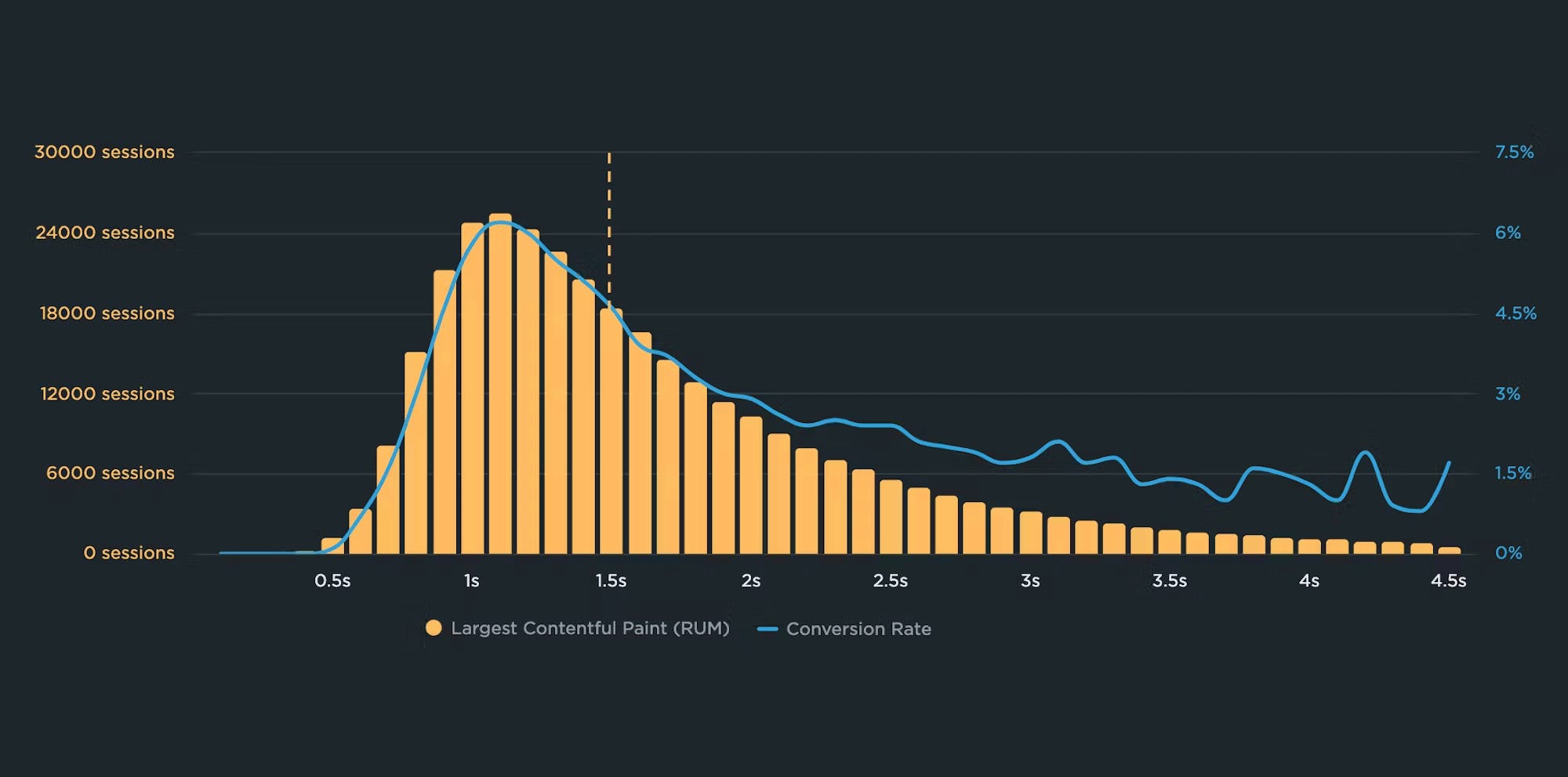
Correlation charts are generated using real user monitoring (RUM) data. They give you a histogram view of all your user traffic, broken out into cohorts based on performance metrics, such as Start Render, Largest Contentful Paint, Interaction to Next Paint, and more. Each cohort shows you the median time for whatever metric you're tracking for the session. (Those cohorts are represented in the yellow columns in the chart below.)
The next layer of the chart is where things get really interesting.
You also get an overlay (the blue line in the chart below) that shows you the business or user engagement metric – commonly conversion rate or bounce rate, but there are many more – that correlates to each of these cohorts. This lets you see at a glance how closely your business/engagement metric aligns with the speed of your site.
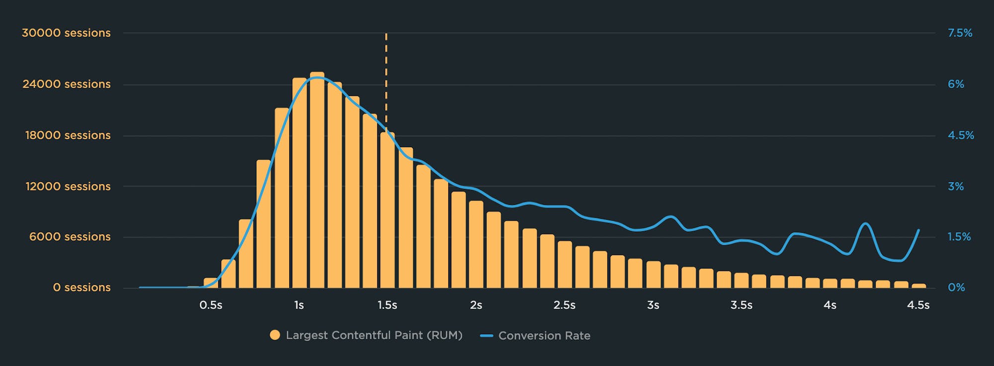
As pages get slower for this site, conversion rate (predictably) decreases. The cohort of users who experienced Largest Contentful Paint times of 1.1 second also had the highest conversion rate – more than 6 percent!
You can also see how quickly conversions drop off as LCP time degrades. At 2.5 seconds – which is Google's recommended threshold for LCP – the conversion rate is well under 3 percent. That's a huge drop!
Communicate to a broad audience
Correlation charts let even the most non-technical stakeholder easily see the connection between performance and the business KPIs they care about.
In my experience with talking about performance to a wide variety of audiences, correlation charts can be extremely effective in winning performance buy-in from key people in your organization. Not everyone understands the nuances of Core Web Vitals. But everyone understands revenue and bounce rate.

Image by pch.vector on Freepik
Identify the performance plateau for your site
If you've ever made your pages faster but didn't see any changes in your business or user engagement metrics, you were probably frustrated – and understandably so. When setting page speed goals for your site, you need to understand your performance plateau. To do this, you first need to create a correlation chart.
The performance plateau is the point at which changes to your pages' rendering metrics (such as Start Render and Largest Contentful Paint) cease to matter because you’ve bottomed out in terms of business and user engagement metrics.
In other words, if your performance metrics are on the performance plateau, making them a couple of seconds faster probably won't help your business.
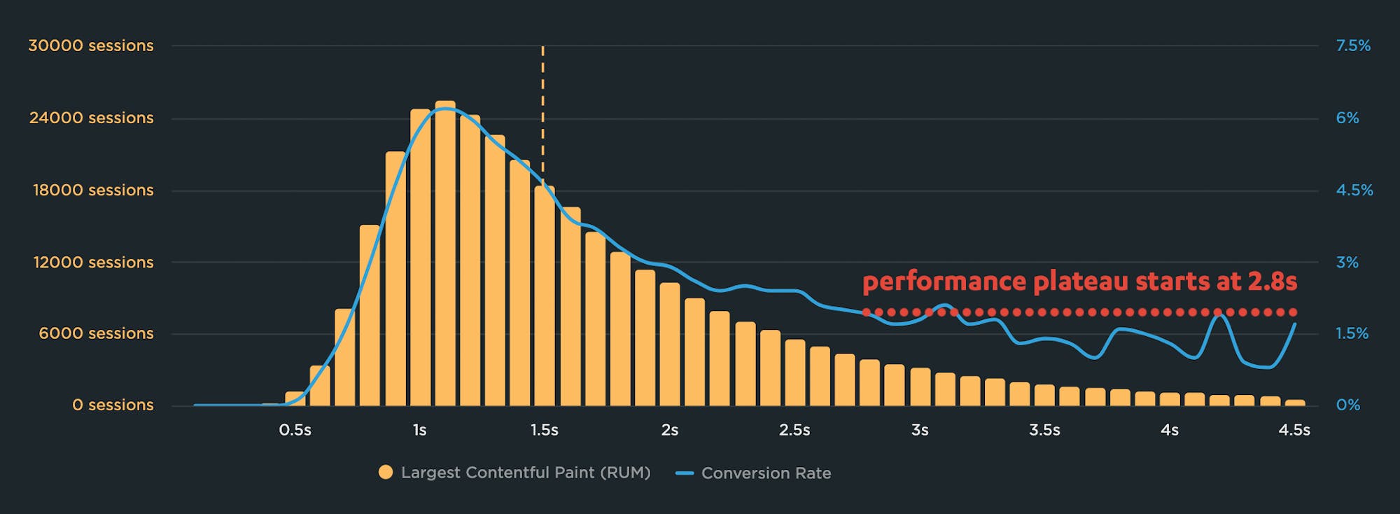
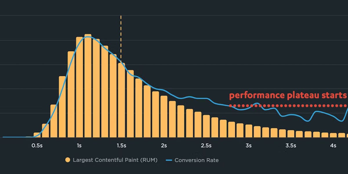
A correlation chart is an essential tool in identifying your performance plateau. For this site, the conversion rate plateaus at 2.8 seconds. To improve conversions, you would need to move more traffic to the higher-converting side of the chart – as close to 1.1 seconds as possible.
Validate your metrics
You don't want to waste time optimizing metrics that ultimately don't move the needle for your business or users. Correlation charts help you validate the performance metrics you're tracking and optimizing.
For example, when Google was in the process of evaluating Interaction to Next Paint (INP) as the new interactivity metric in Core Web Vitals, we conducted an independent analysis to validate that INP is a meaningful page speed metric. (By our definition, a meaningful metric is one that can be demonstrated to affect business or user engagement KPIs.)

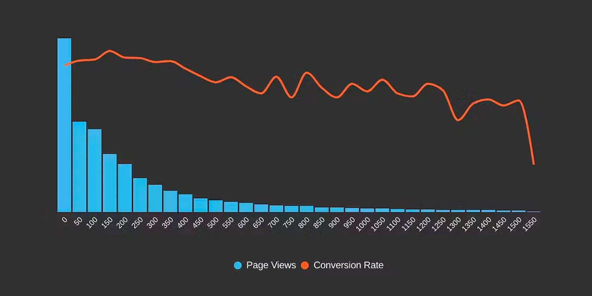
In this correlation chart, the fastest INP time (48ms) correlates to a 9% conversion rate for this retail site. An INP degradation of just 50ms correlates to a 7.6% conversion rate – a significant drop!
My fellow SpeedCurver Cliff Crocker looked at RUM data for several sites – and specifically focused on correlation charts for each site. Cliff determined that, yes, having a faster Interaction to Next Paint Time typically does correlate to better conversion rates. Knowing this, most people should feel confident that optimizing INP is a smart move.
Spot performance-blocking trends
You can even use correlation charts to see the relationship between page-construction metrics – like blocking JavaScript, blocking CSS, and number of image requests – with your other metrics! This lets you spot trends on your pages that could be hurting performance and your business.
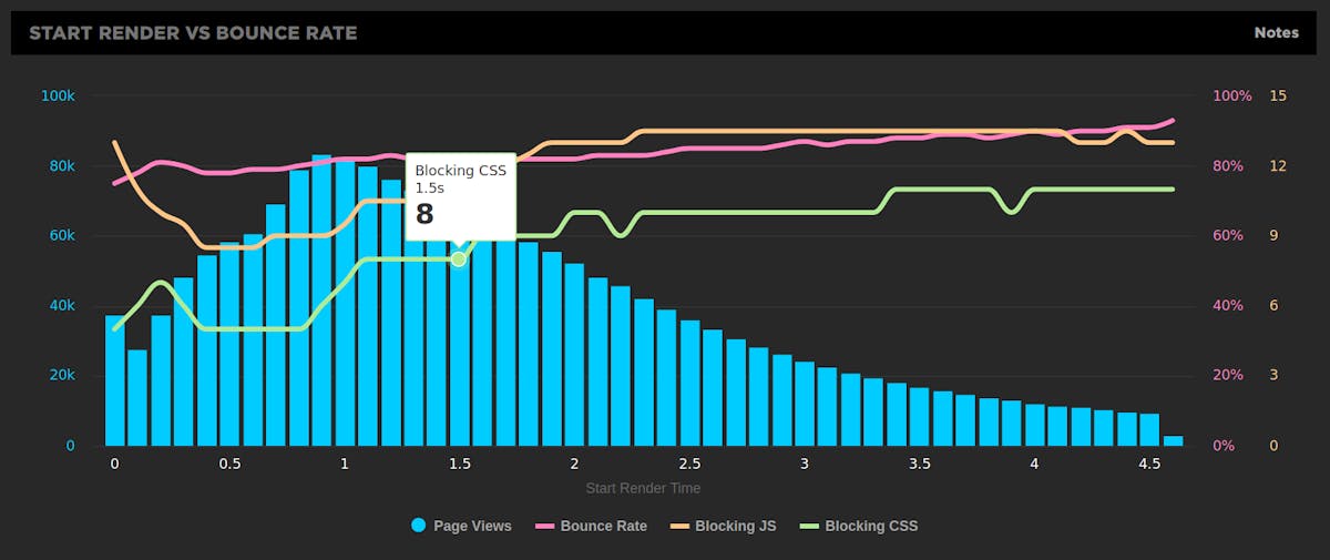
For example, in the chart above, you can see that while there are fewer blocking resources on the faster pages, this number takes a sharp upturn starting with the cohort of pages that have a start render time of 1.1 seconds.
If your goal is to deliver faster start render times to more users (and 1.1 seconds is a pretty good goal to shoot for), then this might trigger you to do an audit of your pages to analyze how your scripts and stylesheets are being executed.
Get started
We care about more than just showing you all your real user data. We want to show you the most important data. And we want to make it easy for you to share that data with people throughout your organization.
If you’re already a SpeedCurve RUM user: Simple correlation charts are available at the top of your RUM > Users dashboard. We capture bounce rate by default, so you'll see a correlation chart that shows you the relationship between Start Render and bounce rate.
You can easily create custom correlation charts in your Favorites dashboard. You can also add your own conversion rate data – as well as other data like cart size and revenue.
Questions? Send us a note at support@speedcurve.com.
If you're a SpeedCurve Synthetic user, but haven't tried RUM yet: Start your free trial any time! All you have to do is grab the RUM ID for your team – on the RUM page visible in the main navbar when you log in – and install the RUM JS snippet on your site. Email us at support@speedcurve.com if you have any questions!
If you’re not a SpeedCurve user: Sign up for your free trial and get these powerful charts for your own site.


