SpeedCurve Recipes: Multi-step test scripting made easy!

You may already know that SpeedCurve lets you test multiple URLs for a site across a wide selection of browsers, devices, connection types, and geolocations.
You may also know that SpeedCurve lets you add synthetic scripts to your test settings, which lets you easily do things like simulate a repeat view or block a third party.
But did you also know that we've made it easy to simulate more complex use cases? These include:
- User journeys through your site
- Checkout processes
- Submit a login form
- SPA and AJAX navigations
- Set cookies
Keep reading to learn how Recipes make it easy for you to test a variety of scenarios that can help you understand how your visitors are experiencing your site – and how to improve their experience!
NEW! Lighthouse 10, Core Web Vitals updates, and Interaction to Next Paint
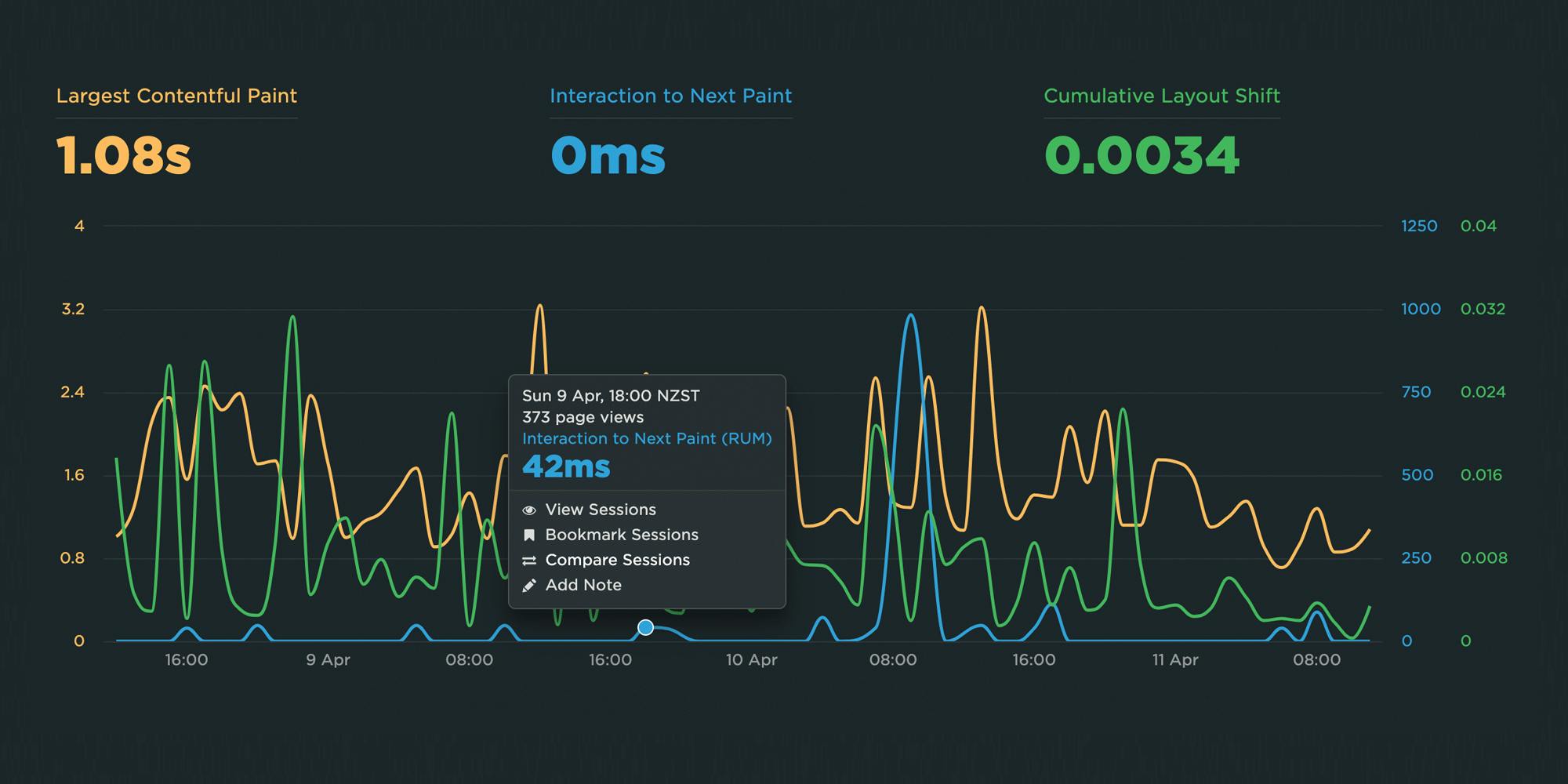
There is a lot of excitement in the world of web performance these days, and April has been no exception! At SpeedCurve, we've been focused on staying on top of the items that affect you the most.
Here is a look at what's new in SpeedCurve:
- Support for Lighthouse 10, including metric scoring changes as well as audits
- Updated RUM Core Web Vitals, including the much-anticipated addition of Interaction to Next Paint (INP)
All of this work driven by the community is having a big impact in our collective goal to make performance accessible for everyone.
Read on to learn more about these exciting changes!
NEW! Home, Site, Page and Tests dashboards
Things have been busy over here at SpeedCurve HQ! Coming off of the back of our latest RUM Compare dashboard release, we are super excited to launch four new dashboards to make your life better, your work easier, and your websites faster.
- Home - Well, now you have one. We needed a place for folks to land when they were jumping into all that SpeedCurve has to offer. The newly released Home page is a great starting place, pulling together views of both RUM and Synthetic data and directing you on where to dig in next.
- Sites - We've rebuilt our Sites dashboard to give you a holistic look across all of the URLs you are monitoring. Start here to understand which areas of your site need the most attention and identify areas you can have the most impact.
- Pages - This detailed view gives you trended information for all the metrics you know and love. Easily identify areas of opportunity and how things are performing over time for specific pages you are monitoring.
- Tests - We've had a lot of requests for this, so we're happy to deliver it. You can now see a list of your latest synthetic tests and spot any failed tests.
Let's take a look!
NEW! RUM Compare dashboard
Exploring real user (RUM) data can be a hugely enlightening process. It uncovers things about your users and their behavior that you never might have suspected. That said, it's not uncommon to spend precious time peeling back the layers of the onion, only to find false positives or uncertainty in all that data.
At SpeedCurve, we believe a big part of our job is making your job easier. This was a major driver behind the Synthetic Compare dashboard we released last year, which so many of you given us great feedback on.
As you may have guessed, since then we've been hard at work coming up with the right way to explore and compare your RUM datasets using a similar design pattern. Today, we are thrilled to announce your new RUM Compare dashboard!
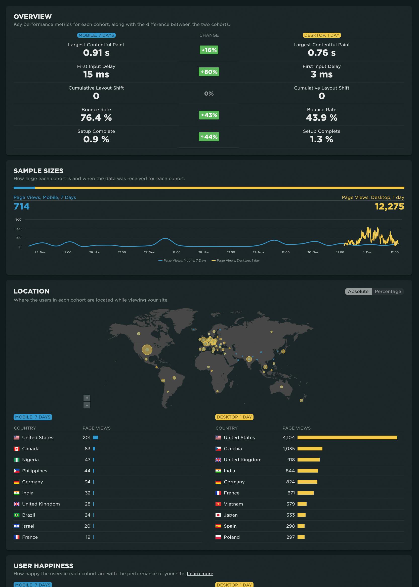
With your RUM Compare dashboard, you can easily generate side-by-side comparisons for any two cohorts of data. Some of the many reasons you might want to do this include:
- Improve Core Web Vitals by identifying the tradeoffs between pages that have different layout and construction
- Triage a performance regression related to the latest change or deployment to your site by looking at a before/after comparison
- Explore and compare different out-of-the-box cohorts, such as device types, geographies, page labels, and more
- Analyze A/B tests or experiments to understand which had the most impact on user behavior, as well as performance
- Optimize your funnel by understanding differences between users that convert or bounce from your site and users who don't
- Evaluate CDN performance by exploring the impact of time-of-day traffic patterns
Let's take a tour...
Page labels: Why they are important and how to use them
Labeling your pages in your synthetic and real user monitoring (RUM) tools is a crucial step in your performance monitoring setup. We recently released some exciting new capabilities for labeling your RUM pages that we want to share with you. This is also a great opportunity to reiterate why page labels are important, and to show you how easy it is to apply labels to your pages.
Why should I care about page labels?
There are so many benefits to labeling your pages in both your synthetic and real user monitoring (RUM) tools. Page labels give you the ability to:
- Compare and benchmark similar pages across different sites
- Create more meaningful performance budgets in RUM
- Correlate RUM data with synthetic diagnostics in the same charts (e.g., for Core Web Vitals that are measurable in synthetic and RUM)
- Prioritize performance optimizations according to their projected impact on real users
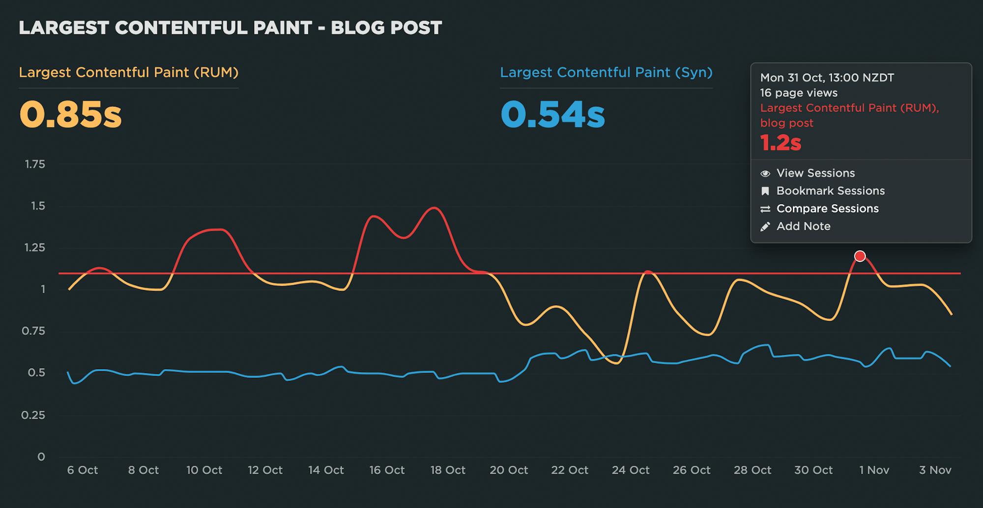
Ready to learn more? Let's get to it!
July 2022 product update: Web Vitals support, more synthetic test agents & performance heat maps

It's been another busy month here at SpeedCurve! Check out our latest product updates below.
June 2022 product update: Performance recommendations on Vitals dashboard, RUM path filters & more

We've been busy here at SpeedCurve HQ! Here's a roundup of our recent product updates.
NEW: RUM Live and Page Views dashboards
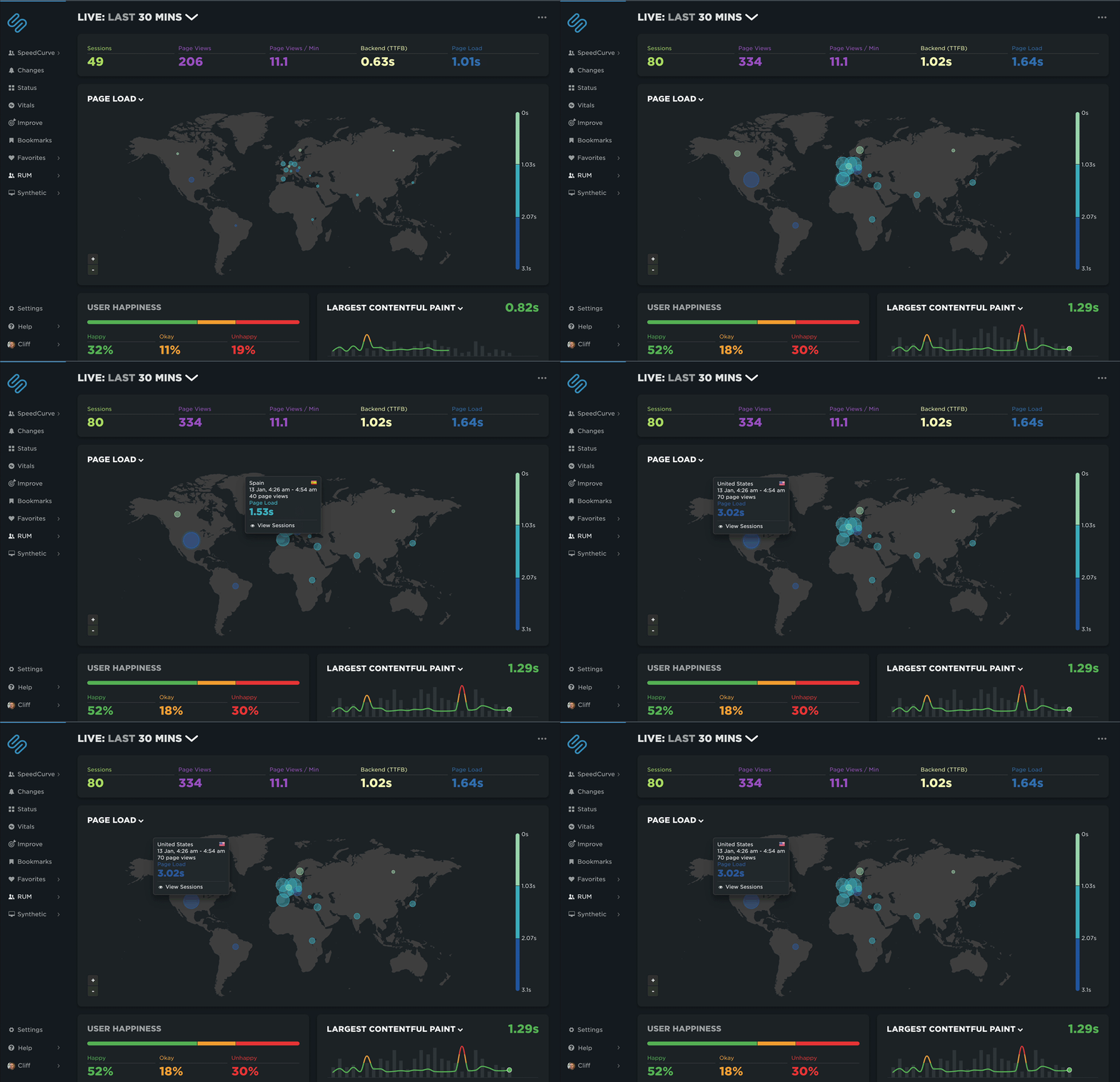
Shortly before the end of the year, we snuck in a couple of last-minute gifts for 2021. It was a great year for SpeedCurve with a lot of renewed focus on RUM. We couldn't think of a better way to finish out the year than to launch the new Live and Page Views dashboards. Let's take a look!
New and improved Support Hub!
One of the things I love about SpeedCurve is our commitment to writing help documents that actually help. Every time we release a new feature, we make sure to give you an accompanying support doc – often written by the same team member who led the feature development. Luckily, we have great writers on our team, so our docs are exceptionally clear, concise, and easy to follow (if I do say so).
We just celebrated our eighth birthday – hooray! Eight years of building new features means eight years worth of support docs. That's a lot of docs! Earlier this year, we realized that we had well over a hundred articles in our support centre. Inevitably, some duplication had crept in and some dead wood had accumulated. So we decided to give our docs a complete overhaul. That meant editing, organizing, purging – we gave them the full KonMari treatment.
Our brand-new Support Hub is live! Here's a quick overview of what you can expect to find, including new goodies like our "Web Performance 101" guides, as well as recipes for completing common tasks and our improved and expanded API documentation.
NEW: Exploring RUM sessions
If you want to understand how people actually experience your site, you need to monitor real users. The data we get from real user monitoring (RUM) is extremely useful when trying to get a grasp on performance. Not only does it serve as the source of truth for your most important budgets and KPIs, it help us understand that performance is a broad distribution that encompasses many different cohorts of users.
While real user monitoring gives us the opportunity for unparalleled insight into user experience, the biggest challenge with RUM data is that there's so much of it. Navigating through all this data has typically been done by peeling back one layer of information at a time, and it often proves difficult to identify the root cause when we see a change:
"What happened here?"
"Did the last release cause a drop in performance?"
"How can I drill down from here to see what's going on?"
"Is the issue confined to a specific region? Browser? Page?"
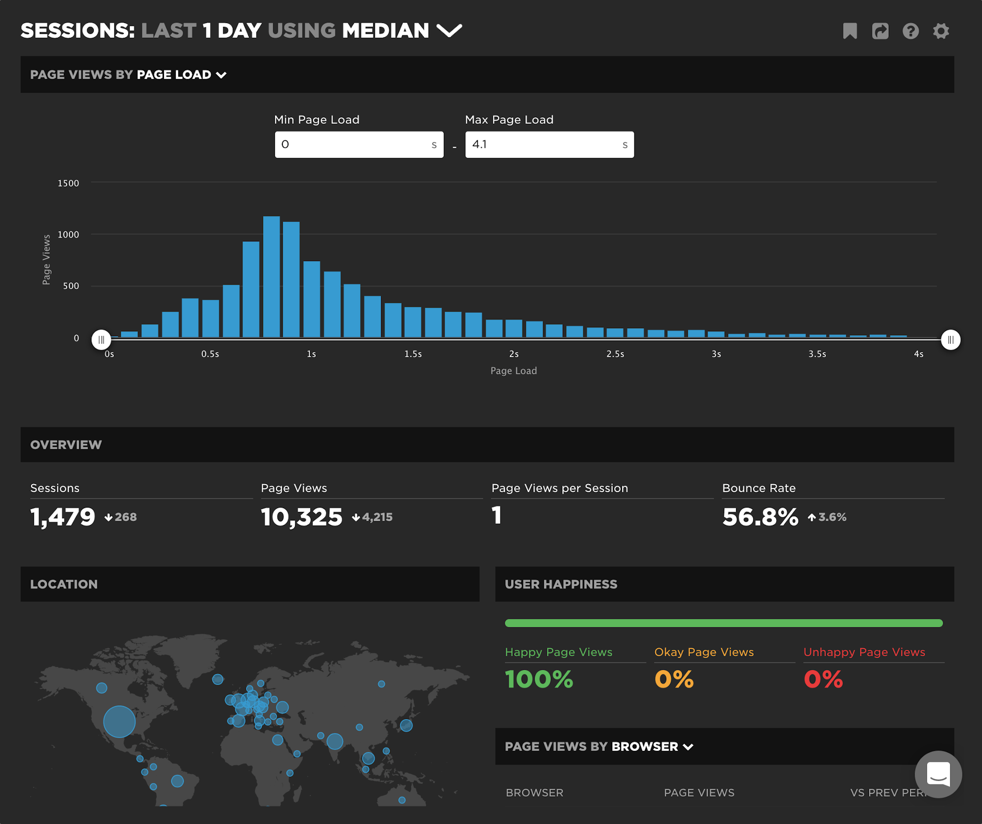
Today we're excited to release a new capability – your RUM Sessions dashboard – which allows you to drill into a dataset and explore those sessions that occurred within a given span of time.
Faster EC2 testing agents
As of the 1st of June SpeedCurve has switched to using faster testing agents at Amazon EC2 data centers. As web pages become more Javascript and resource heavy I've noticed more and more pages max out the CPU while performance testing.
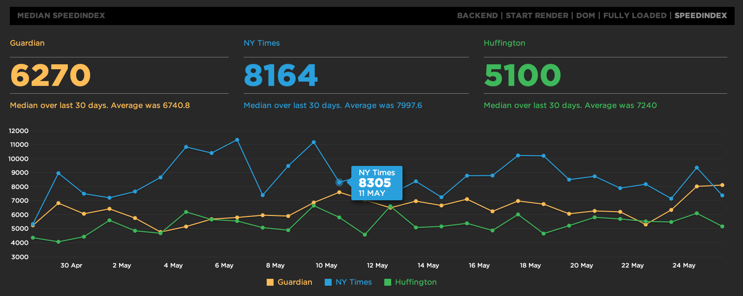
Speed Index now available
Speed Index is now available on SpeedCurve. Choose "SpeedIndex" from the top right of the main graphs.
IE11 and average speed update
To keep inline with browser trends and average connection speeds SpeedCurve will begin updating the test setting every quarter.
For Q2 2014 we're switching to IE11 which is now the most popular version of IE according to Akamai and StatsCounter and the average connection speed has been updated to 9.8Mbps download, 2.5Mbps upload with a 10ms latency. The 9.8Mbps download speed is based on the latest State of the Internet report from Akamai.
Share dashboards, basic auth and export HAR's
New features:
- Share your dashboard via a private url. Find the link on the "account" page.
- During site setup you can now add a user/pass for developments sites using basic authentication.
- On the individual test pages below the waterfall are links to the underlying WebPagetest waterfall and ability to export a HAR file.
Sort browser waterfalls
Sort the items in a browser waterfall by Time, Savings and Slowest. Time is the default showing how assets loaded in the browser. Savings places assets at the top that have the greatest optimization potential and Slowest shows you which are the slowest overall requests.
Annotate your graphs
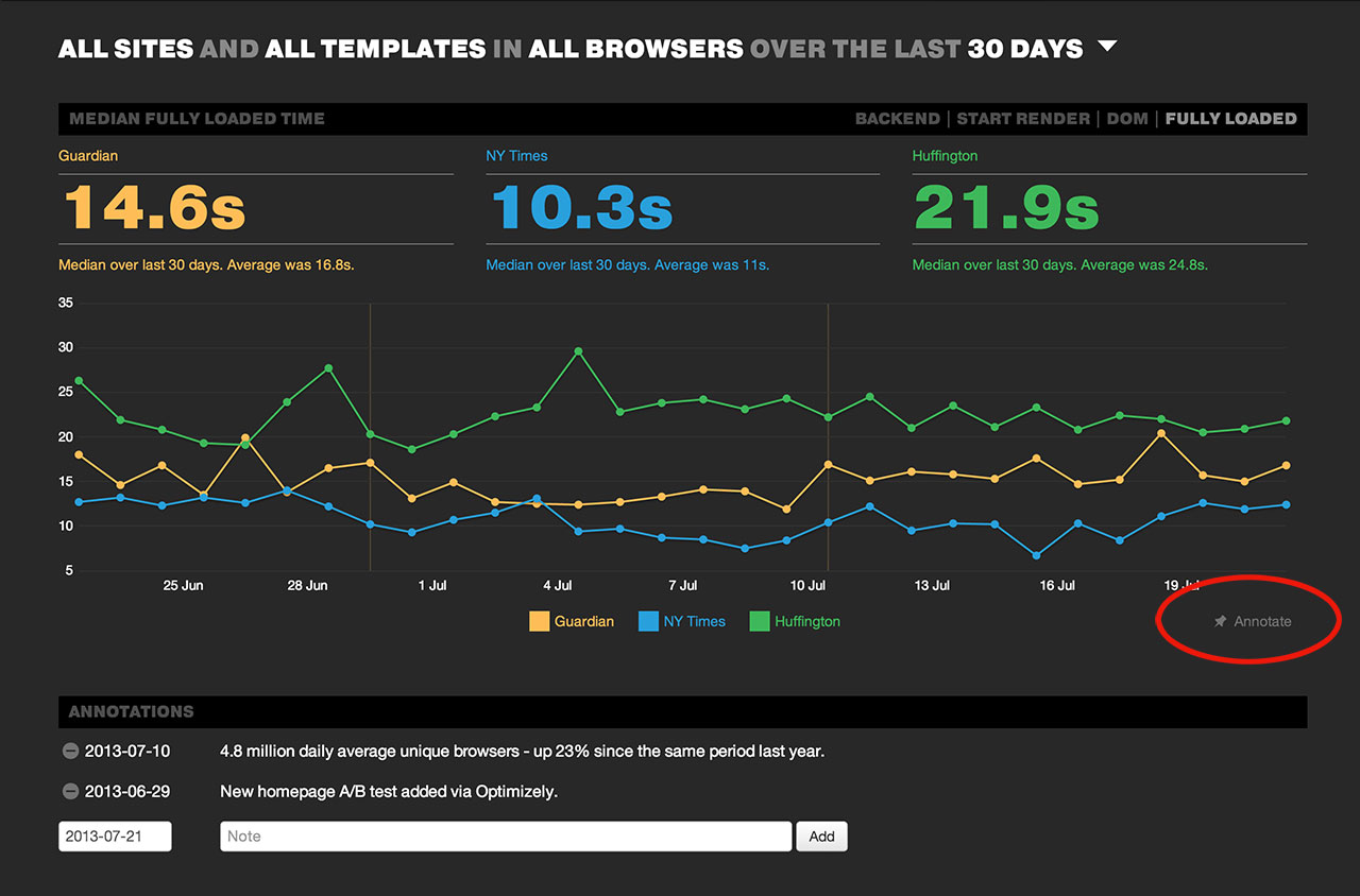
You can now annotate the main graph on SpeedCurve with notes about deployments or specific performance optimizations you may have put live. Just click on the "Annotate" link at the bottom right of the main graph to start adding them and comparing the before and after performance of your website. A vertical line will be placed on the graph where ever a note has been added.
Filter graphs by browser events
It's important to not obsess over the full load time of your website. The point at which a user can see content and interact with your site is arguably more important. To help keep a focus on this you can now filter the main graph by the different browser events like "start render" and "DOM complete".


