The average web page is 3MB. How much should we care?
See our more recent page growth posts:
- What is page bloat? And how is it hurting your business, search rank, and users? (July 2023)
- 10 years of page bloat: What have we learned? (March 2022)
A couple of month ago, someone asked if I'd written a page bloat update recently. The answer was no. I've written a lot of posts about page bloat, starting way back in 2012, when the average page hit 1MB. To my mind, the topic had been well covered. We know that the general trend is that pages are getting bigger at a fairly consistent rate of growth. It didn't feel like there was much new territory to cover.
Also: it felt like Ilya Grigorik dropped the mic on the page bloat conversation with this awesome post, where he illustrated why the "average page" is a myth. Among the many things Ilya observed after analyzing HTTP Archive data for desktop sites, when you have outliers that weigh in at 30MB+ and more than 90% of your pages are under 5MB, an "average page size" of 2227KB (back in 2016) doesn't mean much.
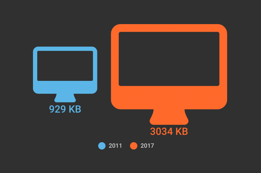
The mic dropped. We all stared at it on the floor for a while, then wandered away. And now I want to propose we wander back. Why? Because the average page is now 3MB in size, and this seems like a good time to pause, check our assumptions, and ask ourselves:
Is there any reason to care about page size as a performance metric? And if we don't consider page size a meaningful metric, then what should we care about?
Before we wade into this topic (again), some big important caveats
- The averages we're about to look at, which are taken from the HTTP Archive, are just that – averages of large datasets. They don't represent the "typical" website, because there's no such thing as a typical website.
- These numbers are mainly relevant when viewed in a historical context. They represent trends – that's all.
- These numbers should not in any way even remotely be taken as a benchmark for your own site. You haven't necessarily achieved anything great if your pages are smaller than this, nor have you failed if your pages are bigger.
- Not all pages are getting bigger. Many have gotten smaller over the years. Maybe yours is one of them!
Graphs or it didn't happen, right?
Here you can see page growth from 2011 to now, broken out by content type:
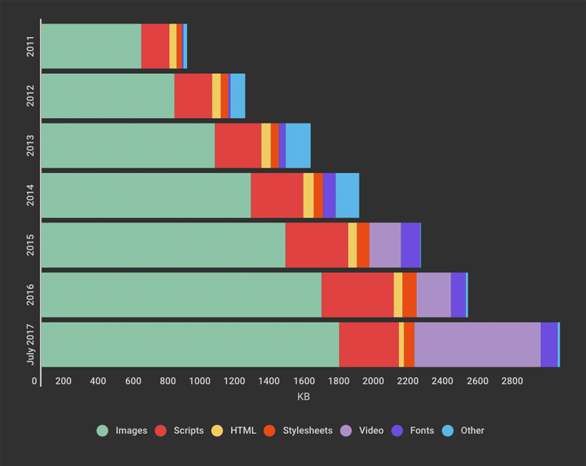
The first thing that jumps out is the large amount of page real estate being taken up by video. Not a huge surprise, given the popularity of hero videos and such, but still interesting to note that this seems to account for much of the recent growth.
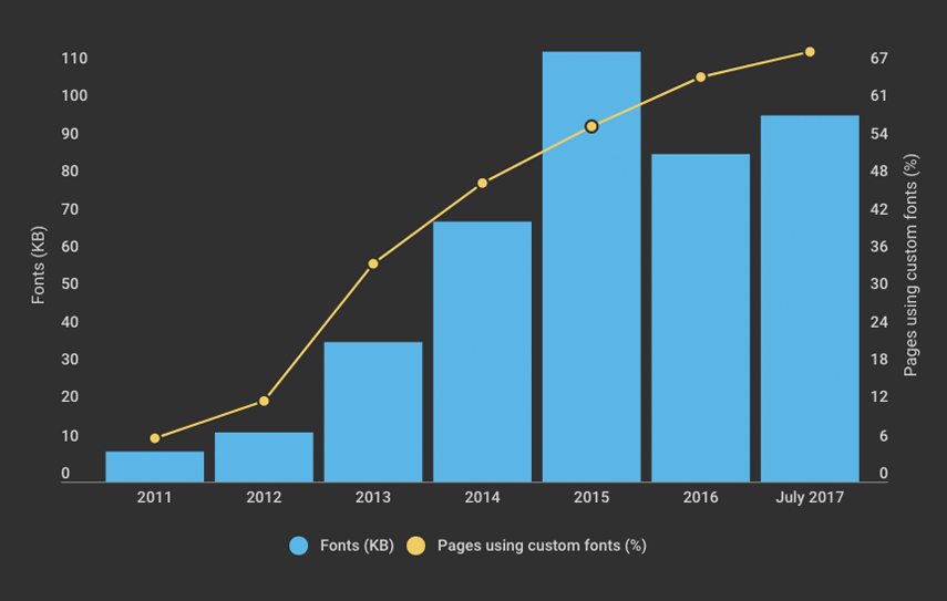
Custom font use continues to increase: 69% of the top 500,000 websites use them. Interesting to note the dip that took place, in terms of total KB, in 2016.
It's interesting to graph some of the current HTTP Archive data (below) and see which metrics remain flat relative to page size and which ones don't.
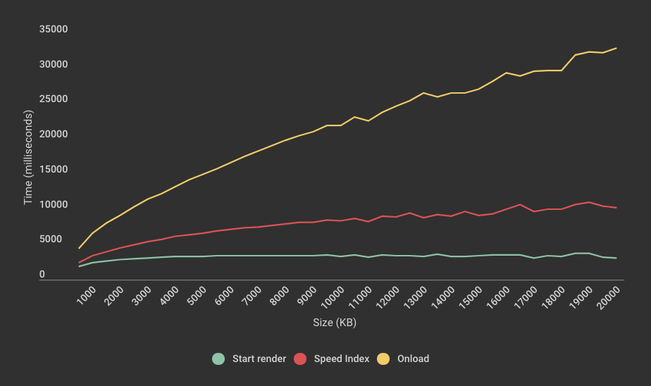
You can see above that start render is fairly consistent regardless of page size. This is quite interesting, because it suggests that bigger pages don't necessarily correlate to when users start being able to see content.
Also, you can also see how easy it is to be misled by onload as a performance metric, because it correlates so strongly with page size. In this graph, the steep rise of onload slightly hides the fact that Speed Index trends upward quite significantly – from 2393 (~2.4 seconds) for pages in the 500KB cohort to 10266 (~10.3 seconds) for pages in the 20MB cohort. This serves as a good reminder that Speed Index is generally a solid synthetic metric for user experience.
Prediction: 4MB pages by 2019?
I'm putting this out there as an interesting talking point, not as a cause for panic. Assuming a roughly 16% year-over-year increase in page size, the average page could exceed 4MB in just over two years.
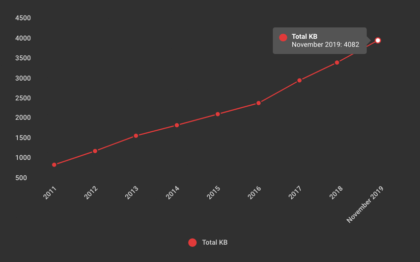
But again, going back to Ilya's point, this is just an average. 4MB pages are already here. According to the HTTP Archive, almost 16% of pages today – in other words, about 1 out of 6 pages – are 4 MB or greater in size. I routinely see pages (and I'm sure you do, too) that are 10MB or larger. When I was talking about this issue with Mark and Steve, Mark referred to the fact that he's built pages that were 30MB that were still highly performant.
If you care about user experience, page size isn't the right metric to track
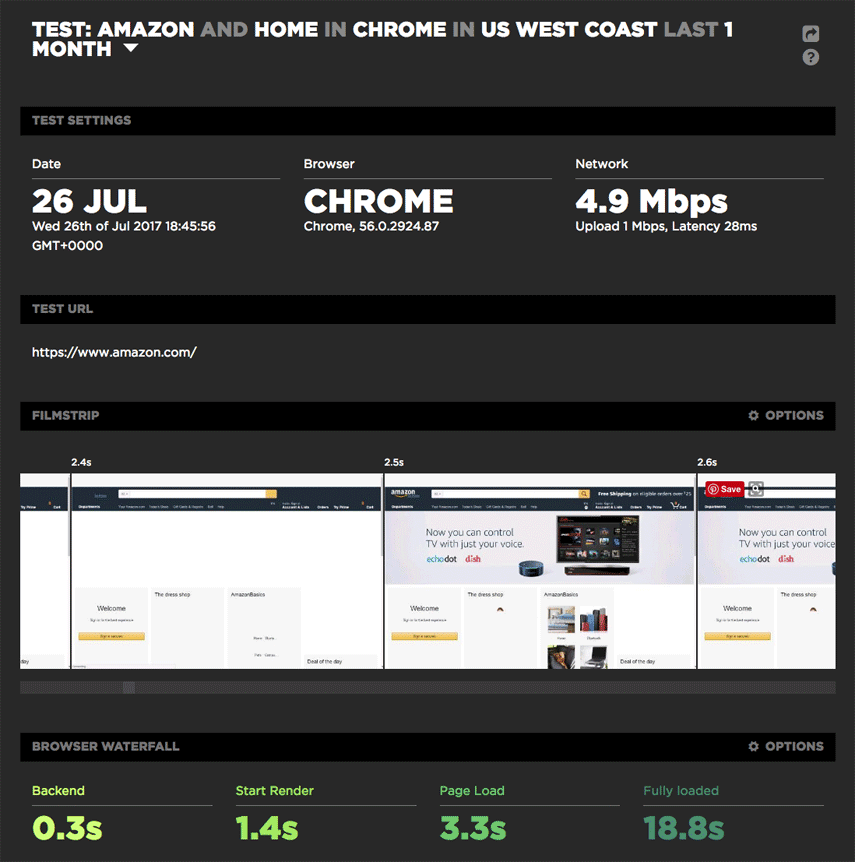
Take Amazon, for example. It's widely considered to be a performance leader, yet it has relatively heavy pages (I'm defining "heavy" as 3MB or more) and slow load times (I'm defining "slow" as 5 seconds or more). But for Amazon, page size and load time are the wrong metrics to look at.
For example, looking at this recent test result page for the Amazon home page (which weighs in at just over 5MB), you can see a start render time of 1.4 seconds and a well-populated viewport at 2.5 seconds – despite the fact that the page doesn't fully load till 18.8 seconds.
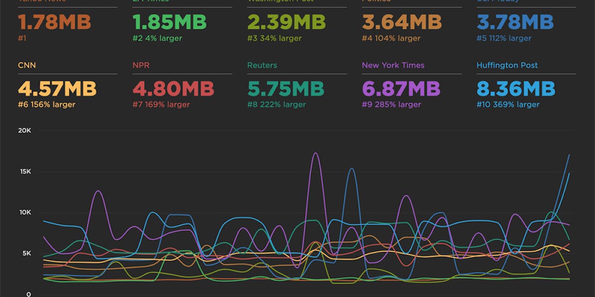
(If you're not already a SpeedCurve user and you want to noodle around with the SpeedCurve synthetic monitoring dashboard, check out our Benchmarks, which lets you explore data for a handful of media sites, including The Guardian, Huffington Post, and The New York Times. Even better, sign up for a free trial and take SpeedCurve out for a spin.)
Takeaways
1. Page size matters, but perhaps not in the way you think
You can have large, robust pages that still feel fast. But you should care about page bloat in terms of how it affects mobile users, especially mobile-only users who are dealing with bandwidth constraints or data limits. At Fluent this past June, Tim Kadlec delivered a passionate keynote that addressed this issue. You should also check out Tim's nifty online calculator, which calculates the cost, in dollars, of your pages in countries around the world. It's an eye-opener.
What you can do: If you're not actively using performance budgets to set thresholds for metrics like page size, start render, and Speed Index, you should start. I love this article on how performance budgets work.
2. Worry about images, but not too much
Yes, images make up the bulk of the average page, and you should definitely make sure you're not serving huge unoptimized images to your users. But this is one of those low-hanging fruit that's relatively easily addressable.
What you can do: Find and fix problem images on your pages.
3. Worry more about CSS and JavaScript
If you're serving asynchronous versions of your stylesheets and scripts, you need to know that these have the potential to block your pages altogether, because they're major CPU hogs.
What you can do: Asynchronous scripts are better than synchronous, but there's an argument for deferring scripts (if you can wrangle it). And if you're not already measuring CPU usage, you should consider starting now.
4. If you care about measuring user experience, then use custom metrics
Correlating page size with user experience is like presenting someone with an entire buffet dinner and assuming that it represents what they actually ate. To properly measure user experience, we need to focus on the content – such as the navbar or hero product image – that users actually want to consume. The best performance metric for measuring user experience is one that measures how long the user waits before seeing this critical content.
What you can do: This is where custom timers, via the W3C User Timing spec, come in. To implement custom timers, you need to identify the critical content on your pages, then add marks and measures to track when they render. Steve wrote a great blog post that goes into custom timers in more detail, as well as providing a handful of sample metrics to get you started. If you care about measuring UX, I strongly recommend checking it out.
To sum up...
At SpeedCurve, we don't think you need more performance data. We think you need the right performance data. That's why we're always working to develop metrics that give you meaningful insight into how your users experience your site. And it's why we believe setting performance budgets and alerts for those metrics is crucial. (If you're not already using SpeedCurve to monitor your site's performance, set up your free trial here.)
The key to a good user experience is quickly delivering the critical content. This is easy to say, but historically has been tricky to do. Custom metrics are a huge evolutionary step forward. If you're using custom metrics, I'd love to hear how they're working for you and what you're learning from them. And if you're not using custom metrics, I'm curious to learn what the barriers are for you.


