NEW: Exploring RUM sessions
If you want to understand how people actually experience your site, you need to monitor real users. The data we get from real user monitoring (RUM) is extremely useful when trying to get a grasp on performance. Not only does it serve as the source of truth for your most important budgets and KPIs, it help us understand that performance is a broad distribution that encompasses many different cohorts of users.
While real user monitoring gives us the opportunity for unparalleled insight into user experience, the biggest challenge with RUM data is that there's so much of it. Navigating through all this data has typically been done by peeling back one layer of information at a time, and it often proves difficult to identify the root cause when we see a change:
"What happened here?"
"Did the last release cause a drop in performance?"
"How can I drill down from here to see what's going on?"
"Is the issue confined to a specific region? Browser? Page?"
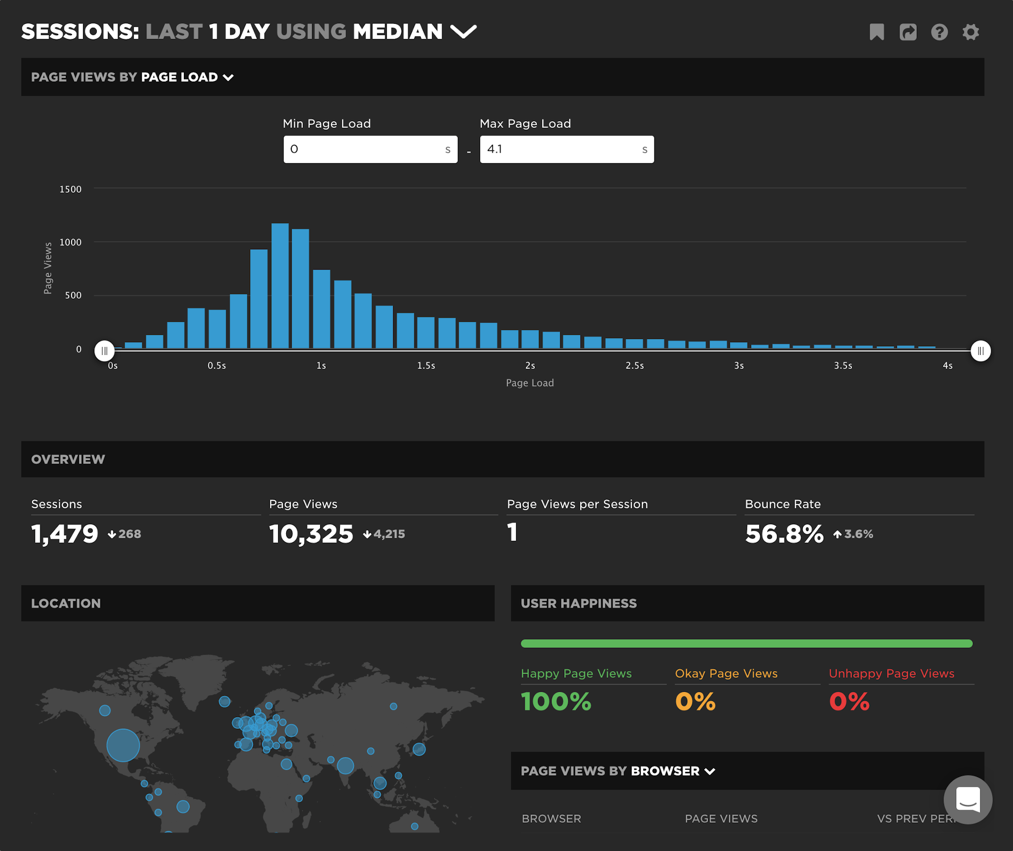
Today we're excited to release a new capability – your RUM Sessions dashboard – which allows you to drill into a dataset and explore those sessions that occurred within a given span of time.

Multiple teams and multiple users
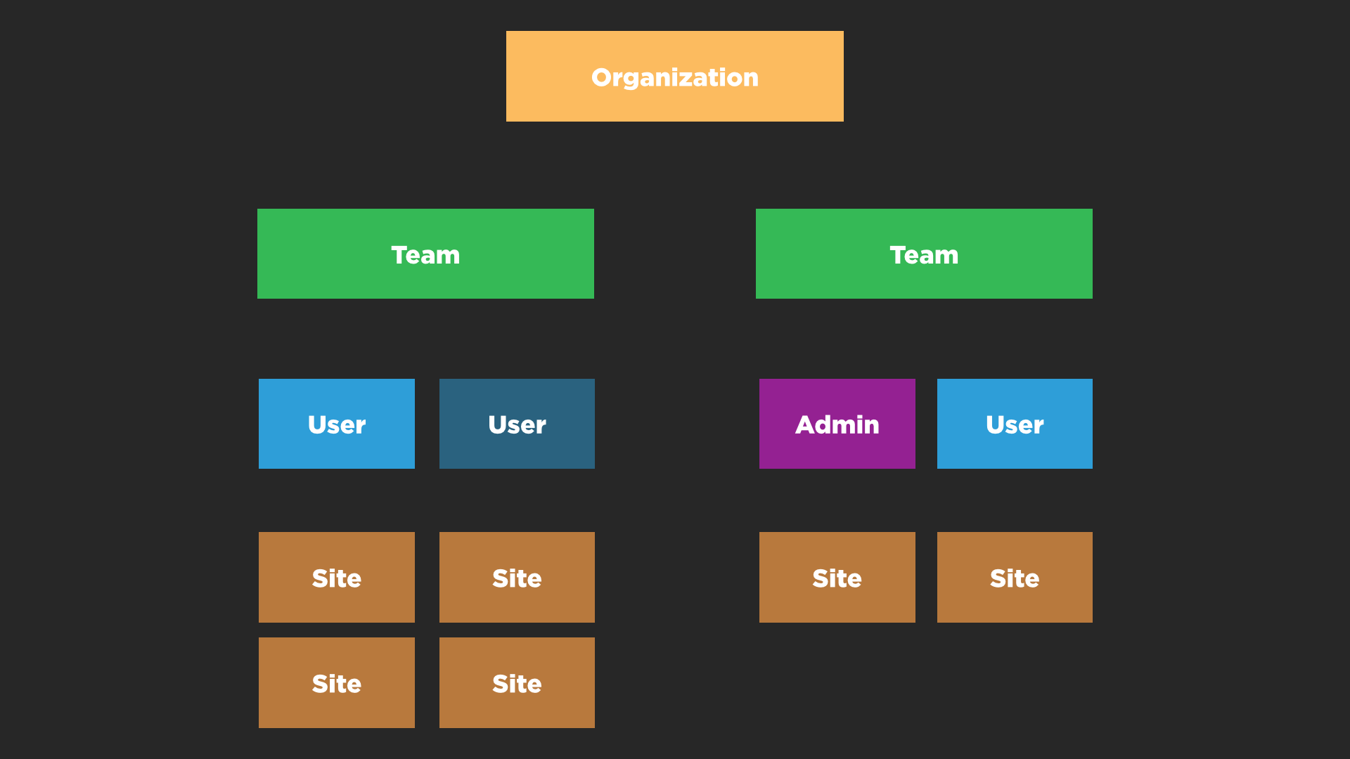
This week we added support for organizations with multiple teams and multiple users.

One of the toughest challenges was simply working out what to call the different layers within the SpeedCurve app. Developers can spend years buried inside a data model but at the end of the day the UI has to be intuitive and easy to use! I hope we’ve done that and if not we’d love your feedback.
The language and metrics of UX evolve at Velocity 2015
Originally published on the O'Reilly Radar Blog
I’ve attended four O’Reilly Velocity conferences over the last year, and I was struck by a notable shift in the conversations at Velocity in Santa Clara, Calif. Many speakers and attendees have started to change their language and describe the experience of their websites and apps from the user’s perspective.
The balance has shifted from just talking about how fast or reliable a particular system is to the overall experience a user has when they interact with and experience a product. Many people are now looking at themselves from the outside in and developing more empathy for their users. The words “user” and “user experience” were mentioned again and again by speakers.
Here are recent talks from Velocity and other events that highlight this shift to UX concerns.
Velocity: Better performance through better design
Improve web performance by improving your design process… it needs to be iterative, mindful, principled and visual.
At my third Velocity conference for the year (this time in beautiful Barcelona) my keynote presentation explored the ways in which a thoughtfully developed design process can lead to higher functioning teams and better web performance.
Velocity: A better waterfall chart
The way we visualize performance data can have an impact on how we interpret and communicate performance issues within our teams.
In this talk from Velocity New York I explored the importance of data visualization and presented some of my own explorations into re-imagining the classic waterfall chart which is the mainstay of front-end performance analysis.
Skip to 15:30 if you just want to see the data visualization experiments.
One of these experiments was also turned into a performance heatmap bookmarklet.
Velocity: Responsive in the wild
I was lucky enough to give a Lighting Demo at Velocity Conference in Santa Clara. The focus was on research I conducted into 250 responsive websites and how well optimized for performance they were.
Speed Index now available
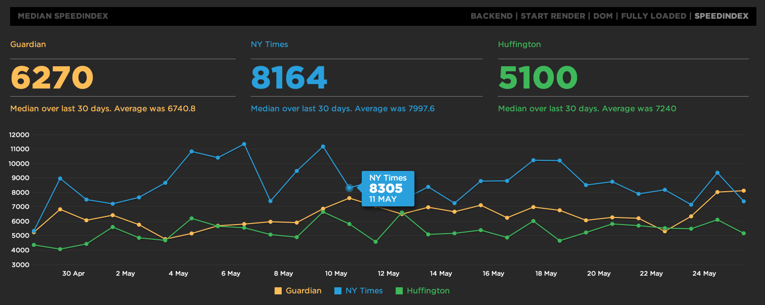
Speed Index is now available on SpeedCurve. Choose "SpeedIndex" from the top right of the main graphs.

SpeedCurve dashboard walkthrough
See how powerful the SpeedCurve dashboard is for digging into your website's front-end performance.
SpeedCurve elevator pitch
I've been having a blast over the last couple of weeks putting an intro video together for SpeedCurve.
SpeedCurve launches at Velocity Conf
SpeedCurve is now in beta. Sign up, check it out and then vote for the features you'd like to see.


