Trend metrics and compare time periods

The Internet really is a complicated series of tubes. As a result, any time-based metrics we capture can have variations as those tubes wobble a bit as we shove data down them. To help reduce that variation, when we do synthetic tests, we always load a page at least three times and take the median result. But even then you'll find that, over time, your charts will still show plenty of variation.
All that variation can make it difficult to see if your metrics are getting better or worse over time. We recently released a couple of new features in your Synthetic and LUX charts that make it easier for you to visualize trends and compare discrete time periods within your historical data.
Highlight trends in your metrics
To make it easier for you to see which direction your metrics are heading, we've added an option to all your charts to show a trend line which helps you visualize how a particular metric is changing over the timespan of the chart. You can hover over the legend to highlight a trend line or hover over any point on the trend to see the estimated value at that point.
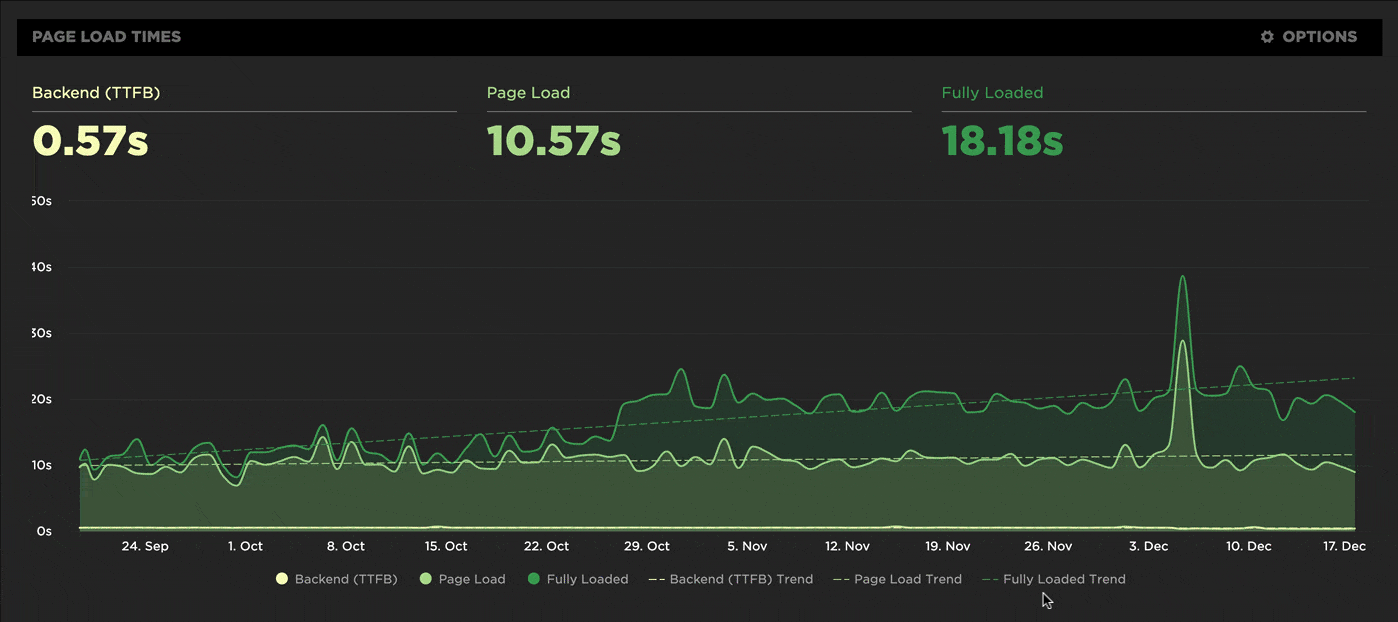
Compare time periods
There's really only one question that always needs answering when discussing web performance:
Are we getting faster or slower?
Our new 'compare' mode helps answer that question and shows just how much things have improved or regressed over the most recent time period compared to the previous one. Things to try:
- Pick a day of real user traffic before and after the release of a new version of your site.
- Track your month-to-month progress on a project, such as refactoring your Javascript.
- Keep a watchful eye on third-party metrics. Review and compare them each month to make sure you're not regressing.
I like to think of this option as boss mode. Take these charts to show off to your boss all the progress you're making on that new performance project. Or scare the jeepers out of your boss by showing him or her performance regressions... and unlock more budget for new performance optimization projects.
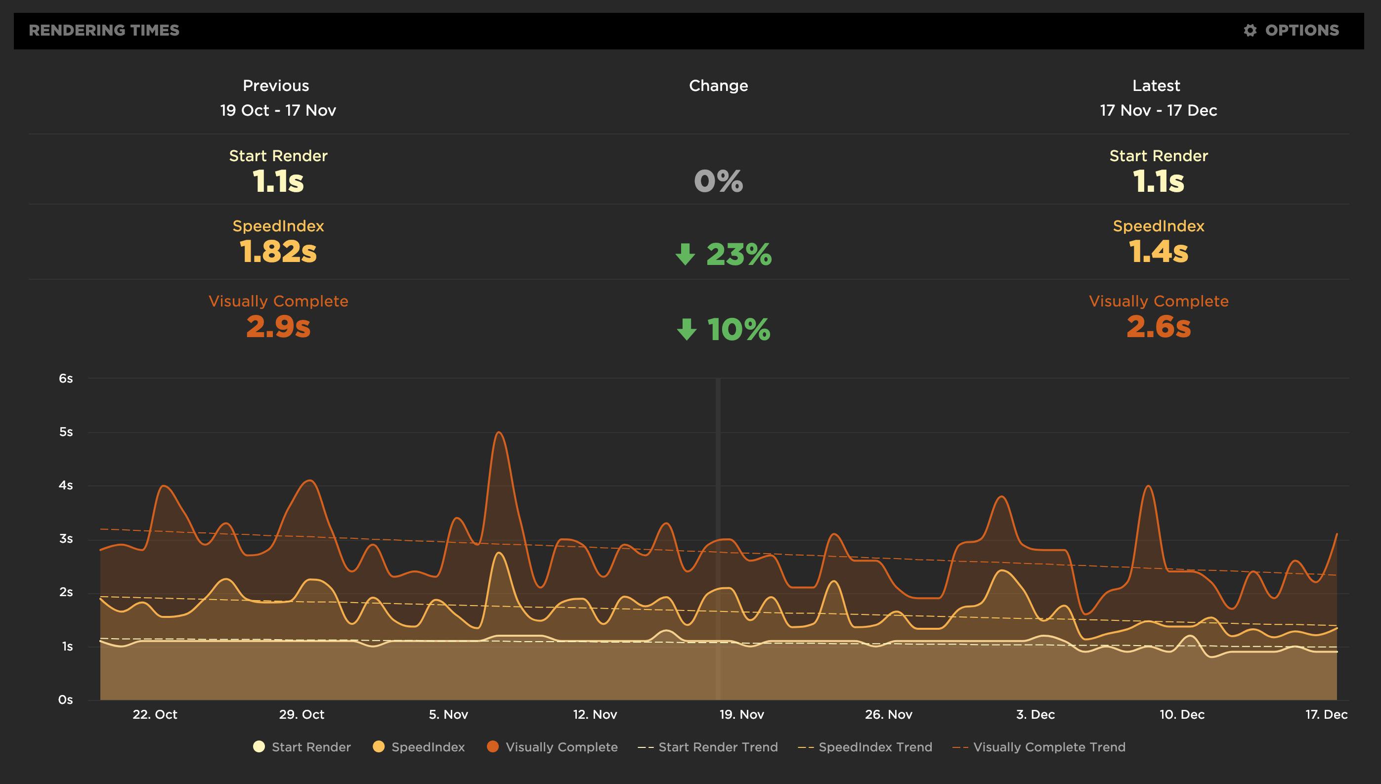
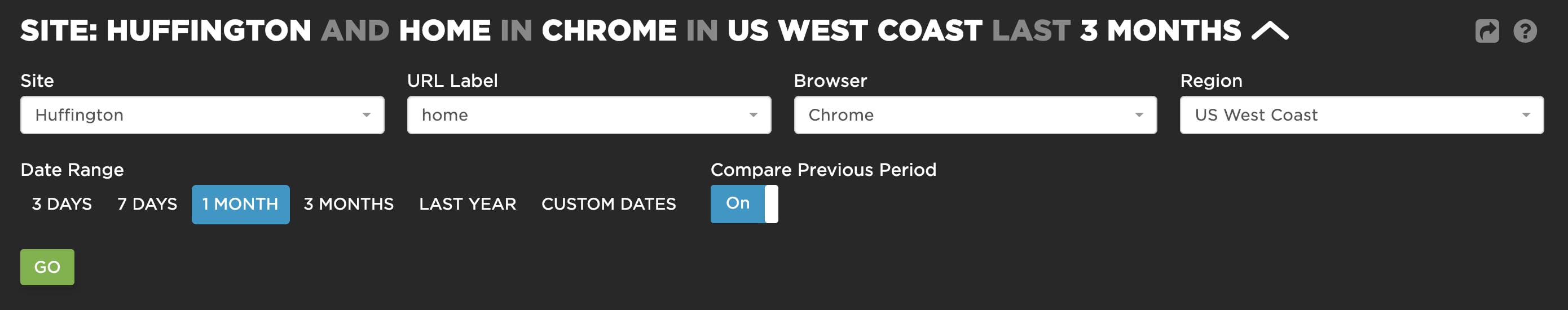
To turn on compare mode, go to your dashboards and select the length of time you want to compare (7 days, 1 month, etc.). You can also select a custom start/end date. Then turn on "Compare Previous Period".
Get started
If you're already a SpeedCurve user, trend lines and compare mode are available in your charts. We'd love to hear how you've used them, and how they've been helpful!
If you're not a SpeedCurve user, why not give us a try for free?