Trend metrics and compare time periods
The Internet really is a complicated series of tubes. As a result, any time-based metrics we capture can have variations as those tubes wobble a bit as we shove data down them. To help reduce that variation, when we do synthetic tests, we always load a page at least three times and take the median result. But even then you'll find that, over time, your charts will still show plenty of variation.
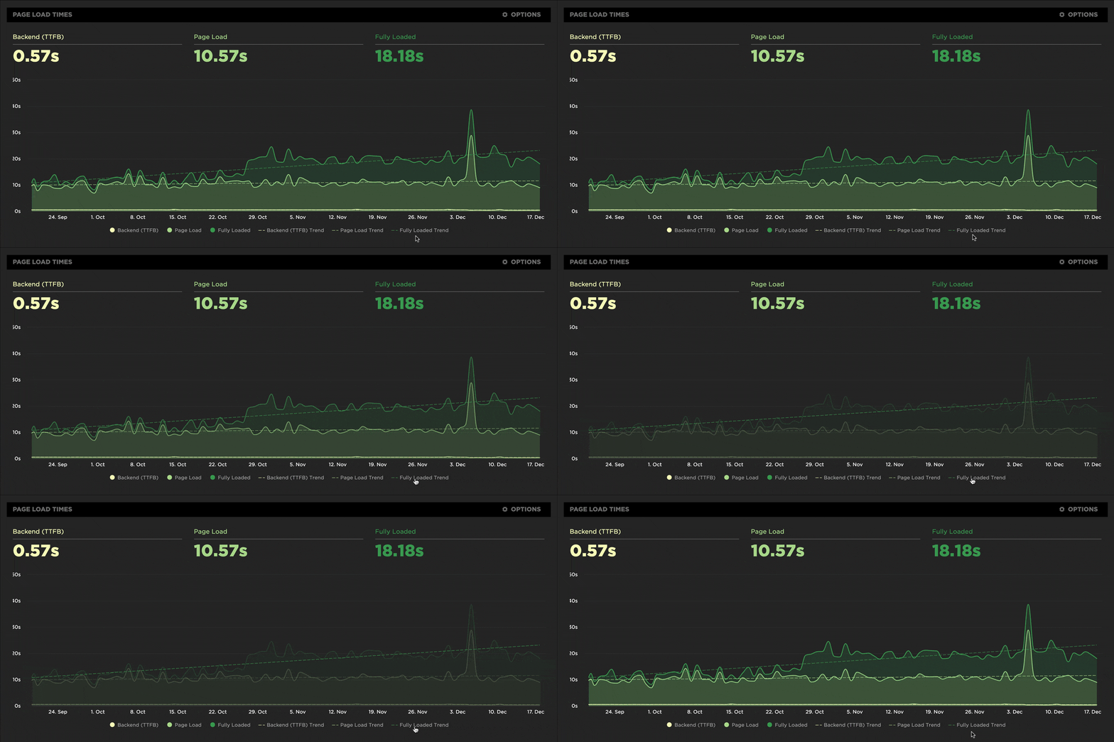
All that variation can make it difficult to see if your metrics are getting better or worse over time. We recently released a couple of new features in your Synthetic and LUX charts that make it easier for you to visualize trends and compare discrete time periods within your historical data.
Highlight trends in your metrics
To make it easier for you to see which direction your metrics are heading, we've added an option to all your charts to show a trend line which helps you visualize how a particular metric is changing over the timespan of the chart. You can hover over the legend to highlight a trend line or hover over any point on the trend to see the estimated value at that point.

