SpeedCurve is now part of the Embrace family! There are no changes to how you use our products. Our founder Mark shares what this means...
Measuring Jank and UX

Ten years ago the network was the biggest problem when it came to making websites fast. Today, CPU is the main concern. This happened because networks got faster while JavaScript moved in the other direction growing 3x in size in the last six years. This growth is important because JavaScript consumes more CPU than all other browser activities combined. While JavaScript and other activities block the CPU, the browser can't respond to user input creating the sensation of a slow, jittery, or broken page, AKA "jank".
To help focus our attention on CPU, several new performance metrics have been defined and evangelized over the last year or three. In this post I'm going to focus on these:
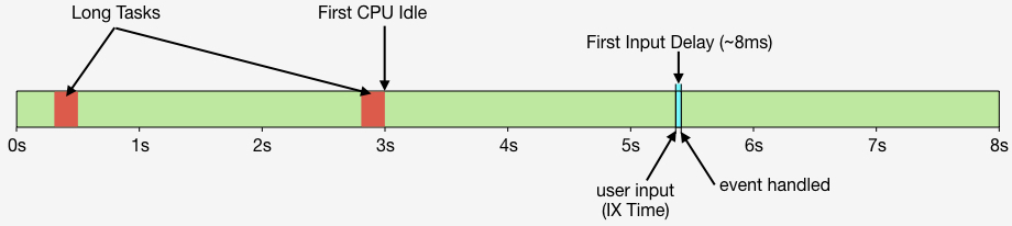
- First CPU Idle measures when the page is no longer janky. Specifically, it is the first span of 5 seconds where the browser main thread is never blocked for more than 50ms after First Contentful Paint. A value of 2-4 seconds is typical.
- First Input Delay measures the gap between when a user interacts with the page (e.g, clicks or scrolls) and when the browser is able to act on that input. First Input Delay values are much lower - a good target is 10ms, but 25ms is common.
- First Interaction Time is when the first user input takes place. This varies widely depending on the type of site and page. A good search results page might have a low First Interaction Time because users scroll and click quickly. A media site might have a high First Interaction Time because users start reading content (headlines, stories) before interacting with the page. At SpeedCurve we call this "IX Time".
- Total Long Task CPU Time is the sum of all long tasks that occur in the page. A "long task" is a browser event that blocks the main thread for more than 50ms.
Here's a figure to help visualize these metrics.
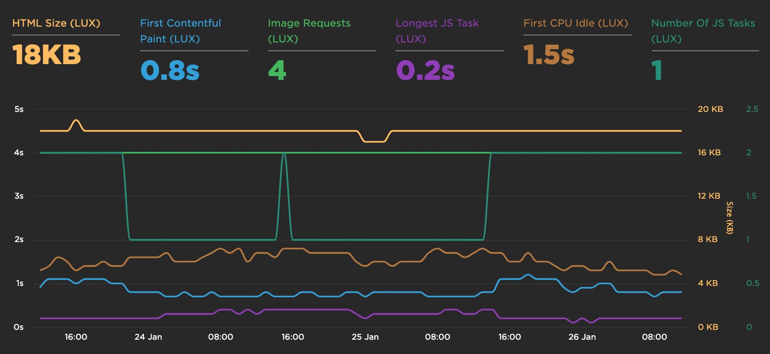
New LUX JavaScript Dashboards
As organizations work to improve performance for users around the world on slower networks and devices, the focus on JavaScript continues to grow. LUX's new JavaScript dashboards help to identify the problems and solutions for creating a fast, joyous user experience.
LUX is SpeedCurve's real user monitoring product. We launched it two years ago with four dashboards: Live, Users, Performance, and Design. Today we've added two more LUX dashboards: JavaScript and JS Errors. These new dashboards let you see the impact JavaScript has on your site and on your users with new metrics, including First CPU Idle and First Input Delay, and new features, such as correlation charts that show you how CPU time correlates with bounce rate.
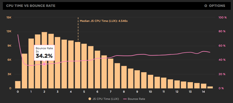
Chart sizes and TV Mode

SpeedCurve now has different chart sizes and a special TV Mode to help you build a performance culture in your organisation.

From its inception, SpeedCurve has always been designed to look awesome on the big screen. We see SpeedCurve as not just a tool for debugging web performance, but as a communication tool to rally your organisation around the importance of web performance. SpeedCurve helps bring together the development, design, and management teams, and gets everyone focused on turning your product into a fast and joyous experience for your users.
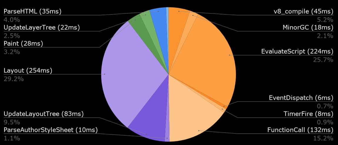
JavaScript dominates browser CPU
Loading scripts asynchronously is critical for getting pages to render more quickly. We care about rendering because that's what users see; if rendering is slow users have a negative experience. But it's not just about what users see - how the site feels is also important. That's why we focus so much on CPU time. If the CPU is blocked, then browsers are delayed responding to user interactions like scrolling and clicking on links. In other words, the page feels janky. And what consumes the most CPU in browsers? You guessed it: JavaScript!
New LUX metrics
Over the winter holiday we added a bunch of new metrics to LUX:
- First Contentful Paint
- First CPU Idle
- Longest Long Task
- Number of Long Tasks
- Connection type
- HTML transfer size
- Total # of image requests
Preload scripts
In my previous post I talked about how loading scripts asynchronously reduces the impact of JavaScript resulting in a (much) faster user experience. But even when scripts are loaded async, the browser may still twiddle its thumbs for a second or more waiting for the first script to arrive. This delay can be decreased by using link rel=preload like this:
<link rel="preload" href="main.js" as="script">Load scripts async
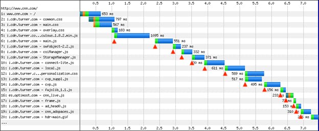
This blog post has a simple conclusion: Load script asynchronously! Simple, and yet the reality is that most scripts are still loaded synchronously. Understanding the importance of loading scripts asynchronously might help increase adoption of this critical performance improvement, so we're going to walk through the evolution of async script loading starting way back in 2007. Here's what loading 14 scripts looked like in Internet Explorer 7:
Trend metrics and compare time periods
The Internet really is a complicated series of tubes. As a result, any time-based metrics we capture can have variations as those tubes wobble a bit as we shove data down them. To help reduce that variation, when we do synthetic tests, we always load a page at least three times and take the median result. But even then you'll find that, over time, your charts will still show plenty of variation.
All that variation can make it difficult to see if your metrics are getting better or worse over time. We recently released a couple of new features in your Synthetic and LUX charts that make it easier for you to visualize trends and compare discrete time periods within your historical data.
Highlight trends in your metrics
To make it easier for you to see which direction your metrics are heading, we've added an option to all your charts to show a trend line which helps you visualize how a particular metric is changing over the timespan of the chart. You can hover over the legend to highlight a trend line or hover over any point on the trend to see the estimated value at that point.
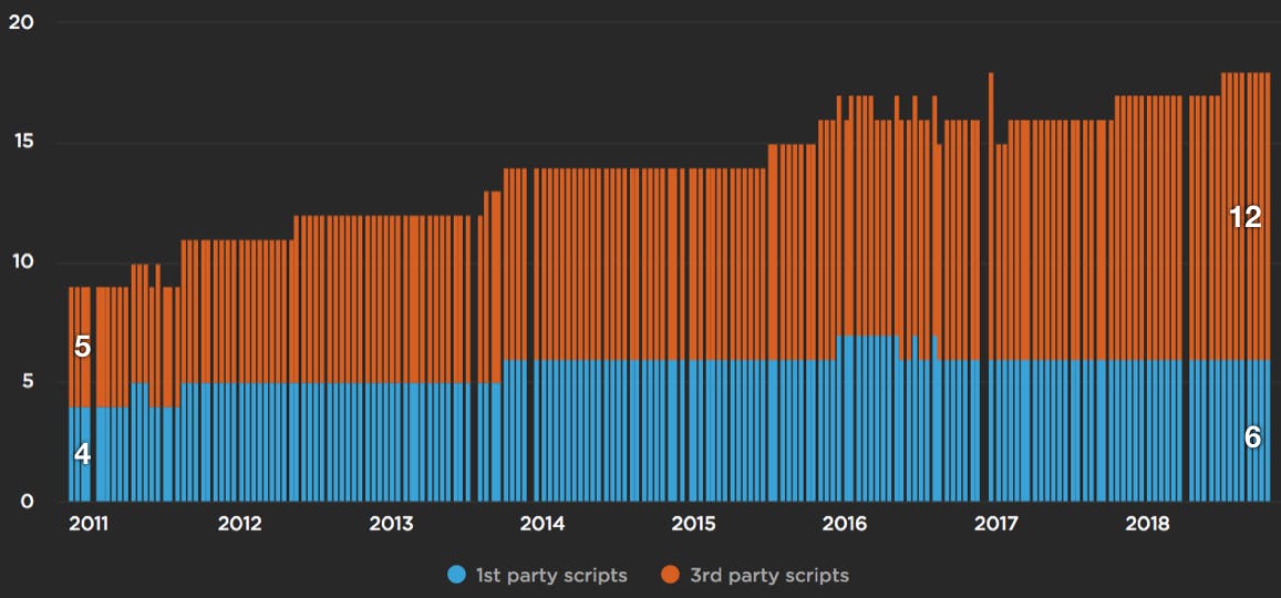
JavaScript growth and third parties
JavaScript is the main cause for making websites slow. Ten years ago it was network bottlenecks, but the growth of JavaScript has outpaced network and CPU improvements on today's devices. In the chart below, based on an analysis from the HTTP Archive, we see the number of requests has increased for both first and third party JavaScript since 2011.
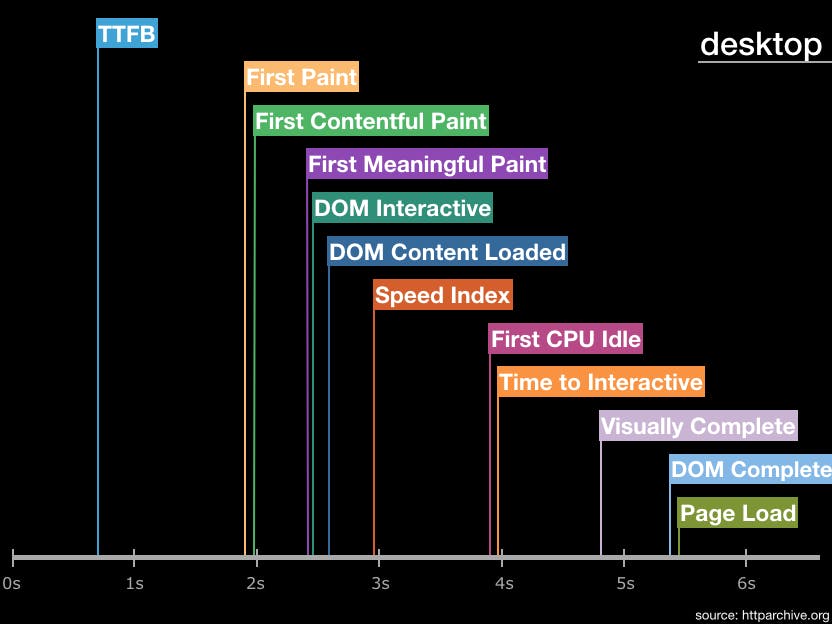
Metrics from 1M sites
The number of performance metrics is large and increases every year. It's important to understand what the different metrics represent and pick metrics that are important for your site. Our Evaluating rendering metrics post was a popular (and fun) way to compare and choose rendering metrics. Recently I created this timeline of performance metric medians from the HTTP Archive for the world's top ~1.3 million sites: