SpeedCurve is now part of the Embrace family! There are no changes to how you use our products. Our founder Mark shares what this means...
Does Interaction to Next Paint actually correlate to user behavior?

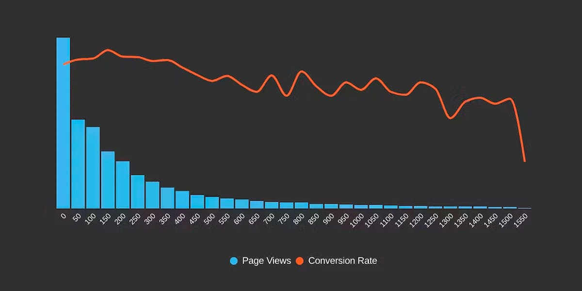
Earlier this year, Google announced that Interaction to Next Paint (INP) is no longer an experimental metric. INP will replace First Input Delay (FID) as a Core Web Vital in March of 2024.
Now that INP has arrived to dethrone FID as the responsiveness metric in Core Web Vitals, we've turned our eye to scrutinizing its effectiveness. In this post, we'll look at real-world data and attempt to answer: What correlation – if any – does INP have with actual user behavior and business metrics?
10 things I love about SpeedCurve (that I think you'll love, too)


This month, SpeedCurve enters double digits with our tenth birthday. We're officially in our tweens! (Cue the mood swings?)
I joined the team in early 2017, and I'm blown away at how quickly the years have flown by. Every day, I marvel at my great luck in getting to work alongside an amazing team to build amazing tools to help amazing people like you!
In the spirit of celebration, I thought it would be fun to round up my ten favourite things to do in SpeedCurve (that I think you'll like, too). Keep scrolling to learn how to:
- Fight regressions and stay fast
- See the impact of performance on your business
- Benchmark your site against your competitors
- Track third parties to make sure they're not quietly hurting performance
- Make sure you're tracking the best metrics for your pages
- Get a prioritized list of performance recommendations
- Bookmark and compare synthetic tests and RUM sessions so you can quickly find and fix performance issues
- Run A/B tests so you see how code changes affect your performance and user engagement metrics
- Get customized weekly reports
- Motivate your team with a wall-mounted monitor showing your favourite charts
Demystifying Cumulative Layout Shift with CLS Windows

As we all know, naming things is hard.
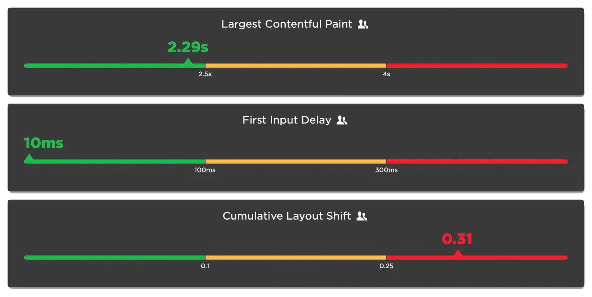
Google's Core Web Vitals are an attempt to help folks new to web performance focus on three key metrics. Not all of these metrics are easy to understand based on their names alone:
- Largest Contentful Paint (LCP) – When the largest visual element on the page renders
- First Input Delay (FID) – How quickly a page responds to a user interaction (FID will be replaced by Interaction to Next Paint in March 2024)
- Cumulative Layout Shift (CLS) – How visually stable a page is
Any time a new metric is introduced, it puts the burden on the rest of us to first unpack all the acronyms, and then explore and digest what concepts the words might refer to. This gets even trickier if the acronym stays the same, but the logic and algorithm behind the acronym changes.
In this post, we will dive deeper into Cumulative Layout Shift (CLS) and how it has quietly evolved over the years. Because CLS has been around for a while, you may already have some idea of what it represents. Before we go any further, I have a simple question for you:
How do you think Cumulative Layout Shift is measured?
Hold your answer in your head as we explore the depths of CLS. I'm interested if your assumptions were correct, and there's a poll at the bottom of this post I'd love you to answer.
Exploring performance and conversion rates just got easier
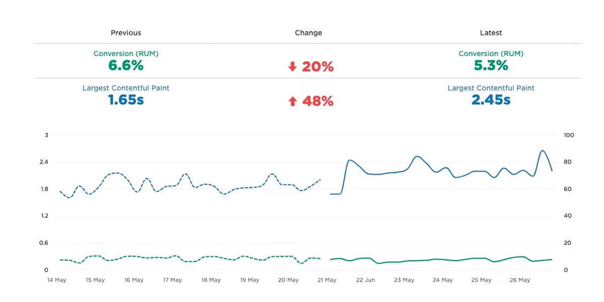
Demonstrating the impact of performance on your users – and on your business – is one of the best ways to get your company to care about the speed of your site.
Tracking goal-based metrics like conversion rate alongside performance data can give you richer and more compelling insights into how the performance of your site affects your users. This concept is not new by any means. In 2010, the Performance and Reliability team I was fortunate enough to lead at Walmartlabs shared our findings around the impact of front-end times on conversion rates. (This study and a number of other case studies tracked over the years can be found at WPOstats.)
Setting up conversion tracking in SpeedCurve RUM is fairly simple and definitely worthwhile. This post covers:
- What is a conversion?
- How to track conversions in SpeedCurve
- Using conversion data with performance data for maximum benefit
- Conversion tracking and user privacy
What is page bloat? And how is it hurting your business, your search rank, and your users?
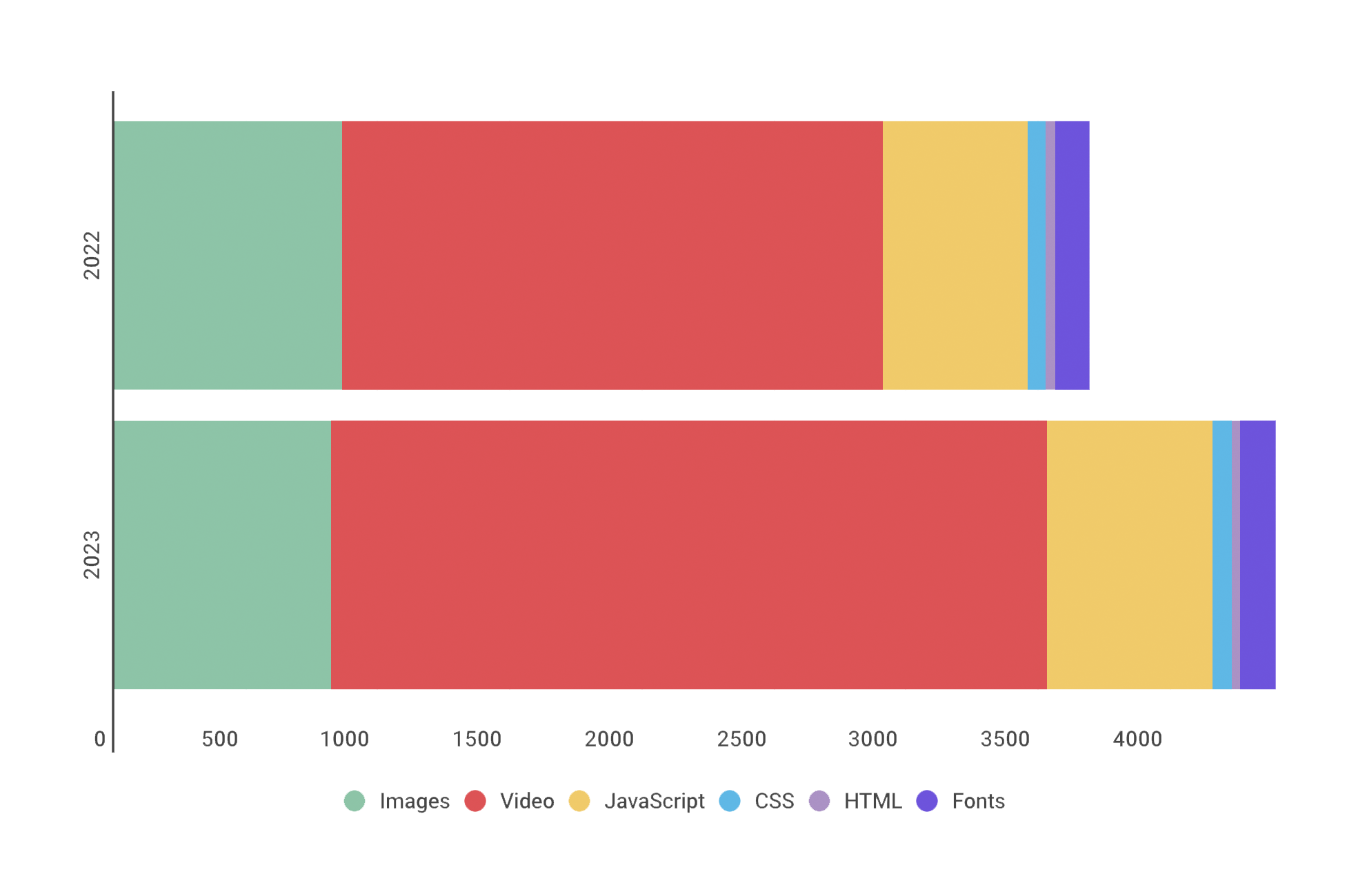
For more than ten years, I've been writing about page bloat, its impact on site speed, and ultimately how it affects your users and your business. You might think that this topic would be played out by now, but every year I learn new things – beyond the overarching fact that pages keep getting bigger and more complex, as you can see in this chart, using data from the HTTP Archive.
In this post, we'll cover:
- How much pages have grown over the past year
- How page bloat hurts your business and – at the heart of everything – your users
- How page bloat affects Google's Core Web Vitals (and therefore SEO)
- If it's possible to have large pages that still deliver a good user experience
- Page size targets
- How to track page size and complexity
- How to fight regressions
SpeedCurve Recipes: Multi-step test scripting made easy!
![]()
You may already know that SpeedCurve lets you test multiple URLs for a site across a wide selection of browsers, devices, connection types, and geolocations.
You may also know that SpeedCurve lets you add synthetic scripts to your test settings, which lets you easily do things like simulate a repeat view or block a third party.
But did you also know that we've made it easy to simulate more complex use cases? These include:
- User journeys through your site
- Checkout processes
- Submit a login form
- SPA and AJAX navigations
- Set cookies
Keep reading to learn how Recipes make it easy for you to test a variety of scenarios that can help you understand how your visitors are experiencing your site – and how to improve their experience!
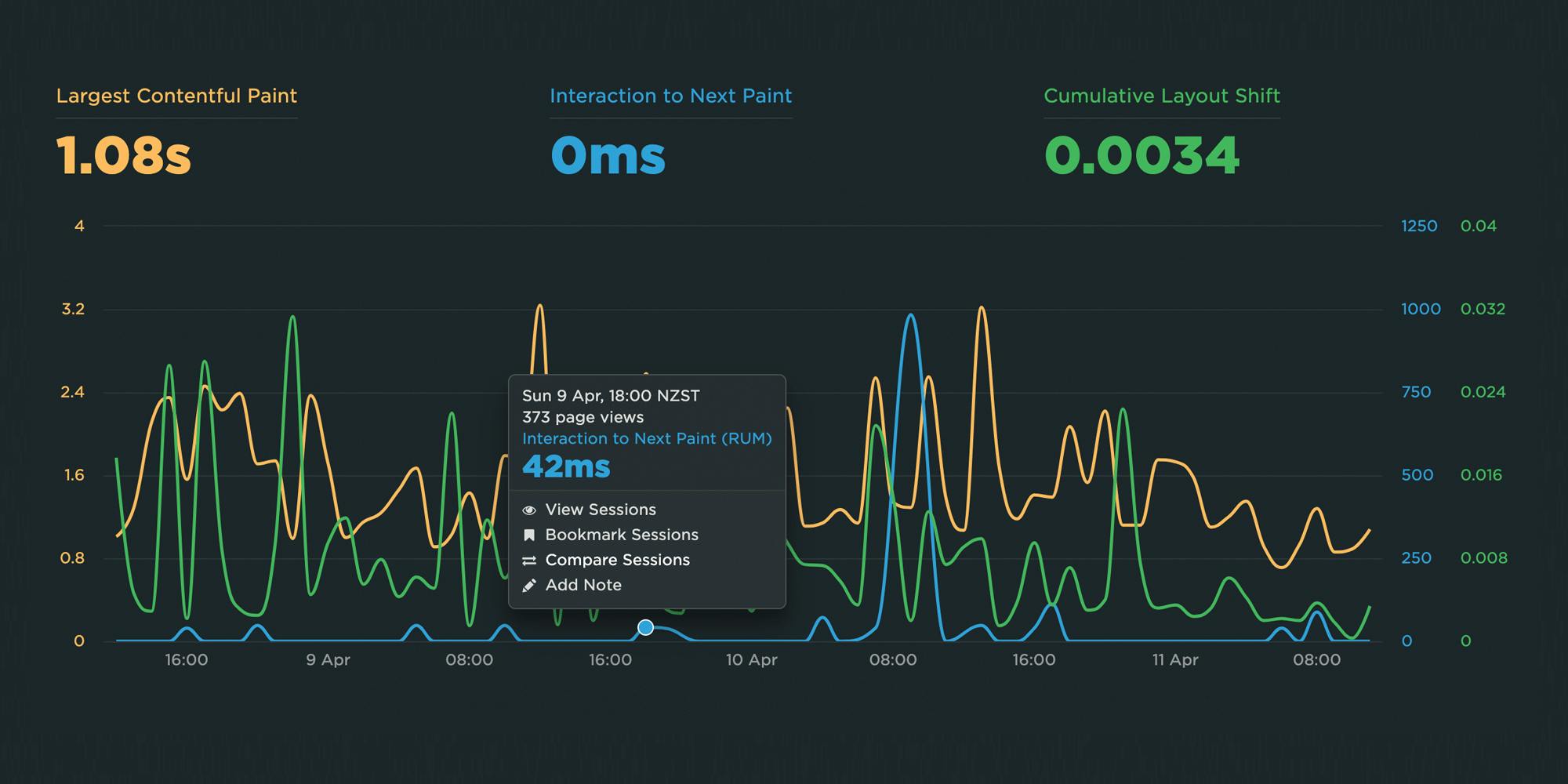
Farewell FID... and hello Interaction to Next Paint!
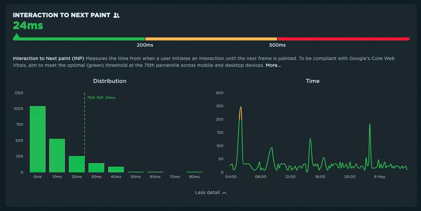
Today at Google I/O 2023, it was announced that Interaction to Next Paint (INP) is no longer an experimental metric. INP will replace First Input Delay (FID) as a Core Web Vital in March of 2024.
It's been three years since the Core Web Vitals initiative was kicked off in May 2020. In that time, we've seen people's interest in performance dramatically increase, especially in the world of SEO. It's been hugely helpful to have a simple set of three metrics – focused on loading, interactivity, and responsiveness – that everyone can understand and focus on.
During this time, SpeedCurve has stayed objective when looking at the CWV metrics. When it comes to new performance metrics, it's easy to jump on hype-fuelled bandwagons. While we definitely get excited about emerging metrics, we also approach each new metric with an analytical eye. For example, back in November 2020, we took a closer look at one of the Core Web Vitals, First Input Delay, and found that it was sort of 'meh' overall when it came to meaningfully correlating with actual user behavior.
Now that INP has arrived to dethrone FID as the responsiveness metric for Core Web Vitals, we've turned our eye to scrutinizing its effectiveness.
In this post, we'll take a closer look and attempt to answer:
- What is Interaction to next Paint?
- How does INP compare to FID?
- What is a 'good' INP result?
- Will there be differences between INP collected in RUM vs. Chrome User Experience Report (CrUX)?
- What correlation does INP have with real user behavior?
- When should you start caring about INP?
- How can you see INP for your own site in SpeedCurve?
Onward!
NEW! Lighthouse 10, Core Web Vitals updates, and Interaction to Next Paint
There is a lot of excitement in the world of web performance these days, and April has been no exception! At SpeedCurve, we've been focused on staying on top of the items that affect you the most.
Here is a look at what's new in SpeedCurve:
- Support for Lighthouse 10, including metric scoring changes as well as audits
- Updated RUM Core Web Vitals, including the much-anticipated addition of Interaction to Next Paint (INP)
All of this work driven by the community is having a big impact in our collective goal to make performance accessible for everyone.
Read on to learn more about these exciting changes!
NEW! Home, Site, Page and Tests dashboards
Things have been busy over here at SpeedCurve HQ! Coming off of the back of our latest RUM Compare dashboard release, we are super excited to launch four new dashboards to make your life better, your work easier, and your websites faster.
- Home - Well, now you have one. We needed a place for folks to land when they were jumping into all that SpeedCurve has to offer. The newly released Home page is a great starting place, pulling together views of both RUM and Synthetic data and directing you on where to dig in next.
- Sites - We've rebuilt our Sites dashboard to give you a holistic look across all of the URLs you are monitoring. Start here to understand which areas of your site need the most attention and identify areas you can have the most impact.
- Pages - This detailed view gives you trended information for all the metrics you know and love. Easily identify areas of opportunity and how things are performing over time for specific pages you are monitoring.
- Tests - We've had a lot of requests for this, so we're happy to deliver it. You can now see a list of your latest synthetic tests and spot any failed tests.
Let's take a look!
2022 in review: New dashboards, Core Web Vitals enhancements, third-party tracking & more!

Every year feels like a big year, and 2022 has been no exception. Not only did we celebrate our ninth birthday (!!!) we also:
- Launched a series of new and improved dashboards to help you identify and fix your performance issues more quickly and efficiently (More on those below.)
- Expanded our test agent locations to bring you even more places to test from worldwide
- Jumped into in-person events, and were so happy to catch up with some of you at SmashingConf and performance.now() (You can watch videos of my talk about performance budgets and Andy Davies' talk about third parties.)
Keep reading for a full recap of the past year...
