The Definitive Guide to Long Animation Frames (LoAF)

With Long Animation Frames (commonly referred to as LoAF, pronounced 'LO-aff') we finally have a way to understand the impact of our code on our visitors' experiences.
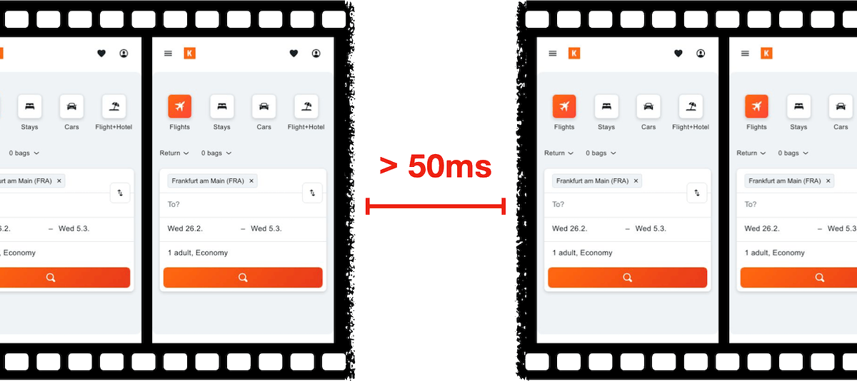
Long Animation Frame – a frame that took longer then 50ms from its start to when it started painting
LoAF allows us to understand how scripts and other tasks affect both hard and soft navigations, as well as how scripts affect interactions. Using the data LoAF provides, we can identify problem scripts and target changes that improve our visitors' experience. We can also finally start to quantify the impact of third-party scripts as they execute in our visitors' browsers.
Keep reading to learn:
- Why animation frame rate matters
- Anatomy of a Long Animation Frame
- Key LoAF milestones and what we can do with milestone data
- Script attribution (and why script details might sometimes be unavailable)
- How to match script data to Interaction to Next Paint, including sub-parts
- How to capture LoAF entries
- Getting started with LoAF
- LoAF support in SpeedCurve
NEW! Monitor Long Animation Frames and get to the bottom of your JavaScript issues

CPU consumption by the browser is one of the main causes – if not the number one cause – of a poor user experience. The primary culprit? JavaScript execution. Now you can use SpeedCurve to monitor Long Animation Frames (LoAFs) and fix the third parties and other scripts that are hurting your page speed.
Until recently, we've had little evidence from the field that definitively attributes the root cause of rendering delays. While JavaScript Long Tasks gave us a good indication that there were blocking tasks affecting metrics such as Interaction to Next Paint and Largest Contentful Paint, there was no way to attribute the work or understand how it was ultimately affecting rendering.
Fortunately, we've gotten a lot of help from Chrome in improving the attribution – and ultimately the actionability – of the data we collect in the field with RUM. The introduction of the Long Animation Frames API (LoAF) not only gives us better methods for understanding what's happening on the browser's main thread, in some cases it also gives us attribution to both first- and third-party scripts that occur during a LoAF.
This has been a highly anticipated addition to SpeedCurve, which is available for all our RUM users today. This post covers what's new in the product and points you to a few new resources to help you get up to speed on all things related to LoAF.
Our 10 most popular web performance articles of 2024

We love writing articles and blog posts that help folks solve real web performance and UX problems. Here are the ones you loved most in 2024. (The number one item may surprise you!)

Some of these articles come from our recently published Web Performance Guide – a collection of evergreen how-to resources (written by actual humans!) that will help you master website monitoring, analytics, and diagnostics. The rest come from this blog, where we tend to publish industry news and analysis.
Regardless of the source, we hope you find these pieces useful!
UPDATE: Bookmark and compare synthetic tests
One of the huge benefits of tracking web performance over time is the ability to see trends and compare metrics. Last year we added new functionality that makes it easy for you to bookmark and compare different synthetic tests in your test history. We recently added some additional enhancements to make comparing tests even easier.
With the 'Compare' feature, you can generate side-by-side comparisons that let you not only spot regressions, but easily identify what caused them:
- Compare the same page at different points in time
- Compare two versions of the same page – for example, one with ads and one without
- Understand which metrics got better or worse
- Identify which common requests got bigger/smaller or slower/faster
- Spot any new or unique requests – such as JavaScript and images – and see their impact on performance
Along the way, we've also made it much more intuitive for you to drill down into your detailed synthetic test results. Let's take a look...
First Input Delay: How vital is it?
We’ve been pretty vocal about Core Web Vitals since Google announced this initiative last spring. We love the idea of having a lean, shared set of metrics that we can all rally around – not to mention having a broader conversation about web performance that includes teams throughout an organization.
For many site owners, the increased focus on Core Web Vitals is driven by the fact that Google will be including them as a factor in search ranking in May 2021. Other folks are more interested in distilling the extremely large barrel of performance metrics into an easily digested trinity of guidelines to follow in order to provide a delightful user experience.
We’ve had some time to evaluate and explore these metrics, and we're committed to transparently discussing their pros and cons.
The purpose of this post is to explore First Input Delay (FID). This metric is unique among the three Web Vitals in that it is can only be measured using real user monitoring (RUM), while the other two (Largest Contentful Paint and Cumulative Layout Shift) can be measured using both RUM and synthetic monitoring.
In this post we'll cover:
- What is FID?
- What does FID look like across the web?
- The importance of measuring user interactions
- How JavaScript affects user behavior
- Suggestions for how you can look at FID in relation to your other key metrics
Let's dig in!
New! Tracking first- and third-party request groups
Getting visibility into the impact that known third parties have on the user experience has long been a focus in our community. There are some great tools out there – like 3rdParty.io from Nic Jansma and Request Map from Simon Hearne – which give us important insight into the complexity involved in tracking third-party content.
When we released our re-imagined Third Party Dashboard last year, we were excited to be providing site owners with another great tool for managing the unmanageable. Among other things, we took an approach that included:
- grouping requests,
- exposing Long Tasks attributed to third parties, and
- tracking blocking CPU time.
This provided even more insight into the different ways JavaScript could be causing real headaches for users.
We received a lot of feedback from our customers, who loved the new third-party functionality but REALLY wanted to see similar functionality for their "first party" content as well. We heard this message loud and clear, and today we're happy to announce a few changes to our Synthetic monitoring tool that address this need while preserving the functionality you already know and love.
Six web performance resolutions for the new year

For the past two years, the performance.now() conference has been the most valuable performance event I've attended. So valuable, in fact, that I've made some of the talks the cornerstone of this list of performance resolutions for 2020. I'd love to know how many – if any – of these are on your list. As always, I'd love people's feedback!
Measuring Jank and UX

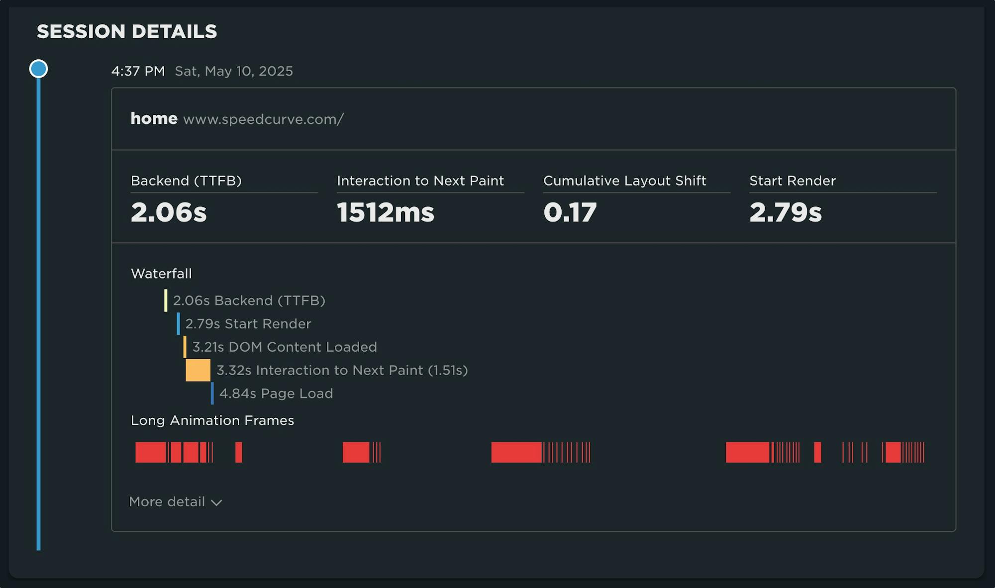
Ten years ago the network was the biggest problem when it came to making websites fast. Today, CPU is the main concern. This happened because networks got faster while JavaScript moved in the other direction growing 3x in size in the last six years. This growth is important because JavaScript consumes more CPU than all other browser activities combined. While JavaScript and other activities block the CPU, the browser can't respond to user input creating the sensation of a slow, jittery, or broken page, AKA "jank".
To help focus our attention on CPU, several new performance metrics have been defined and evangelized over the last year or three. In this post I'm going to focus on these:
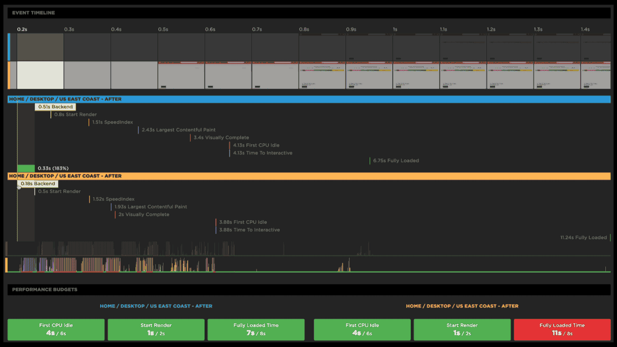
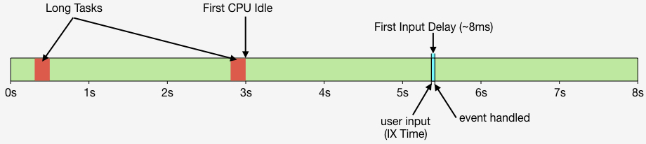
- First CPU Idle measures when the page is no longer janky. Specifically, it is the first span of 5 seconds where the browser main thread is never blocked for more than 50ms after First Contentful Paint. A value of 2-4 seconds is typical.
- First Input Delay measures the gap between when a user interacts with the page (e.g, clicks or scrolls) and when the browser is able to act on that input. First Input Delay values are much lower - a good target is 10ms, but 25ms is common.
- First Interaction Time is when the first user input takes place. This varies widely depending on the type of site and page. A good search results page might have a low First Interaction Time because users scroll and click quickly. A media site might have a high First Interaction Time because users start reading content (headlines, stories) before interacting with the page. At SpeedCurve we call this "IX Time".
- Total Long Task CPU Time is the sum of all long tasks that occur in the page. A "long task" is a browser event that blocks the main thread for more than 50ms.
Here's a figure to help visualize these metrics.
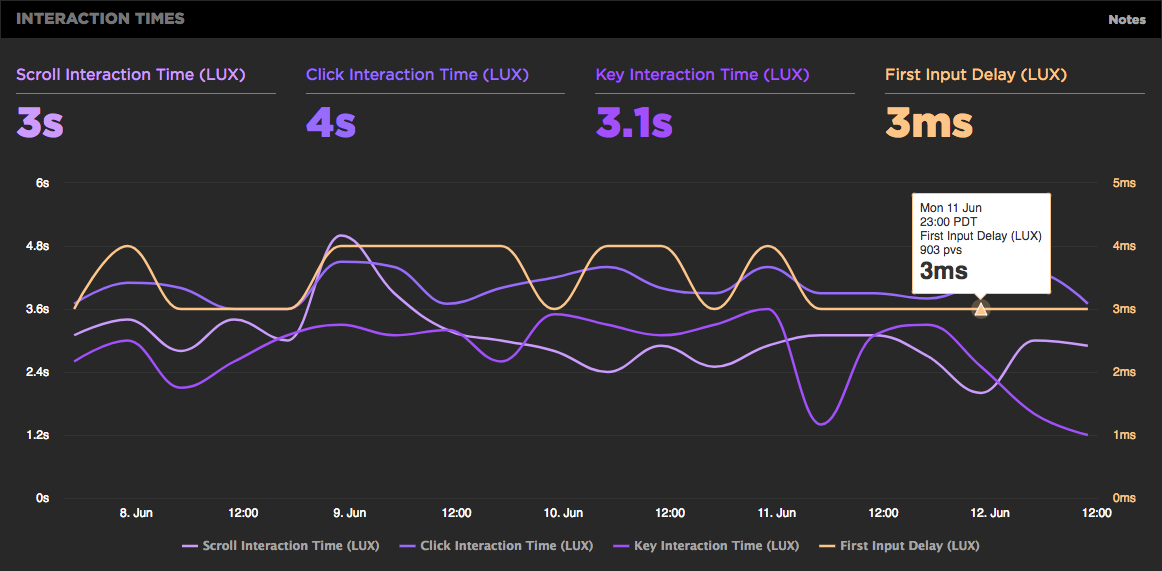
New LUX JavaScript Dashboards
As organizations work to improve performance for users around the world on slower networks and devices, the focus on JavaScript continues to grow. LUX's new JavaScript dashboards help to identify the problems and solutions for creating a fast, joyous user experience.
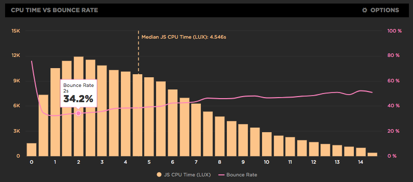
LUX is SpeedCurve's real user monitoring product. We launched it two years ago with four dashboards: Live, Users, Performance, and Design. Today we've added two more LUX dashboards: JavaScript and JS Errors. These new dashboards let you see the impact JavaScript has on your site and on your users with new metrics, including First CPU Idle and First Input Delay, and new features, such as correlation charts that show you how CPU time correlates with bounce rate.
Preload scripts
In my previous post I talked about how loading scripts asynchronously reduces the impact of JavaScript resulting in a (much) faster user experience. But even when scripts are loaded async, the browser may still twiddle its thumbs for a second or more waiting for the first script to arrive. This delay can be decreased by using link rel=preload like this:
<link rel="preload" href="main.js" as="script">Metrics from 1M sites
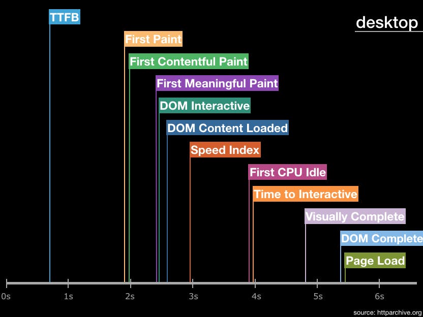
The number of performance metrics is large and increases every year. It's important to understand what the different metrics represent and pick metrics that are important for your site. Our Evaluating rendering metrics post was a popular (and fun) way to compare and choose rendering metrics. Recently I created this timeline of performance metric medians from the HTTP Archive for the world's top ~1.3 million sites:
First Input Delay shows how quickly your site responds to user interaction
We're excited to announce the availability of the First Input Delay metric as part of LUX, SpeedCurve's RUM product.