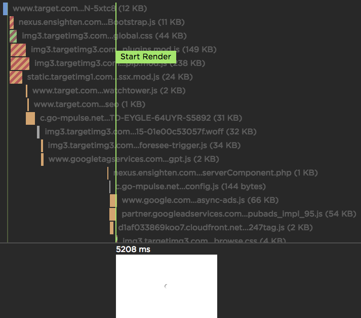
SpeedCurve Waterfall
If you're a performance engineer, then you're familiar with waterfall charts. They are found in browser dev tools as well as other performance services. I use multiple waterfall tools every day, but the waterfall chart I love the most is the one we've built at SpeedCurve:

Measuring the User Experience
SpeedCurve’s sweet spot is the intersection of design and performance - where the user experience lives. Other monitoring services focus on network behavior and the mechanics of the browser. Yet users rarely complain that “the DNS lookups are too slow” or “the load event fired late”. Instead, users get frustrated when they have to wait for the content they care about to appear on the screen.
The key to a good user experience is quickly delivering the critical content.
