SpeedCurve Consulting Services with Tim Kadlec

We're excited to announce that SpeedCurve is partnering with Tim Kadlec to provide consulting services to our customers!
Tim is a recognized expert when it comes to web performance. He has spoken at numerous conferences including Velocity, Fluent, QCon, SmashingConf, Beyond Tellerand, and WebStock. He wrote High Performance Images and Implementing Responsive Design, as well as contributing to other books. Mark, Tammy and I have each collaborated with Tim on side projects. We're full of gleeful anticipation as we look forward to this opportunity to work together again.
In the first sentence I mentioned that this is a partnership. Here's what that means: Tim will continue to do consulting outside of SpeedCurve, and if you're not a SpeedCurve customer we encourage you to contact him directly. Tim will also be running SpeedCurve's consulting services. This partnership brings special advantages to SpeedCurve customers:
PWA Performance
Progressive Web Apps (PWAs) combine the best and newest features of the Web to deliver an experience that rivals native applications on mobile. Even better, they work on desktop, too. In fact, they work everywhere that the Web works! "Ah", you say, "that's not true! They require features that don't exist in all browsers." Because PWAs are "progressive", they can adapt to older browsers to deliver the best experience possible given the features that are available.
Given these winning attributes, it's no surprize that PWAs are the most popular movement in web development today. And while there are already numerous conferences, videos, and evangelists for PWAs, there's less focus on testing and tracking the performance of PWAs. Mark and I discussed this gap in PWA performance. In response, we added some new features to SpeedCurve that, coupled with some existing features, provide a great toolkit for evaluating the performance of PWAs.
Responsive Design Dashboard
The dramatic growth of mobile traffic has created an urgency for websites to adapt to different screen sizes. Responsive design is the preferred technique for making web content adapt to the device on which it's viewed. This approach ensures that the appropriate content is rendered in an appropriate way on phones, tables, laptops, and any other screen being used.
A corollary to responsive design is the need for performance. Delivering content that's customized for a particular device isn't enough if its delivery is slow and frustrating. Indeed, last week Google announced that websites need to deliver their design appropriately and quickly on mobile devices or they will be demoted in Google's search results.
How can you know if your website matches these standards for adaptive content and speed? SpeedCurve's Responsive Design Dashboard answers both questions in one view.

Velocity: Responsive in the wild
I was lucky enough to give a Lighting Demo at Velocity Conference in Santa Clara. The focus was on research I conducted into 250 responsive websites and how well optimized for performance they were.
Performance tips for building responsive sites
The following article was originally published in the 2013 Performance Calendar. There's 31 great articles to explore in the calendar including Steve Souders's browser wishlist and Tim Kadlec's take on what it takes to create a performance culture.
----
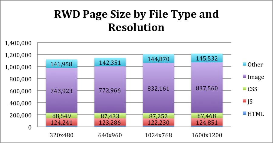
Responsive Web Design (RWD) is now a well established technique yet it’s adoption is still surprisingly low. Guy Podjarny’s recent research shows that only one in eight websites is responsive. Often when responsive sites are designed the approach is primarily from a visual design perspective and teams struggle with the complexity of changing design and navigation patterns let alone any performance concerns, which become secondary. This can lead to serving the same sized assets to all browser widths resulting in a responsive site that is visually scaled but not performance optimised. On average responsive sites at 320 pixels wide are only 8% small than at 1600 pixels wide. Unsurprisingly these performance concerns and a lack of established techniques have made some hesitate when considering RWD adoption.
Responsive page sizes across different screen resolutions. Source: Guy Podjarny
Easily add WebP, SVG and Retina responsive images to your site
A lot of sites are now using responsive design techniques to create great user experiences across mobile, tablet and desktop. Unfortunately images are often just set to 100% width with the same large image being delivered to all browsers and platforms. Picturefill was an important step in delivering responsive images and David Newton's fork now extends that approach to include WebP and SVG images in the mix you send down the pipe.


