Understanding the performance impact of anti-flicker snippets
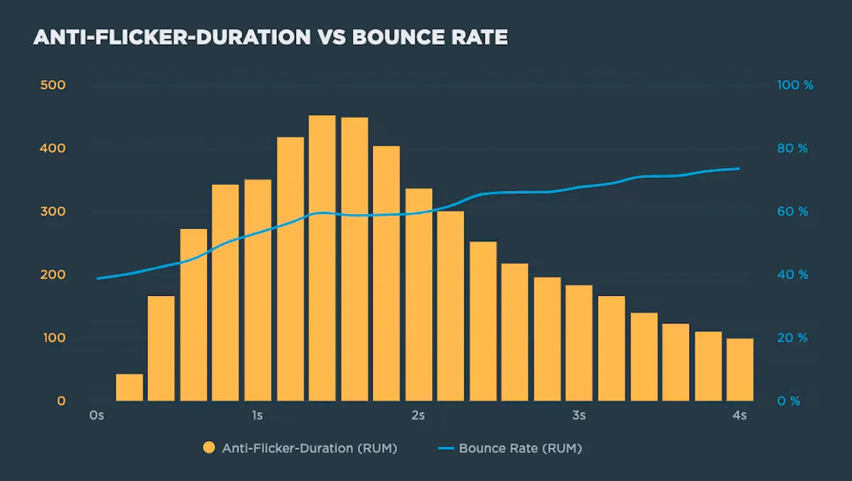
Experimentation tools that use asynchronous scripts – such as Google Optimize, Adobe Target, and Visual Web Optimizer – recommend using an anti-flicker snippet to hide the page until they've finished executing. But this practice comes with some performance measurement pitfalls:
- Hiding the contents of the page can have a dramatic effect on the Web Vitals that measure visual experience, such as First Contentful Paint (FCP) and Largest Contentful Paint (LCP)
- Anti-flicker snippets can also affect Cumulative Layout Shift (CLS) and the synthetic equivalent of First Input Delay (FID), Total Blocking Time (TBT).
In this post we'll look at how anti-flicker snippets work, their impact on Web Vitals, and how to measure the delay they add to visitors' experience.

Responsive Design Dashboard
The dramatic growth of mobile traffic has created an urgency for websites to adapt to different screen sizes. Responsive design is the preferred technique for making web content adapt to the device on which it's viewed. This approach ensures that the appropriate content is rendered in an appropriate way on phones, tables, laptops, and any other screen being used.
A corollary to responsive design is the need for performance. Delivering content that's customized for a particular device isn't enough if its delivery is slow and frustrating. Indeed, last week Google announced that websites need to deliver their design appropriately and quickly on mobile devices or they will be demoted in Google's search results.
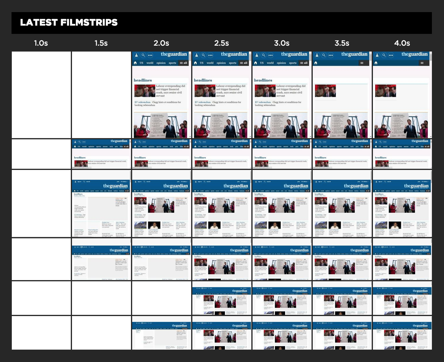
How can you know if your website matches these standards for adaptive content and speed? SpeedCurve's Responsive Design Dashboard answers both questions in one view.


