SpeedCurve is now part of the Embrace family! There are no changes to how you use our products. Our founder Mark shares what this means...
NEW! A trickle of updates to your waterfall charts

Waterfall charts are the workhorse of any web performance enthusiast. SpeedCurve's interactive waterfall is one of the first components I designed and built more than a decade ago. I've just given our much-loved waterfall chart some team-inspired updates that you may find helpful in understanding how page construction affects important user experience metrics.
At SpeedCurve, we love incremental updates based on both external and internal user feedback. We dogfood our own products, and while consulting with customers, our in-house performance expert Andy Davies is often confronted by the gulf between a customers questions and how he might answer those questions using the data we collect and the visulizations we wrap around it.
It's not always easy. Making data visible doesn't automatically mean it's useful in answering questions about the intersection of web performance and user behaviour.
Three years ago Andy asked me for a feature in the waterfall chart. I added it straight away, and to this day Andy has never discovered or used the feature!
"Wait, you can do that?" ~ Andy
If Andy uses SpeedCurve everyday, knows it inside out, and still can't stumble across a three-year-old feature, that's not Andy's problem. That's a problem with complexity in the user interface and feature discoverability. It's a common problem as software matures and features get layered on top of each other. What started out simple and easy to explore becomes complex and hidden behind a myriad of options.
Today I'm taking a crack at removing some options in the waterfall to reduce complexity and choice while exposing better defaults.
I'm hoping Andy sees the changes this time around and it helps answer more of his questions...
Waterfall with browser events
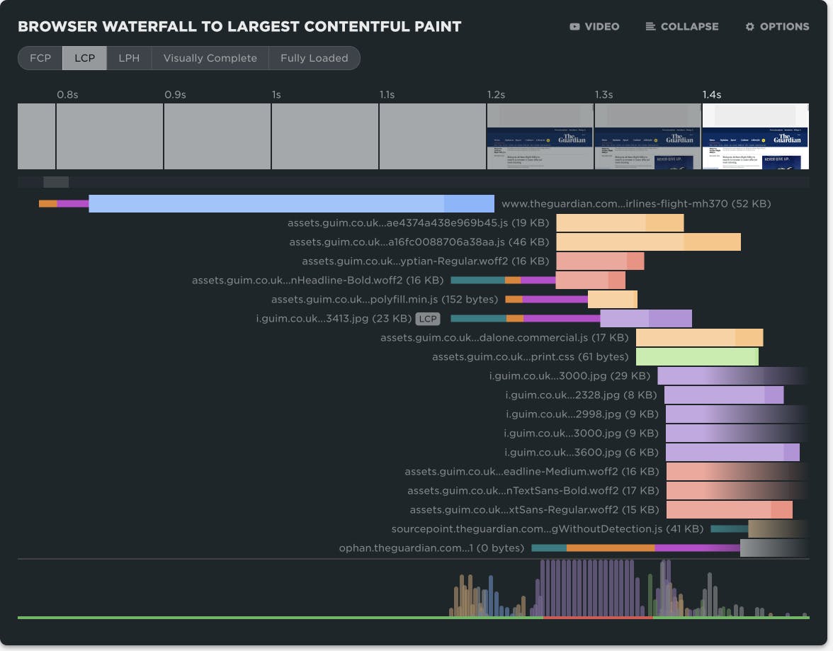
We've improved our already fantastic interactive waterfall chart with a new collapsed mode that highlights all the key browser events. This lets you quickly scan all the events that happen as the page loads and if you scrub your mouse across the waterfall you can easily correlate each event to what the user could see at that moment.
Along with all the browser metrics you also get to see our new hero rendering times in context. Click on any event to see a large version of that moment in the filmstrip.
SpeedCurve Waterfall

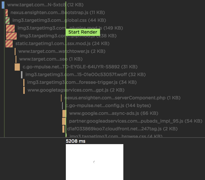
If you're a performance engineer, then you're familiar with waterfall charts. They are found in browser dev tools as well as other performance services. I use multiple waterfall tools every day, but the waterfall chart I love the most is the one we've built at SpeedCurve:
UX Focus for Waterfalls and Third Parties
At SpeedCurve, we want to help designers and developers have better insight into the user experience they're delivering. For websites, this means understanding when the critical parts of the page render and what might be blocking rendering.
We've redesigned our waterfall chart to really highlight the relationship between the assets on the page and their affect on the user experience. Now as you move you mouse over the waterfall chart we show you exactly what a user is seeing at that millsecond while the page loads. This makes it much easier to identify any Javascript or CSS that might be blocking the page from rendering. I recently used this new combined waterfall and filmstrip view to identify a common issue with hero images being delayed.
Velocity: A better waterfall chart
The way we visualize performance data can have an impact on how we interpret and communicate performance issues within our teams.
In this talk from Velocity New York I explored the importance of data visualization and presented some of my own explorations into re-imagining the classic waterfall chart which is the mainstay of front-end performance analysis.
Skip to 15:30 if you just want to see the data visualization experiments.
One of these experiments was also turned into a performance heatmap bookmarklet.
Sort browser waterfalls
Sort the items in a browser waterfall by Time, Savings and Slowest. Time is the default showing how assets loaded in the browser. Savings places assets at the top that have the greatest optimization potential and Slowest shows you which are the slowest overall requests.
