SpeedCurve is now part of the Embrace family! There are no changes to how you use our products. Our founder Mark shares what this means...
User Timing Level 3: Set a value!

The Chrome team has snuck a fundamental change to how user timing marks work into Chrome 78. For many years now, our own Steve Souders has championed user timing, and he has always believed you should be able to set a value for a user timing mark or measure.
With User Timing Level 3, now you can! Level 3 lets you explicit set a startTime whereas previously you could only pass in the name of a mark.
performance.mark("name", {startTime: 1000})New! Tracking first- and third-party request groups

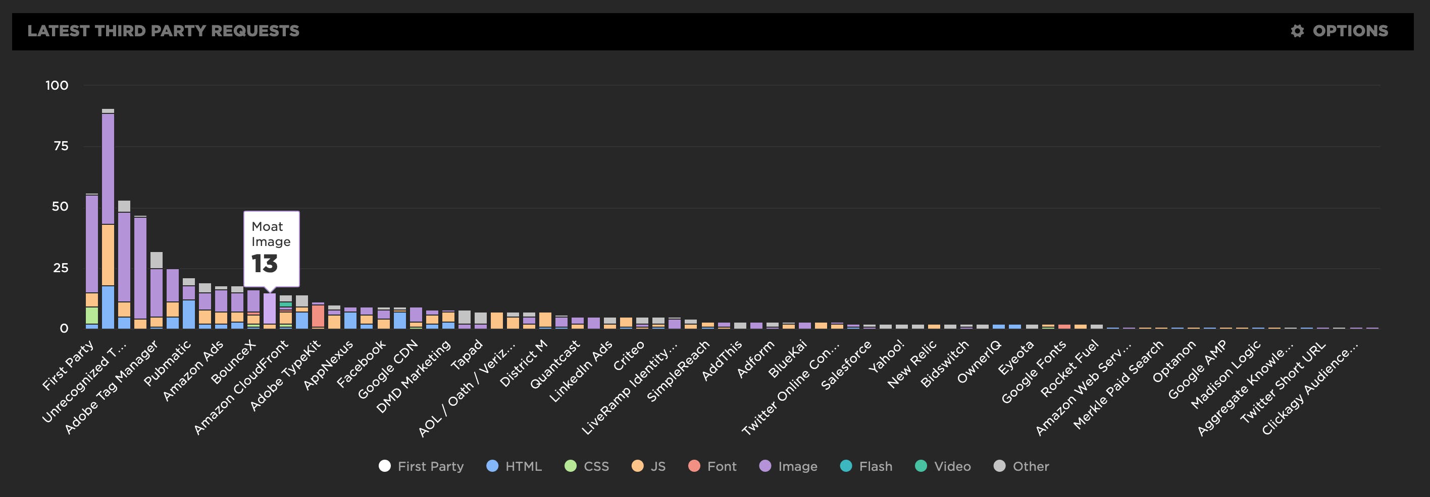
Getting visibility into the impact that known third parties have on the user experience has long been a focus in our community. There are some great tools out there – like 3rdParty.io from Nic Jansma and Request Map from Simon Hearne – which give us important insight into the complexity involved in tracking third-party content.
When we released our re-imagined Third Party Dashboard last year, we were excited to be providing site owners with another great tool for managing the unmanageable. Among other things, we took an approach that included:
- grouping requests,
- exposing Long Tasks attributed to third parties, and
- tracking blocking CPU time.
This provided even more insight into the different ways JavaScript could be causing real headaches for users.
We received a lot of feedback from our customers, who loved the new third-party functionality but REALLY wanted to see similar functionality for their "first party" content as well. We heard this message loud and clear, and today we're happy to announce a few changes to our Synthetic monitoring tool that address this need while preserving the functionality you already know and love.
Introducing a new resource for the performance community: Page Speed Benchmarks!

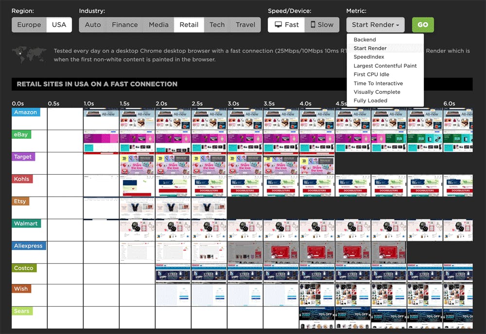
Here are some common questions I’m asked when I talk with people about performance:
- Which metrics should I care about?
- What types of devices and connections should I test on?
- Which third parties should I be most concerned about?
- How fast should I be?
- What are some good sites I can use for benchmarking?
Today, I’m very excited to announce the release of a new project that helps answer those questions – and more!
Page Speed Benchmarks is an interactive dashboard that lets you explore and compare web performance data for leading websites across several industries – from retail to media.
With Page Speed Benchmarks, you can do things like:
- See what the different metrics actually mean in terms of user-perceived performance
- Compare how the same page renders on fast vs slow devices and connections
- Understand what makes fast sites fast (and slow sites slow)
- Get insights into how third parties can perform on different sites
- Identify sites you can use for your own competitive benchmarking
If you already like tools like the HTTP Archive, I think you'll love how you can use Page Speed Benchmarks to complement the insights you're already getting. Keep reading to find out how we set up these benchmarks, and how you can mine our test data – even if you're not a SpeedCurve user – for your own performance research.
Six web performance resolutions for the new year

For the past two years, the performance.now() conference has been the most valuable performance event I've attended. So valuable, in fact, that I've made some of the talks the cornerstone of this list of performance resolutions for 2020. I'd love to know how many – if any – of these are on your list. As always, I'd love people's feedback!
Sampling RUM: When and why it's a good idea

I confess, I’m not a statistician. While I pride myself on the 'A' I received in my college statistics class, admittedly it was on a pretty steep curve. That said, I’ve been looking at performance data for many years and have found myself on both sides of the debate about whether or not the practice of sampling performance data is inherently a good or bad idea.
When it comes to real user monitoring (RUM), I’m convinced that the marginal cost of collection, computation, storage, etc. is not always great enough to warrant a practice of collecting ALL THE THINGS by default.
Like any experiment, how you sample RUM data – as well as how much data to sample – depends on the answers you seek. While certainly not an exhaustive list, here are some questions you might ask when looking at implementing a sampled approach to real user monitoring...
A long time coming...
I’ve joined SpeedCurve! I’m thrilled to share this news and have never been more excited about a career change than I am today. I’ve known this cast of characters for a while and am humbled that they have brought me onto the team. As Tammy put it when she joined, if this crew invited you to work with them, “what would you say?”

Tammy, Steve and Cliff at Velocity Conference circa 2015
Who am I?
As a veteran in the performance industry, I’ve spent a large part of my career helping to build performance culture. I’ve been in countless rooms and discussions defending the case for performance and helping to educate cross-functional teams about the impact of performance on the user experience and ultimately the health of the business.
My journey has taken me to both sides – as a product leader focused on building tools and solutions for customers, and as a practitioner focused on creating a culture of performance for one the world’s largest brands.
New! User Happiness metric, CI plugin, and an inspiring third-party success story
Here at SpeedCurve, the past few months have found us obsessing over how to define and measure user happiness. We've also been scrutinizing JS performance, particularly as it applies to third parties. And as always, we're constantly working to find ways to improve your experience with using our tools. See below for exciting updates on all these fronts.
As always, we love hearing from you, so please send your feedback and suggestions our way!

Getting started with web performance? Here's what you need to focus on.
A while back, our friends at Shopify published this great case study, showing how they optimized one of their newer themes from the ground up – and how they worked to keep it fast. Inspired by that post, I wanted to dig a bit deeper into a few of the best practices they mentioned, which fall loosely into these three buckets:
- Analyze your pages – understand the critical rendering path and page composition.
- Create performance budgets and fight regression.
- Build a performance culture that embraces collaboration between design and dev.
Keep reading to learn how you can apply these best practices to your own site and give your pages a speed boost.
Performance testing in CI: Let's break the build!

Raise your hand if you've ever poured countless hours into making a fast website, only to have it slowly degrade over time. New features, tweaks, and Super Important Tracking Snippets all pile up and slow things down. At some point you'll be given permission to "focus on performance" and after many more hours, the website will be fast again. But a few months later, things start to slow again. The cycle repeats.
What if there was a way that you could prevent performance from degrading in the first place? Some sort of performance gateway that only allows changes to production code if they meet performance requirements? I think it's time we talked about having performance regressions break the build.
Third party blame game
Our third party metrics and dashboard have had an exciting revamp. With new metrics like blocking CPU, you can now see exactly who is really to blame for a crappy user experience. We've also given you the ability to monitor individual third parties over time and create performance budgets for them.
It's not you, it's me
Or is it really you, and not me? We now automatically group all the requests in our third party waterfall chart, letting you easily identify all the third party services used on your website.
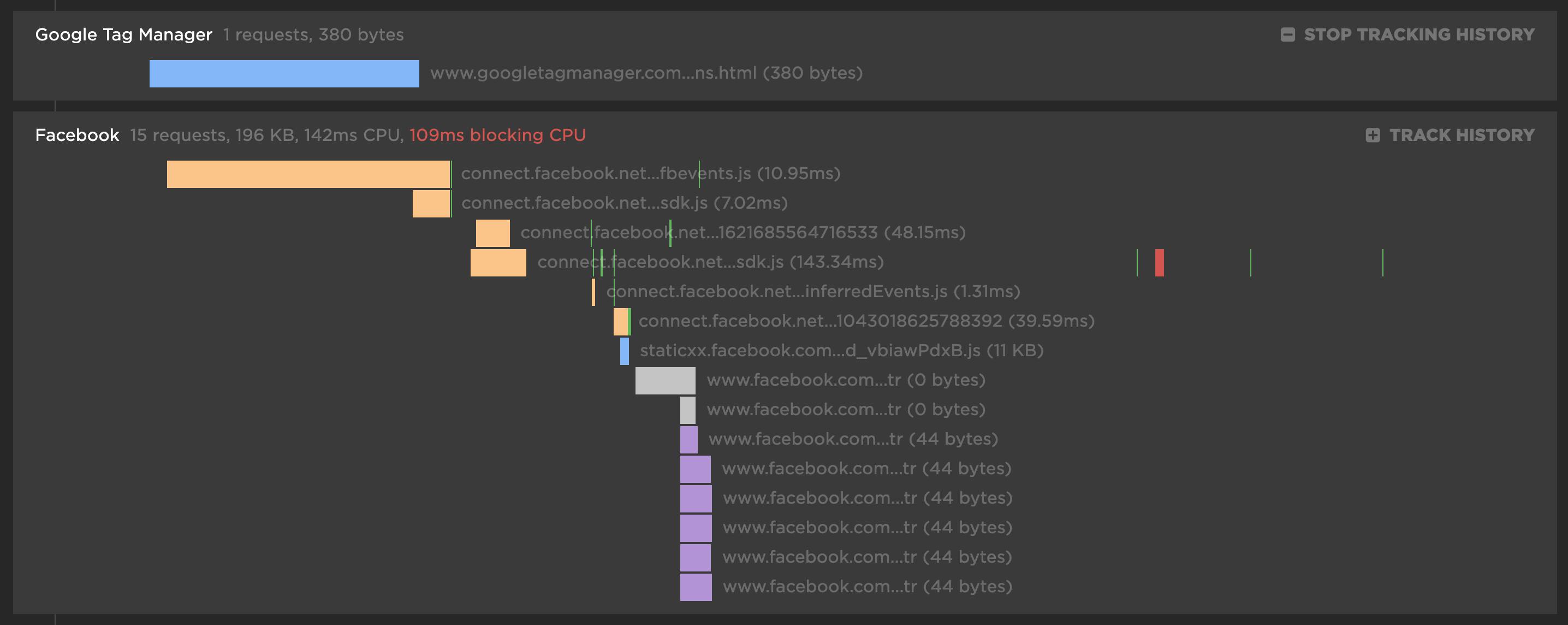
For each third party, you get the number of requests and size for each content type. There's also a first party comparison you can toggle on/off to see what proportion of your requests come from first party vs third party.