SpeedCurve is now part of the Embrace family! There are no changes to how you use our products. Our founder Mark shares what this means...
SpeedCurve Consulting Services with Tim Kadlec


We're excited to announce that SpeedCurve is partnering with Tim Kadlec to provide consulting services to our customers!
Tim is a recognized expert when it comes to web performance. He has spoken at numerous conferences including Velocity, Fluent, QCon, SmashingConf, Beyond Tellerand, and WebStock. He wrote High Performance Images and Implementing Responsive Design, as well as contributing to other books. Mark, Tammy and I have each collaborated with Tim on side projects. We're full of gleeful anticipation as we look forward to this opportunity to work together again.
In the first sentence I mentioned that this is a partnership. Here's what that means: Tim will continue to do consulting outside of SpeedCurve, and if you're not a SpeedCurve customer we encourage you to contact him directly. Tim will also be running SpeedCurve's consulting services. This partnership brings special advantages to SpeedCurve customers:
More RUM metrics in your Favorites dashboards
SpeedCurve comes with a great set of dashboards for Synthetic and RUM. But we know that one size does not fit all when it comes to data charts, which is why we've invested so much work into the Favorites dashboards. For customers who use RUM, it provides a place to create custom charts that combine metrics from synthetic and RUM.
We just added some new RUM metrics in Favorites to allow for even more customized monitoring:
- Page Views – The number of page views, including Single-Page-App page transitions
- Sessions – The number of unique sessions
- Session Length – The number of page views per session
- Bounced Sessions – The number of sessions that only have one page view
- Bounce Rate – The percentage of bounced sessions out of the total number of sessions
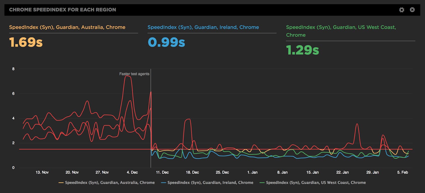
Faster test agents and more regions

We’re kicking off 2018 with a bang and a donut. We’ve been busy preparing all-new faster test agents and they’re now available for you to switch to – at no extra cost!
Go to your Settings to switch to faster test agents.
Faster agents
All our agents now run on much faster AWS C4.Large instances, which better approximate current desktop browsers. We’ve also switched to the latest WebPageTest agent running on Linux.
How much faster? 20-30%
When you switch to the new agents, some of your metrics will get 20-30% faster, so pick a time to switch that suits your team. In between projects or the start of the month are good times to set a new baseline.
How to create a healthy, happy performance culture

One of the best parts of my job is getting to talk to so many people from so many different companies about web performance. Every company is different, and I learn a ton from talking to each one. But one question that almost every person asks me – regardless of what industry they're in or the size of their organization – is this:
How can I create a stronger culture of web performance at my company?
Creating a performance culture means creating a feedback loop in your company or team that looks like this:
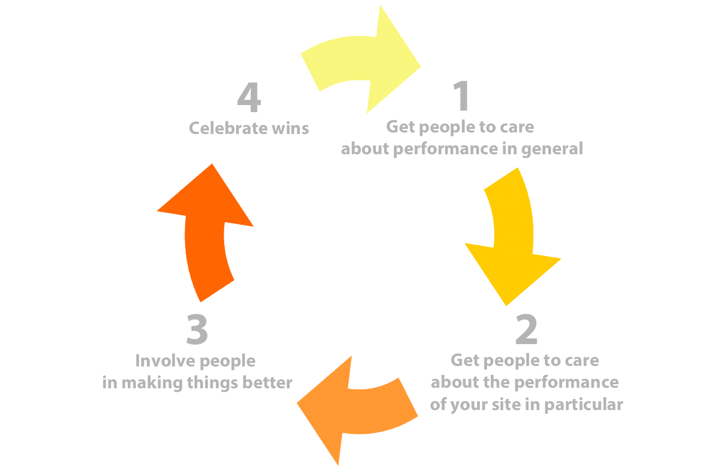
In other words: Get people to care, show them what they can do to help, and then give them positive reinforcement when you get results. It's basic human psychology, and it might seem obvious when you see it in a super-simple graphic. But it's surprisingly easy to miss these steps and instead skip ahead to the part where you invest in awesome performance tools, and then wonder why all your performance efforts feel like such a painful uphill slog.
In this post, I'm going to share some proven tips and best practices to help you create a healthy, happy, celebratory performance culture.
Evaluating rendering metrics
At SpeedCurve, we're fond of the phrase "a joyous user experience". Creating this joy requires delivering what users want as quickly as possible. It's important that the critical content is downloaded and rendered before users get frustrated.
Network metrics have been around for decades, but rendering metrics are newer. Speed Index. Start Render. Time to First Interactive. First Meaningful Paint. These are a few of the rendering metrics that currently exist. What do they mean? How do they compare? Which are best for you? Let's take a look.
By popular demand: Multiple Favorites dashboards!
Rolling out new features is always a blast, and it's extra rewarding when the new feature is a response to a customer request. We've had many conversations with SpeedCurve users who've told us that multiple Favorite dashboards would be a huge benefit for their teams.
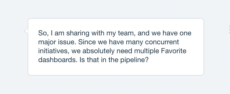
Today, we're very excited to announce that multiple Favorites dashboards are now available. Here's why you need them and how to create them.
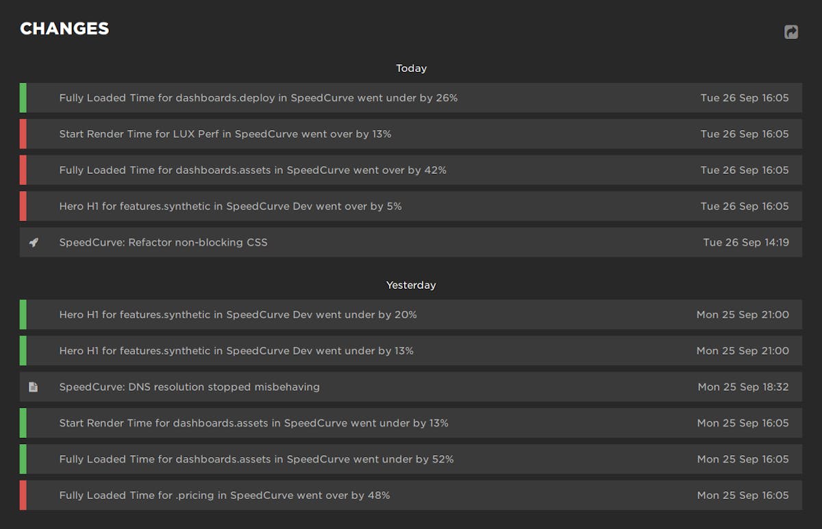
Keeping track of performance changes

Being able to track which changes have an impact – either positive or negative – on your site’s performance is an important part of performance monitoring that can provide valuable feedback to your team. We wanted to make it easier to see at a glance all the changes to your site, without the cognitive overhead of interpreting charts. That’s why we created the new Changes dashboard, which gives you a newsfeed-style overview of recent activity in your SpeedCurve account.
Your Changes dashboard shows your performance budget alerts, deploys, site notes, and SpeedCurve product updates:
A retailer's guide to web performance
I’m at Shop.org this week, having really interesting conversations with online retailers. What I love about talking with this crowd is that – like me – they're super focused on user-perceived performance. Not surprisingly, we have a lot to talk about.
Making customers happy is the not-so-secret secret to retail success. Delivering a fast, consistent online experience has been proven to measurably increase every metric retailers care about – from conversions and revenue to retention and brand perception. (In fact, there's so much research in this area, I dedicated an entire chapter in my book to it. You can also find a number of great studies on WPO Stats.)
Delivering great, fast online experiences starts with asking two questions:
- What’s making my pages seem slower for my users?
- What can I do about it?
The good news is that most of the issues that are making pages slow for your shoppers are right on your pages, which means you have control over them. Here's an overview of the most common performance issues on retail sites, and how you can track them down and fix them.
Woohoo! I'm helping build SpeedCurve
I’m super excited to be able to say that I’ve joined Mark, Steve, and Tammy at SpeedCurve!
I’ve watched how Mark has shown over the last couple of years that performance monitoring doesn’t have to be dry and data-heavy; it can be insightful, interactive, and actionable. I’ve also been a follower of Steve’s work for many years. In fact, I should probably thank Steve for providing me with the knowledge that got me interested in web performance in the first place! Tammy’s work has been really interesting to follow, too - her focus on real people and how web performance impacts the way they use our websites is something that resonates strongly with me.

Joseph making BBC News way faster for all users.
Waterfall with browser events
We've improved our already fantastic interactive waterfall chart with a new collapsed mode that highlights all the key browser events. This lets you quickly scan all the events that happen as the page loads and if you scrub your mouse across the waterfall you can easily correlate each event to what the user could see at that moment.
Along with all the browser metrics you also get to see our new hero rendering times in context. Click on any event to see a large version of that moment in the filmstrip.
