SpeedCurve is now part of the Embrace family! There are no changes to how you use our products. Our founder Mark shares what this means...
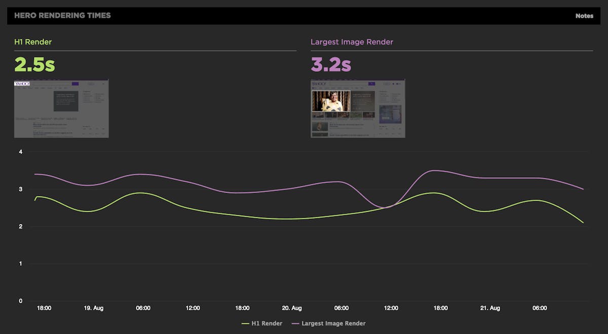
Hero Rendering Times: New metrics for measuring UX

The key to a good user experience is quickly delivering the content your visitors care about the most. This is easy to say, but tricky to do. Every site has unique content and user engagement goals, which is why measuring how fast critical content renders has historically been a challenging task.
That's why we're very excited to introduce Hero Rendering Times, a set of new metrics for measuring the user experience. Hero Times measure when a page's most important content finishes rendering in the browser. These metrics are available right now to SpeedCurve users.
More on how Hero Rendering Times work further down in this post. But first, I want to give a bit of back story that explains how we got to here.
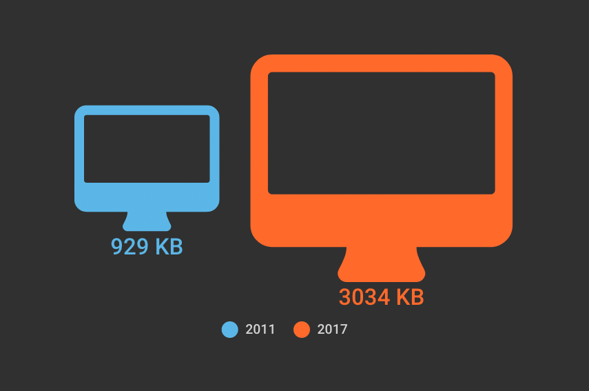
The average web page is 3MB. How much should we care?
See our more recent page growth posts:
- What is page bloat? And how is it hurting your business, search rank, and users? (July 2023)
- 10 years of page bloat: What have we learned? (March 2022)
A couple of month ago, someone asked if I'd written a page bloat update recently. The answer was no. I've written a lot of posts about page bloat, starting way back in 2012, when the average page hit 1MB. To my mind, the topic had been well covered. We know that the general trend is that pages are getting bigger at a fairly consistent rate of growth. It didn't feel like there was much new territory to cover.
Also: it felt like Ilya Grigorik dropped the mic on the page bloat conversation with this awesome post, where he illustrated why the "average page" is a myth. Among the many things Ilya observed after analyzing HTTP Archive data for desktop sites, when you have outliers that weigh in at 30MB+ and more than 90% of your pages are under 5MB, an "average page size" of 2227KB (back in 2016) doesn't mean much.
The mic dropped. We all stared at it on the floor for a while, then wandered away. And now I want to propose we wander back. Why? Because the average page is now 3MB in size, and this seems like a good time to pause, check our assumptions, and ask ourselves:
Is there any reason to care about page size as a performance metric? And if we don't consider page size a meaningful metric, then what should we care about?
Find and fix what matters most
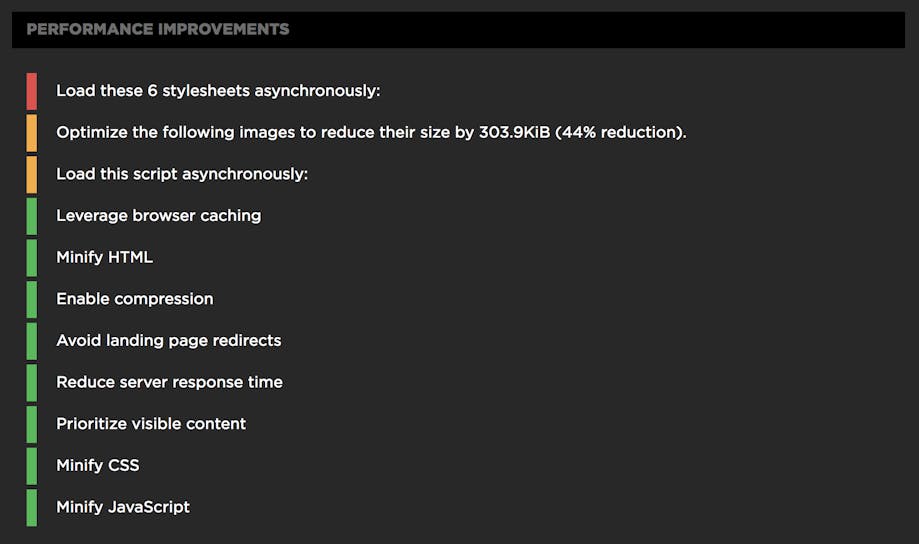
Being able to monitor and measure the performance of your pages is crucial. You know that already. You also know that the next step is to quickly find out what’s hurting your pages so you can stop the pain.
You want to know:
- Which performance rules is my page breaking?
- How do I prioritize my optimization efforts?
- How can I communicate this quickly and clearly to my team?
We’re super excited to announce that you can now use SpeedCurve to answer these questions.
I've joined SpeedCurve! Here's why
TL;DR
If Mark and Steve invited you to work with them, what would you say? Exactly.
Long version
Okay, I have to elaborate a bit more about why I’m ridiculously excited about working with Mark and Steve. My first foray into the performance space was at the Velocity Conference in 2009. If you had told me then that someday I’d be working with that tall guy rocking the main stage, I would’ve thanked you for the kind words… while secretly thinking you were nuts. But here I am!

Tammy at International Women's Day Tech Talks in Toronto
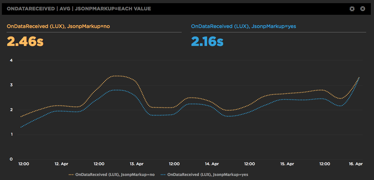
A/B Testing JSONP and the Preloader with RUM

SpeedCurve is a SPA (Single Page App) so we construct the charts dynamically using JSONP. It works great, but we're always looking for ways to make the dashboards faster. One downside to making requests dynamically is that the browser preloader isn't used. This isn't a factor for later SPA requests, but on the first page view the preloader might still bring some benefits. Or maybe not. We weren't sure, so we ran an A/B test. Long story short, doing the first JSONP request via markup caused charts to render 300 milliseconds faster.
Improved Favorites

We've improved the "Favorites" dashboard which now lets you build your own charts which:
- Combine synthetic tests and LUX (real user monitoring) in one chart.
- Choose average, median, or 95th percentile.
- Create charts that have multiple metrics.
- Select multiple values for a filter, eg, browser = Chrome or Firefox, country = UK or US.
- Compare A/B tests in a single chart.
Here's a walkthrough showing you some of the new features:
Measuring Blocking Resources
SpeedCurve reports the number of critical blocking resources in the page. These are the resources that block rendering. Since it's important that users see your content as quickly as possible, it's important to know what might be causing your page to render slowly. We recently enhanced the way we measure blocking resources and wanted to share those improvements with our customers as well as the performance community at large.
The main culprits that block rendering are scripts and stylesheets that are loaded synchronously. A great way to avoid this blocking problem is to load your scripts and stylesheets asynchronously. You can do that for scripts by using the async and defer attributes, plus other programmatic techniques. Loading stylesheets asynchronously is less popular but is still possible using techniques like loadCSS.
Build your own charts
We put a lot of thought into curating a thematic set of dashboards that help you understand the performance of your front-end, but sometimes you just want to play with the data yourself and slice 'n' dice the data in all sorts of different ways. We've added a new "Favorites" dashboard that lets you do just that. You can explore the data and build your own charts, then rearrange them and share them with the team to help demonstrate the performance issues you're focused on right now.
Here's a walkthrough showing you how to slice the available data in different ways:
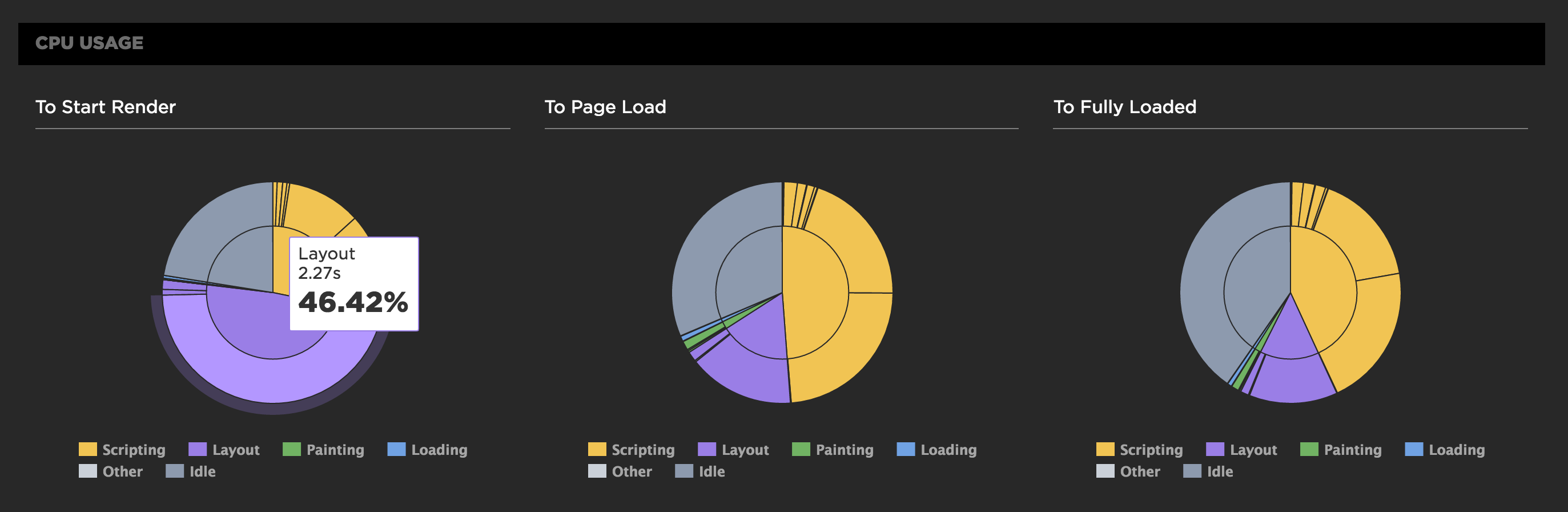
Track down front-end CPU hogs
Often when monitoring and debugging site performance we focus on network activity and individual resources, but what about the CPU? As more and more sites switch to using large Javascript frameworks and manipulating the page using Javascript, the execution time this code takes and the available CPU can instead become the performance bottleneck.
CPU usage for all Chrome tests
For any of SpeedCurve's Chrome-based tests, including emulated devices, we capture the Chrome Dev Tools timeline. From the browser main thread usage in the timeline we extract how busy the CPU is and what it's spending time on. Is it busy executing Javascript functions or busy laying out elements and painting pixels?
We also measure the CPU usage to different key events in the rendering of the page. SpeedCurve's focus is on the user experience and getting content in front of people as fast as possible, so we show you what the CPU is doing up till the page starts to render. This reflects CPU usage during the browser critical rendering path and can highlight various issues. If there's lots of CPU idle time then you're not delivering your resources efficiently. You want to get the CPU busy nice and early rendering the page, rather than sitting idle waiting for slow resources.
In the test below we see in the first pie chart that the CPU is spending a lot of time on layout up to the start render event, which is quite a different picture from the Fully Loaded CPU usage.
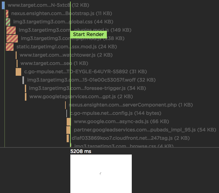
SpeedCurve Waterfall
If you're a performance engineer, then you're familiar with waterfall charts. They are found in browser dev tools as well as other performance services. I use multiple waterfall tools every day, but the waterfall chart I love the most is the one we've built at SpeedCurve: