SpeedCurve is now part of the Embrace family! There are no changes to how you use our products. Our founder Mark shares what this means...
Deeper performance analysis with histograms and correlations

This week we've made some pretty exciting new changes to your Favorites dashboards. Aside from a brand-new chart editor interface, you'll also notice that we've introduced two new chart types: histograms and correlations.
In this post, I'm going to talk through some of the features in our new chart editor. I'll also explain in detail explain why I think histograms are such an important tool in your performance toolkit, and how you can get some fascinating insights by correlating other metrics on top of a histogram.
.png)
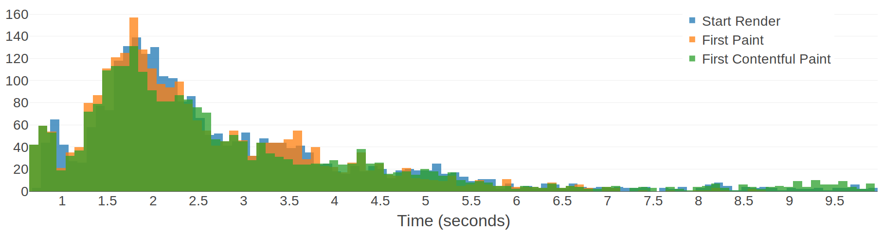
An analysis of Chromium's paint timing metrics
Here at SpeedCurve, we are continually gathering detailed performance data from tens of thousands of web pages. This gives us a relatively unique opportunity to analyse and aggregate performance metrics to gain some interesting insights. In this post, I'm going to analyse some browser-based paint timing metrics: First Paint & First Contentful Paint (defined in the Paint Timing spec and implemented in Chromium). I'm also going to analyse First Meaningful Paint (defined in a draft spec and implemented as a Chromium trace metric).
What are paint timing metrics?
The aim of almost any performance optimisation on the web is to improve the user experience. The folk at Google have been pushing this sentiment with a focus on user-centric performance metrics, which aim to answer four questions about users’ experiences:
- Is it happening? Is the page that I want to see actually loading?
- Is it useful? Has enough content rendered that I can engage with it?
- Is it usable? Can I scroll and interact with the page, or is it still loading?
- Is it delightful? Are my interactions with the page smooth?
First Paint (FP) measures the point at which pixels are first rendered to the screen after navigating to a new page. First Contentful Paint (FCP) is slightly more specific, in that it measures the point at which text or graphics are first rendered to the screen. Both of these metrics are available in Chromium browsers (Chrome, Opera, Samsung Internet, etc) via the Performance API: performance.getEntriesByType('paint').
The paint timing metrics are important because they aim to answer the first question: is it happening? My analysis will look at performance data from some popular websites in an attempt to figure out whether the paint timing metrics really do answer that question.
Performance improvement checklist for your whole site
One of the longest-standing items on my performance monitoring tool wishlist is an automatically-generated performance improvement checklist, with the improvements ordered by the impact that they will have on the website. In a previous life, I spent countless hours writing performance reports and conducting A/B performance tests to figure out which change would have the biggest impact on a website's performance.
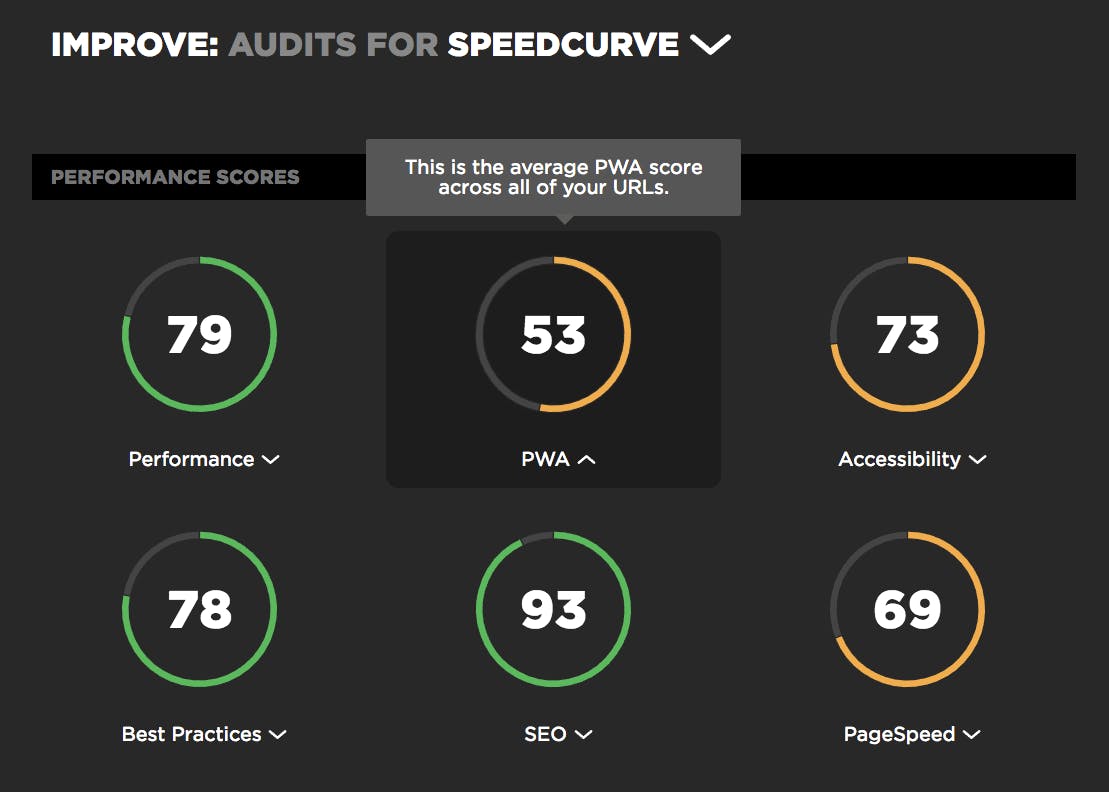
So I'm understandably very excited that today we're announcing the new Improve dashboard – a prioritised performance improvement checklist that aggregates Lighthouse and Google PageSpeed results across all the URLs in your site to identify the most impactful performance changes you can make.
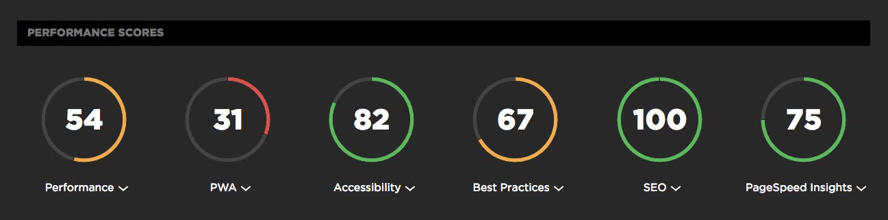
Lighthouse scores now available in your test results

In the year since Google rolled out Lighthouse, it's safe to say that "Will you be adding Lighthouse scoring?" is one the most common questions we've fielded here at SpeedCurve HQ. And since Google cranked up the pressure on sites to deliver better mobile performance (or suffer the SEO consequences) earlier this month, we've been getting that question even more often.
We take a rigorous approach to adding new metrics. We think the best solution is always to give you the right data, not just more data. So we're very happy to announce that after much analysis and consideration, we've added Lighthouse scores to SpeedCurve. Here's why – as well as how you can see your scores if you're already a SpeedCurve user.
Ouch, your JavaScript hurts!

When looking to improve the performance and user experience of our sites we often start by looking at the network:
What's the time to first byte?
How many requests are we making and how long are they taking?
What's blocking the browser from rendering my precious pixels?
While these are entirely valid questions, over the last few years we've seen a growing number of web performance issues that are caused, not by the network, but by the browser's main thread getting clogged up by excessive CPU usage.
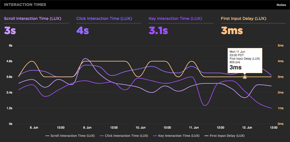
First Input Delay shows how quickly your site responds to user interaction

We're excited to announce the availability of the First Input Delay metric as part of LUX, SpeedCurve's RUM product.
Monitor performance budgets at a glance with your Status dashboard
This may sound counter-intuitive, but we don't want you to spend countless hours using SpeedCurve. In fact, our goal is to make your web performance data so accessible, understandable, and actionable that you can get everything you need from us in just a few minutes.
That's why we're so excited to announce the brand-new Status dashboard – a visualization that lets you see at a glance all your web performance budgets, as well as which budgets have been violated.
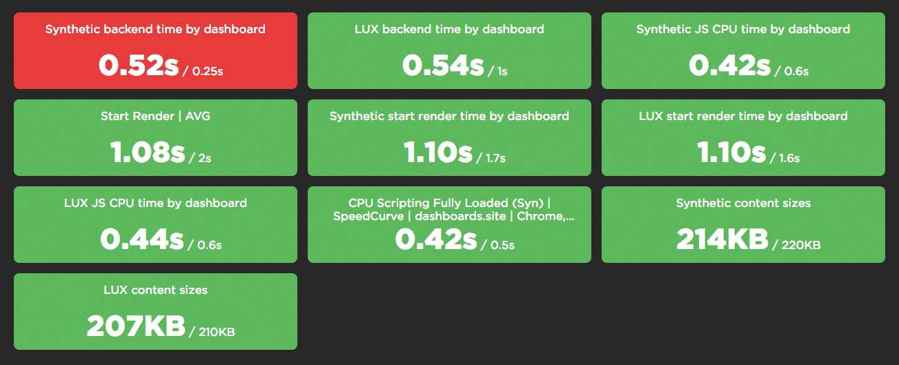
Keep reading to find out how to start using your Status dashboard to diagnose and fix your performance pains. But first, let's talk about why we built this feature.
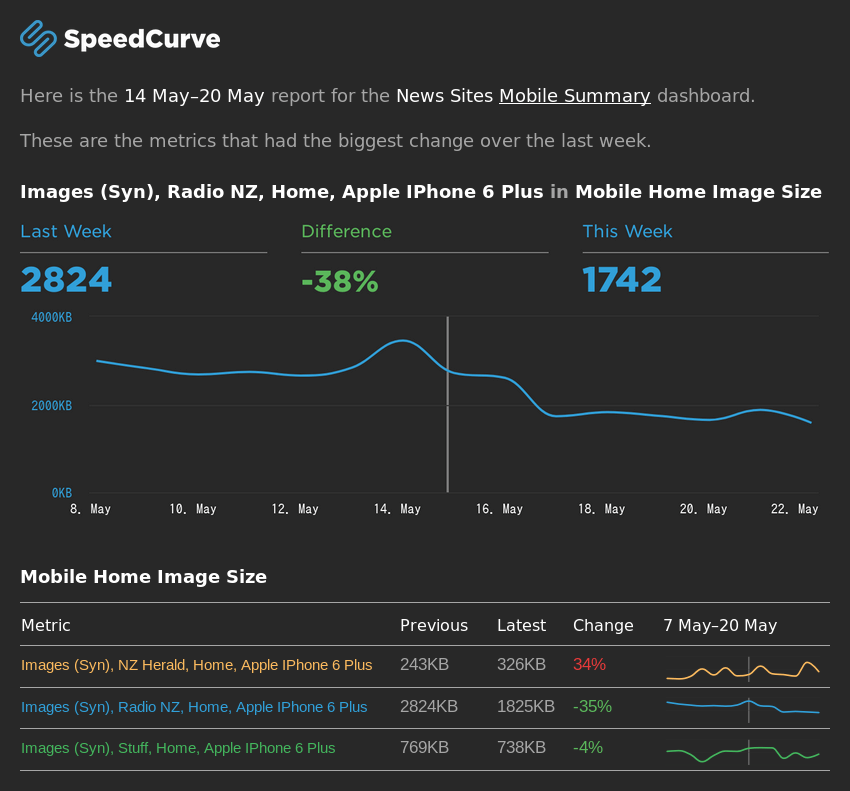
Weekly email reports from your SpeedCurve dashboards
Part of building a strong performance culture in an organisation is lowering the barrier to getting people excited about performance. One of the most effective ways I've found to do this is to send around a performance report every week that can, at a glance, answer an important question: did performance get better or worse?
That was the motivation behind our new Weekly Report feature. Now you can configure any of your Favorites dashboards to be summarized in a weekly email, like this one:
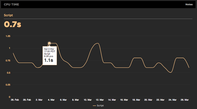
Using RUM to track CPU time
It's exciting working at SpeedCurve and pushing the envelope on performance monitoring to better measure the user's experience. We believe when it comes to web performance it's important to measure what the user sees and experiences when they interact with your site. A big part of our focus on metrics has been around rendering including comparing TTI to FMP, Hero Rendering, and critical blocking resources.
The main bottleneck when it comes to rendering is the browser main thread getting blocked. This is why we launched CPU charts for synthetic testing over a year ago. Back then it wasn't possible to gather CPU information using real user monitoring (RUM), but the Long Tasks API changes that. Starting today, you can track how CPU impacts your users with SpeedCurve's RUM product.
Introducing Last Painted Hero
We're excited to announce that we've launched Last Painted Hero as an official metric. Last Painted Hero is a synthetic metric that shows you when the last piece of critical content is painted. Keep reading to learn how Last Painted Hero works, why (and how) we created it, and how it can help you understand how your users perceive the speed of your pages.
The case for smarter heuristics
When choosing the right performance metric, my soapbox for the last few years has been "not every pixel has the same value". In other words, rather than chase dozens of different performance metrics, focus on the metrics that measure what's critical in your page.
Here at SpeedCurve, we think it's good to focus on rendering metrics, because they're a closer approximation to what the user experiences. There are some good rendering metrics out there, like start render and Speed Index, but the downside to these metrics is that they give every pixel the same value. For example, if the background renders and some ads render, that could improve your start render time and Speed Index score, but it might not have a big impact on the user's experience. Instead, it's better to measure the parts of the page that matter the most to users. We call those parts of the page the "hero elements".
